You are here:
Bar Charts
CRM Analytics provides the following types of bar charts: Bar, Column, Stacked Bar, and Stacked Column. Use the Bar or Column chart to provide a quick visual comparison of related values. Use the Stacked Bar or Stacked Column chart to show groups within each bar.
Create a Horizontal Bar Chart
Use a horizontal bar chart to compare values across one or more categories. Using the auto-fit feature, you can fit a bar chart into a crowded dashboard without the necessity of long scroll bars or loss of information.
For example, create a bar chart that analyzes the average opportunity amount by opportunity owner.
-
In the lens, click
 and then select the Bar chart type.
- In the Bar Length field, add one or more measures.
- In the Bars field, add one or more dimensions to analyze the measures by.
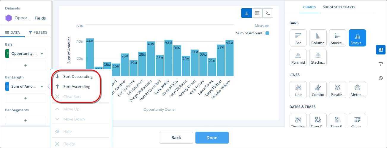
-
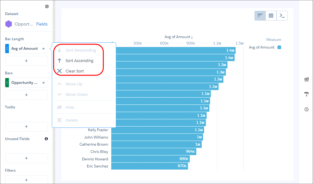
To rank the records and see the highest or lowest values, click the down arrow next to
the measure and sort the results.
-
To change the chart display, click
 and set the chart properties in the Formatting panel.
For example, to show all bars without scrolling, select Fit in the Auto Fit field.
and set the chart properties in the Formatting panel.
For example, to show all bars without scrolling, select Fit in the Auto Fit field.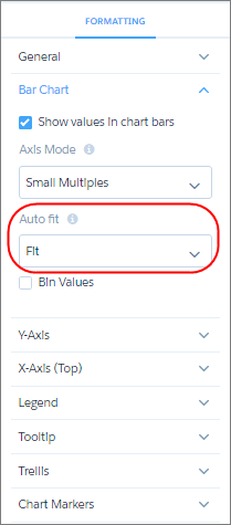
 Tip If you resize the bar chart while arranging a dashboard and lose the labels, choose Preserve labels in the Auto Fit field to restore them.
Create a Stacked Column Chart
Use a stacked column or bar chart to compare parts of a whole and show values across one or more categories.
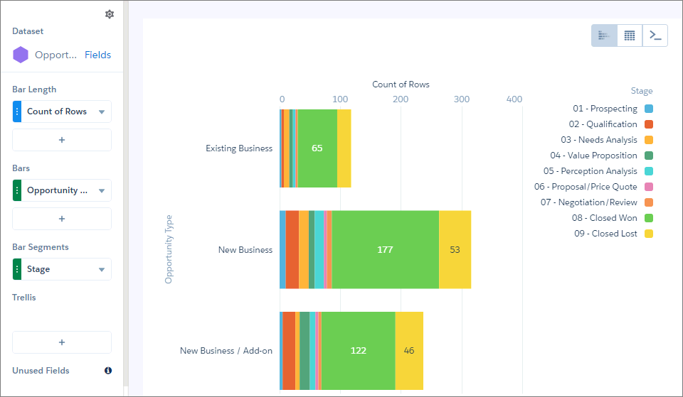
For example, create a stacked column chart that analyzes the total opportunity amount by opportunity owner and breaks down total opportunity amount by opportunity type within each bar.
-
In the lens, click and then select the Stacked
Column chart type.
- In the Bar Length field, add the Sum of Amount measure.
- In the Bars field, add one or more dimensions to analyze the measures by.
-
To rank the records and see the highest or lowest values, click the down arrow next to the
measure and sort the results.
-
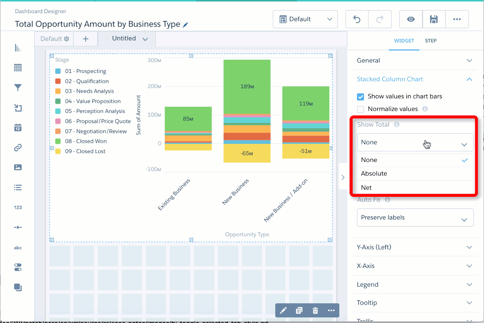
In the Bar Segments field, select Stage.
Each chart bar breaks up the total amount to show the value contributed by each opportunity stage.
-
To change the chart display, click and set the chart properties in the Formatting panel.
For example, to show the total for each bar, select a value in the Show Total field. To subtract negative values from the total, select Net. To ignore the negative signs and add the absolute values, select Absolute.