
You are here:
Heat Maps
Use a heatmap to visually enhance high- and low-value data when there's a single measure and multiple dimensions.
Create a Heat Map Chart
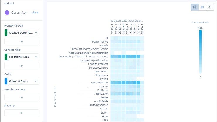
Use a heat map chart to analyze the distribution of data to find if there are concentrations in particular segments.
For example, use a heat map to determine which functional areas and quarters have the most support cases.
-
In the lens, click
 and then select the Heat Map chart
type.
and then select the Heat Map chart
type.
- In the X-Axis field, add a dimension to analyze the measure by. For example, add the Created Date dimension and choose Year-Quarter.
- In the Y-Axis field, add another dimension. For example, select Billing State/Province.
-
In the Color field, add the measure that you want to analyze across both dimensions.
For example, select to look at the average opportunity amount.
By default, the heat map shows a color gradient based on two colors.
 Tip When it’s hard to tell the difference between gradients, use bins.
 -
To change the chart display, click
 and set the chart properties in the Formatting panel.
For example, to categorize values in high, medium, and low bins, select Bins under the Conditional Formatting section, and set them up based on thresholds.
and set the chart properties in the Formatting panel.
For example, to categorize values in high, medium, and low bins, select Bins under the Conditional Formatting section, and set them up based on thresholds.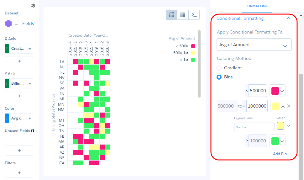
Did this article solve your issue?
Let us know so we can improve!