
You are here:
Matrix Charts
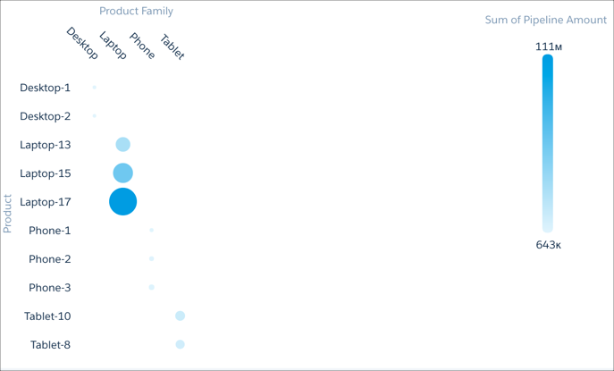
Use matrix charts to create a table that represents measures visually, allowing you to quickly spot extreme values.
For example, you can show which product families are generating the most opportunities.
Create a Matrix Chart
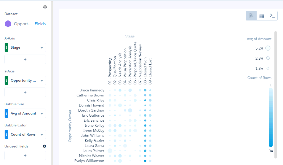
Use a matrix chart to compare one or two measures across two dimensions.
For example, use a matrix chart to compare the number of opportunities by sales rep and pipeline stage.
-
In the lens, click
 and then select the Matrix chart
type.
and then select the Matrix chart
type.
- In the X-Axis field, add a dimension to analyze the measure by. For example, select Stage.
- In the Y-Axis field, add another dimension. For example, select Opportunity Owner.
- In the Bubble Size field, add the measure that you want to analyze across both dimensions. For example, select average opportunity amount.
-
In the Bubble Color field, add another measure that you want to analyze across both
dimensions. For example, select Count of Rows to look at the number
of opportunities.
By default, the matrix shows a color gradient based on two colors.
-
To change the chart display, click
 and set the chart properties in the Formatting panel. For
example, change the two colors under the Conditional Formatting section.
and set the chart properties in the Formatting panel. For
example, change the two colors under the Conditional Formatting section.
Did this article solve your issue?
Let us know so we can improve!