
You are here:
Parallel Coordinates Charts
Use a parallel coordinates chart when you have multiple measures and a single grouping. Parallel coordinate charts are useful for displaying how data elements in a grouping stack up against each other.
Create a Parallel Coordinates Chart
If you're trying to spot outliers or patterns based on related metric factors, parallel coordinates charts can help tease them out.
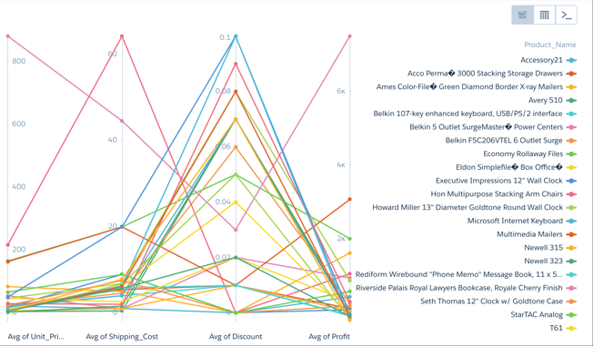
For example, you have product pricing data but you aren't sure why some higher-volume products are more profitable than others.
-
In the lens, click
 and then select the Parallel
Coordinates chart type.
and then select the Parallel
Coordinates chart type.
-
In the Node Measures field, add the measures you're interested in.
To compare product pricing, add average unit cost, discount, shipping cost, and profit.
-
In the Lines field, add the dimension that you’d like to group the data by. Each group
gets its own line. For example, select Product Name.
The parallel coordinates chart shows that higher discounts aren't adding up to higher profits.
-
To change the chart display, click
 and set the chart properties in the Formatting panel. For
example, indicate whether to show every measure title in the chart.
and set the chart properties in the Formatting panel. For
example, indicate whether to show every measure title in the chart.
Did this article solve your issue?
Let us know so we can improve!