
You are here:
Pyramid Charts
Use a pyramid chart to visually highlight relative sizes of stacked dimension values.
Create a Pyramid Chart
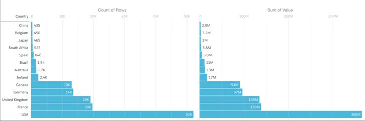
A pyramid chart is a good choice for presenting related measures for one particular dimension, such as number of accounts and account values in a particular category.
For example, you're interested in looking at the overall value and number of accounts in countries where your company does business. A bar chart can show that data in order, but it's not necessarily a compelling or easy-to-read visualization. Changing it to a pyramid chart improves both overall appearance and readability.
-
In the lens, click
 and then select the Pyramid chart
type.
and then select the Pyramid chart
type.
- In the Left Axis field, add the measure to include on the left side of the pyramid. For example, select Count of Rows.
- In the Right Axis field, add the second measure. For example, select Sum of Amount.
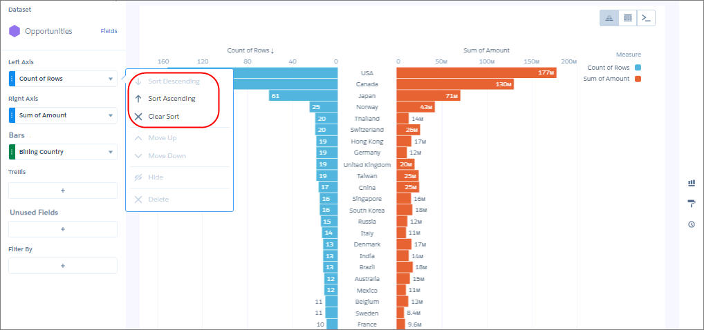
- In the Bars field, add a dimension to analyze the measures by, like Billing Country.
-
To sort the results by a measure, select the down arrow next to the measure and select the
sort order.
-
To change the chart display, click
 and set the chart properties in the Formatting panel.
For example, specify whether to show measure axes and titles.
and set the chart properties in the Formatting panel.
For example, specify whether to show measure axes and titles.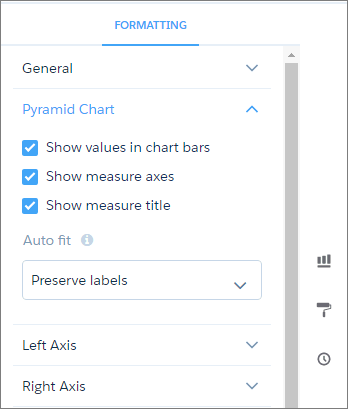
Did this article solve your issue?
Let us know so we can improve!