
You are here:
Radar Charts
Use radar charts to display a small dataset with one dimension and at least three measure columns.
Create a Radar Chart
A radar chart is useful when you're trying to visually represent a dimension along three or more measure axes that have different scales.
For example, you want to visualize the key metrics for all sales reps (opportunity owners) to determine who has superior performance.
-
In the lens, click
 and then select the Metrics Radar chart
type.
and then select the Metrics Radar chart
type.
- In the Axes field, add at least three measures. For example, add average opportunity amount, total opportunity amount, and count of rows.
- In the Polygons field, add the dimension to analyze the measures by. For example, select Account Type.
-
To change the chart display, click
 and set the chart properties in the Formatting panel.
For example, show all measures in the tooltip when you hover over a data point.
and set the chart properties in the Formatting panel.
For example, show all measures in the tooltip when you hover over a data point.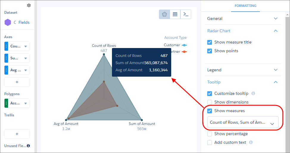
-
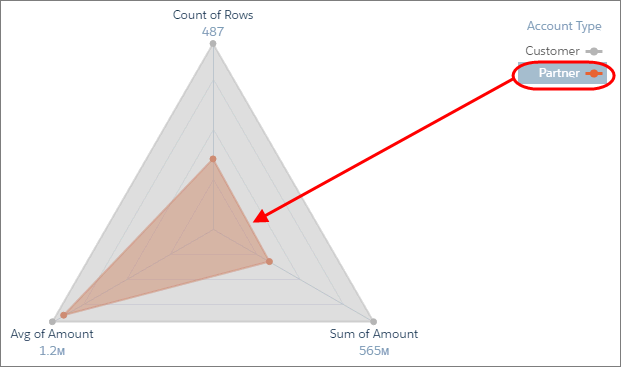
To view a specific grouping, click it in the legend.
Tip Use a metrics radar chart instead of a stacked bar chart when the measures
are similar across groupings. Although stacked bar charts can analyze multiple measures,
they don’t provide enough contrast when comparing values with subtle differences. For
example, it’s difficult to determine which customer segment has the highest average discount
in this stacked bar chart.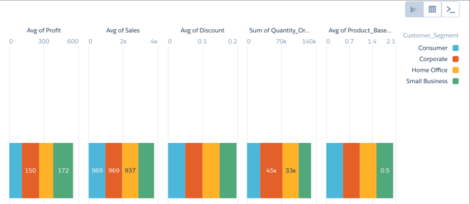
Did this article solve your issue?
Let us know so we can improve!