
You are here:
Rating Charts
Use a rating chart to get a sense of how well a measured quality, such as customer satisfaction, is meeting expectations.
Create a Rating Chart
If you've set a goal for, as an example, customer satisfaction in each of the countries where your company operates, rating charts are a good choice for showing how close you are to that goal.
You've collected, averaged, and loaded the data from the surveys. Now you want to present it in a way that makes sense for customer satisfaction scores. Each rating chart can display 1 value per country, and highlight value ranges.
-
In the lens, click
 and then select the Rating chart
type.
and then select the Rating chart
type.
- In the Value field, add the measure that you want to analyze, like average opportunity value.
-
To compare the measure across each member of a category, like opportunity owner, add
the dimension in the Trellis field.
A separate rating chart appears for each value of the selected dimension.
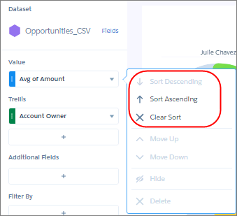
-
To change the order of multiple rating charts, sort the measure in ascending or
descending order. Default sort order is alphabetical order.
-
To change the chart display, click
 and set the chart properties in the Formatting panel.
For example, show the rating as a series of stars.
and set the chart properties in the Formatting panel.
For example, show the rating as a series of stars.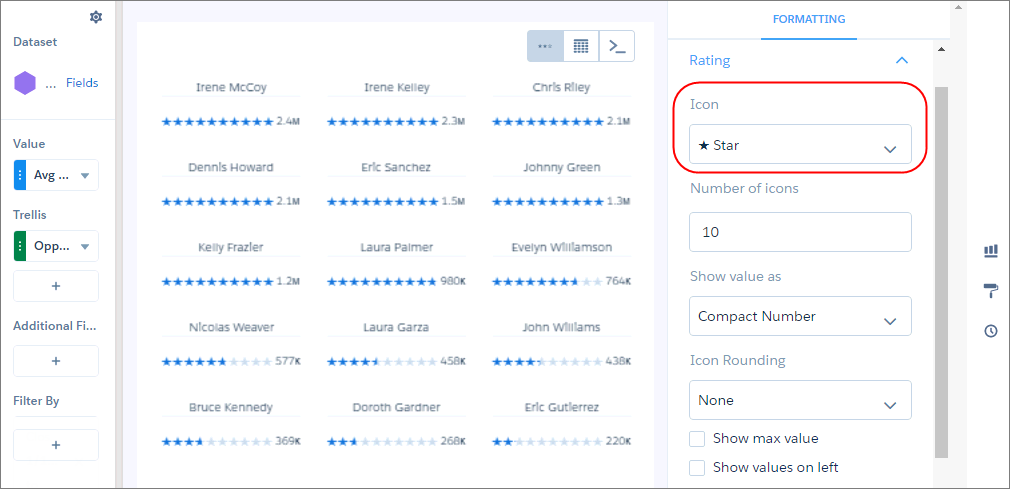
Did this article solve your issue?
Let us know so we can improve!