
You are here:
Sankey Charts
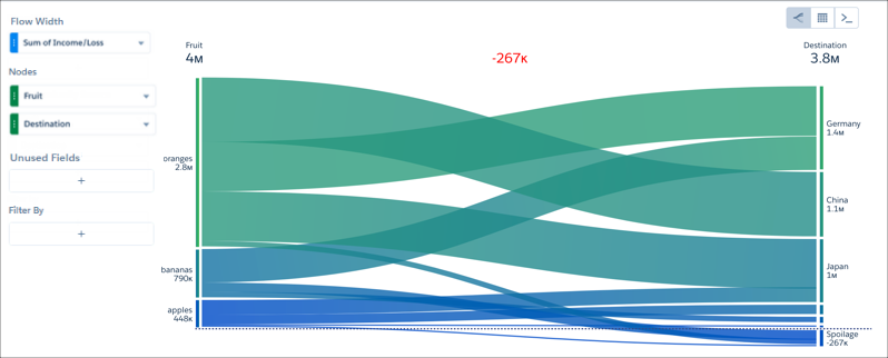
Use a sankey chart to visualize the distribution of a measure from one grouping to another grouping.
The sankey chart performs calculations based on the absolute value of each measure. For example, you have the following data:
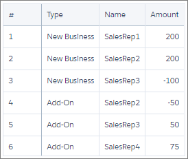
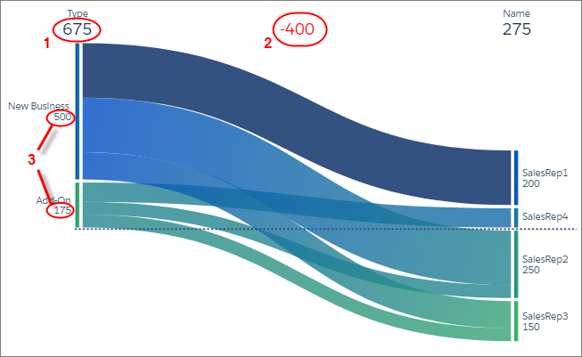
Based on the data in the table, total new business is 300 (200 + 200 + -100) and total add-on business is 75 (-50 + 50 + 75). When you visualize this data in a sankey chart, notice the different results: new business is 500 and add-on business is 175. These values (3) also impact the total (1) and difference between the two groupings (2).
Keep these considerations in mind when using sankey charts:
- Sankey charts don't support scroll and don't render when there's not enough space. For high cardinality situations, consider alternative visualizations.
- To facet and filter dashboard widgets based on a grouping in a sankey chart, set the chart’s Selection Type as Multiple Selection in the Query Properties tab.
Did this article solve your issue?
Let us know so we can improve!