
You are here:
Scatter Charts
Use a scatter chart to visualize correlation between two groups of data.
Create a Scatter Plot Chart
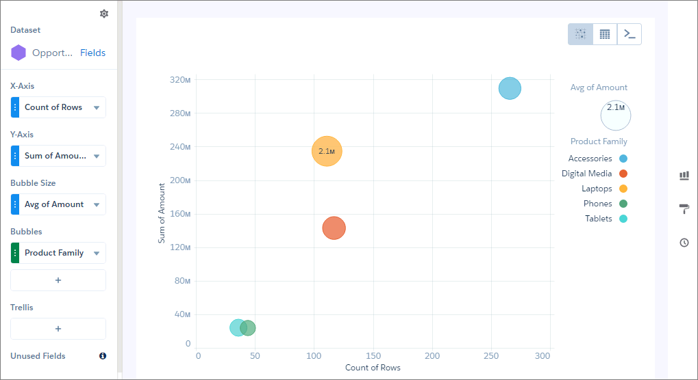
Use a scatter chart to see the correlation between two measures across a single dimension.
For example, use this chart to analyze the correlation between total opportunity amount and number of opportunities for product families.
-
In the lens, click
 and then select the Scatter Plot chart
type.
and then select the Scatter Plot chart
type.
- In the X-Axis field, add the first measure. For example, select the count of rows.
- In the Y-Axis field, add the second measure, such as sum of amount.
- In the Bubble Size field, add a third measure that determines the bubble size. For instance, add average amount.
-
In the Bubble field, add the dimension that determines the bubbles that appear in the
chart. For example, select Product Family to create a bubble for
each family.
-
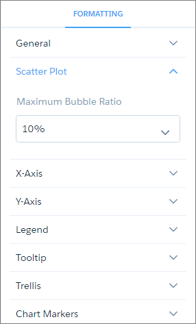
To change the chart display, click
 and set the chart properties in the Formatting panel.
Did this article solve your issue?
Let us know so we can improve!