
You are here:
Time Bar Charts
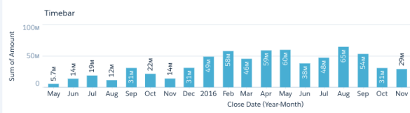
A time bar chart is a column chart with the horizontal axis showing a time dimension. Use a time bar chart to visualize changes over time with vertical bars, which is a great way to illustrate relative changes over time and highlight missing data.
Note Time bar charts need a defined point in time. If a data point has a null or missing value
for its time-related field, the chart can’t place it on the time axis. As a result, rows with
a null value in the axis field are excluded.
Create a Time Bar Chart
Use a time bar to analyze a measure over time using vertical bars.
For example, a time bar chart can show how total opportunity closes over time, where the lack of bars highlights no sales.
-
In the lens, click
 and then select the Time Bar chart
type.
and then select the Time Bar chart
type.
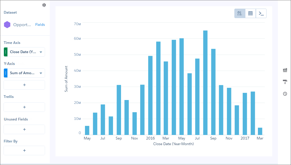
- In Time Axis, select the date field and the granularity that you want to analyze the results by.
-
In Y-Axis, choose the measure to analyze over time, such as the total opportunity
amount.
The time bar chart appears as a column chart, with the time dimension shown along the X-axis.
-
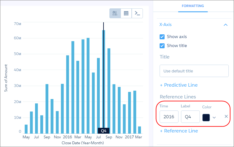
To change the chart display, click
 and set the chart properties in the Formatting panel.
For example, if some of the dataset includes predictions of future amounts, click Predictive Line under the X-Axis section in the charts properties panel. Or add a reference line to provide a visual cue about a particular point in time.
and set the chart properties in the Formatting panel.
For example, if some of the dataset includes predictions of future amounts, click Predictive Line under the X-Axis section in the charts properties panel. Or add a reference line to provide a visual cue about a particular point in time. -
To add a reference line, set the position of the reference line by specifying the date in
Time.
The numerical date you specify should match the granularity selected in the Time Axis field. For example, if you selected Year-Month and want the reference line to start just after August 2016, enter 2016/8. You can also specify a label in Label for the line, and a color.
Did this article solve your issue?
Let us know so we can improve!