
You are here:
Time Combo Charts
A time combo chart shows two or more measures over time. You can display each measure as a line or bar. You can display the charts on the same or separate axes.
If the time combo chart shows multiple bars, you can stack them to show and compare parts of a whole. For example, add a chart that analyzes opportunities over time. Then stack the bars to compare how much you lost and won over each time interval.
Create a Time Combo Chart
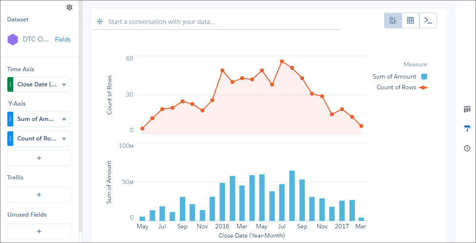
Use a time combo chart analyze two or more measures over time.
For example, this chart can show how the total opportunity amount and the number of opportunities change over time.
-
In the lens, click
 and then select the Time Combo chart
type.
and then select the Time Combo chart
type.
- In Time Axis, select the date field and the granularity that you want to analyze the results by.
-
In Y-Axis, choose at least two measures to show, such as the total opportunity amount and
count of rows.
The first measure displays on the time bar graph and each subsequent measure displays on a timeline graph.
 Note Time combo charts need a defined point in time. If a data point has a null or missing value for its time-related field, the chart can’t place it on the time axis. As a result, rows with a null value in the axis field are excluded.
 -
To change the chart display, click
 and set the chart properties in the Formatting panel.
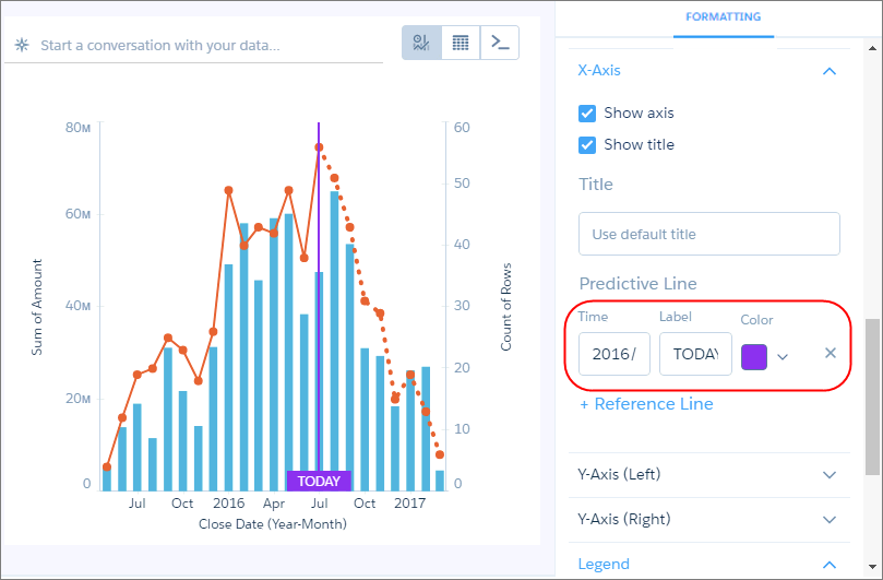
For example, if some of the dataset includes predictions of future amounts, click Predictive Line under the X-Axis section in the charts properties panel. Or add a reference line to provide a visual cue about a particular point in time.
and set the chart properties in the Formatting panel.
For example, if some of the dataset includes predictions of future amounts, click Predictive Line under the X-Axis section in the charts properties panel. Or add a reference line to provide a visual cue about a particular point in time. -
To add a reference line, set the position of the reference line by specifying the date
in Time.
The numerical date you specify should match the granularity selected in the Time Axis field. For example, if you selected Year-Month and want the reference line to start just after August 2016, enter 2016/8. You can also specify a label in Label for the line, and a color.
Did this article solve your issue?
Let us know so we can improve!