
You are here:
Waterfall Charts
Use a waterfall chart to show the cumulative effect of sequentially introduced positive or negative values with breakdowns of value totals. Also known as "flying bricks" or "Mario" charts. To include breakdowns of value totals, use a stacked waterfall chart.
Create a Waterfall Chart
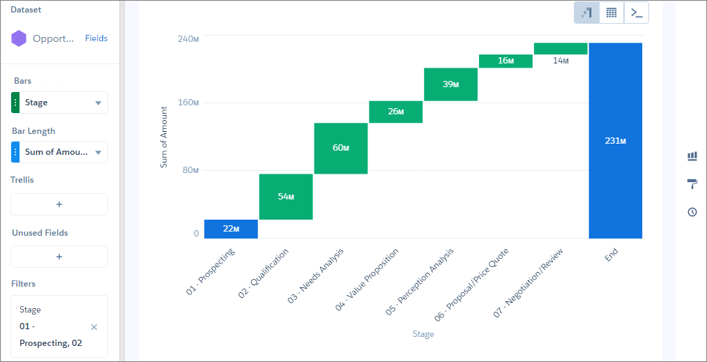
Use a waterfall chart to analyze the smaller segments that comprise a total value.
For example, use this chart to determine the relative contribution each stage adds to the total open opportunity amount,
-
In the lens, click
 and then select the Waterfall chart
type.
and then select the Waterfall chart
type.
- In the X-Axis field, add the dimension to analyze the measures by. For example, select Stage.
-
In the Y-Axis field, add the measure, such as the sum of amount.
-
To change the chart display, click
 and set the chart properties in the Formatting panel.
For example, set the label for the total column.
and set the chart properties in the Formatting panel.
For example, set the label for the total column.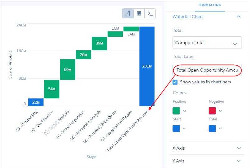
Did this article solve your issue?
Let us know so we can improve!