
You are here:
Customize Charts with Chart Properties
To create the best visualizations for presenting your data, use chart properties to configure Analytics charts.
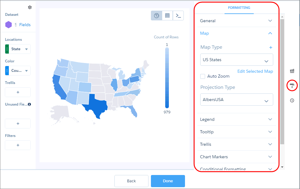
To display the chart properties in the lens, click  . The chart
properties appear in the right panel and are grouped into sections. The properties differ
based on the chart type. Properties that are unique to a chart type are grouped in their own
section. For example, the map chart has the “Map” section.
. The chart
properties appear in the right panel and are grouped into sections. The properties differ
based on the chart type. Properties that are unique to a chart type are grouped in their own
section. For example, the map chart has the “Map” section.
If you add a chart to a dashboard, edit the dashboard and select the chart widget in the dashboard designer to change the chart properties for the widget.
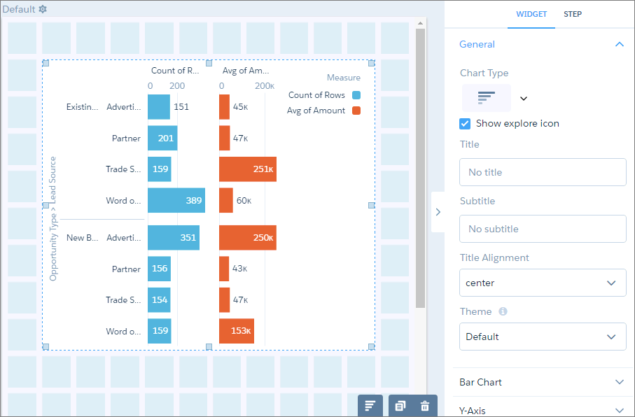
Or, to change the chart properties at the query level, double-click the widget in the
dashboard designer (which opens the query in lens mode) and click . If the query
powers multiple charts in the dashboard, changes to the chart properties at the query level
only affect chart that you double-clicked.
- Use a Suggested Chart to Display Results
Using a sophisticated algorithm that analyzes your lens's composition, CRM Analytics suggests chart types that can better communicate the essential message your data is communicating. - Format Numbers in Charts to Your Liking
Take advantage of formatting options for chart numbers in lenses and dashboards. Display the entire number value when precision is important, or the compact version for improved readability, or a percentage relative to the total value represented in the chart for easier comparisons. - Show Each Measure on a Separate Set of Axes
Charts that display multiple measures are sometimes hard to read. To fix that, display each measure separately. - Automatically Highlight Data with Conditional Formatting
Don’t delay important decisions because you miss critical changes in your data. With clicks, not code, add rules to automatically format results to quickly catch changes and take immediate action. For example, highlight accounts in red in a bar chart when their CSAT score drops below 80% so that you can get on the phone with those customers. - Set a Custom Domain to Focus the Results
If the domain on the chart is too large, chart elements can be difficult to view, like the bars in this chart. - Fill the Area Between Lines
You can shade the area between lines in line and timeline charts to accentuate the spread between two measures. - Use Dashed Lines for Effect
To differentiate a measure in a line or timeline chart, use a dashed line. - Handle Missing Values in Line Charts
Charts can display gaps to highlight missing data. Or charts can ignore the missing data and show a continuous line that connects the data points. For periods of missing data in timeline charts, you can make cumulative lines horizontal to indicate that no change occurs. - Add Multiple Reference Lines to Charts
You can use any number of static or dynamic reference lines to mark up a chart, such as when you indicate points of reference on a timeline before and after a predictive line. Dynamic reference lines are powered by existing queries in the dashboard. - Annotate Data Points with Tooltips and Markers
Create your own tooltips and markers in charts to show details about data points. Create a tooltip to specify which details appear when you hover over any data point. To annotate a specific data point, add a marker and, to draw more attention, make it blink. - Compare Results for Different Groups with Trellis
Enable trellis on a chart to display a separate chart for each group. Because the charts in a trellis have the same scale, you can quickly compare results across all groups. - Add Icons to CRM Analytics Charts
Bar charts (but not stacked bars), dot-plot charts, and line charts can have icons along with dimension values as labels. Polar gauge charts can include icons in their centers.