You are here:
Compare Results for Different Groups with Trellis
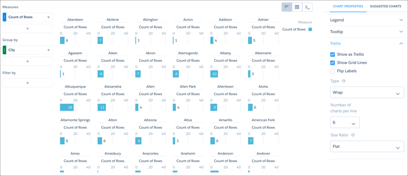
Enable trellis on a chart to display a separate chart for each group. Because the charts in a trellis have the same scale, you can quickly compare results across all groups.
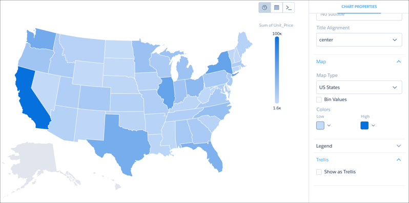
Regular map charts, for example, can display one grouping. This map of the United States shows a sum grouped by state.
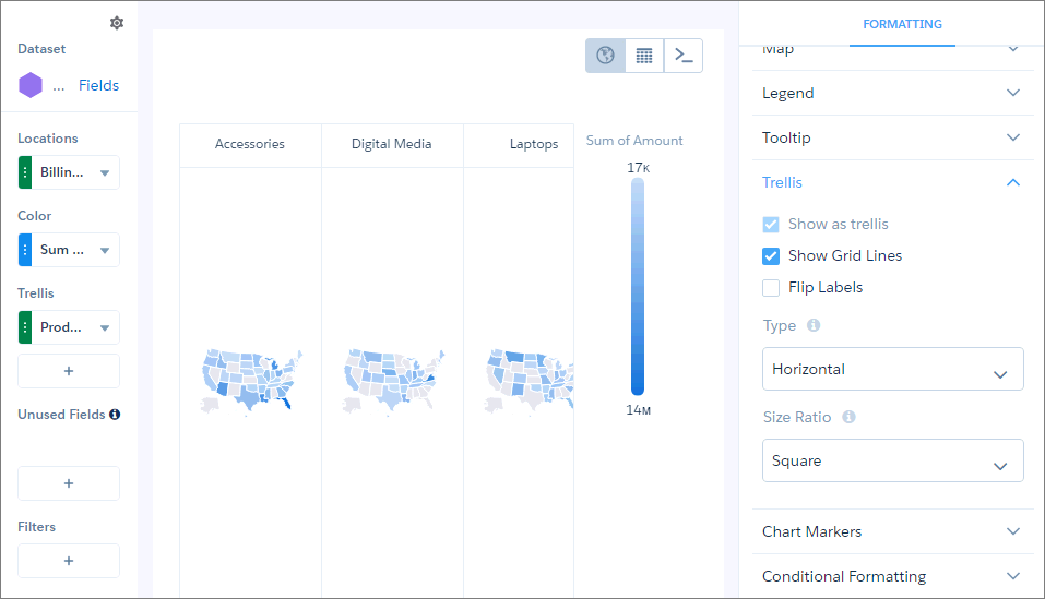
In trellis view, more groupings can be added. This trellis of maps of the United States shows a sum grouped by billing state and by product.
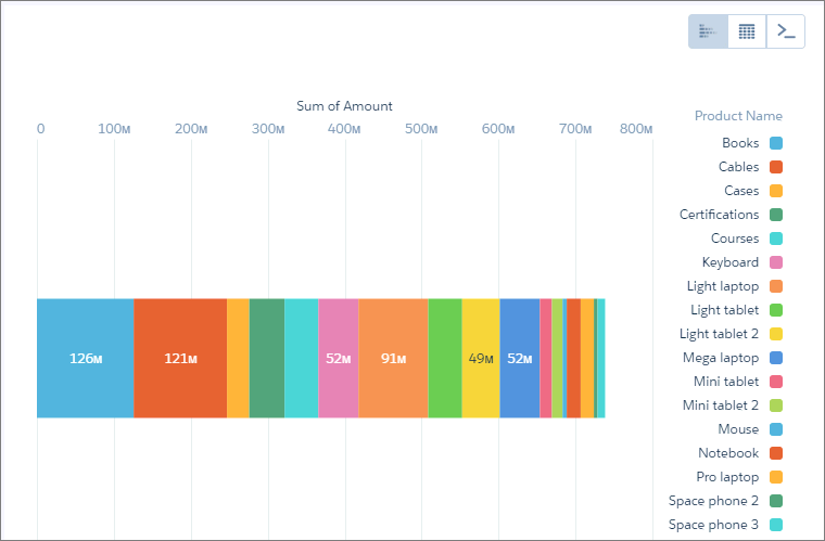
Trellis view can also be used to visualize values that may otherwise be difficult to see in a chart. For example, some of the values shown by this stacked bar chart are difficult to pick out.
By using trellis view, you can separate the values so that smaller values can be picked out more easily.
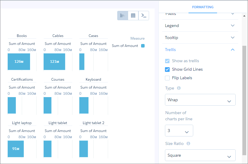
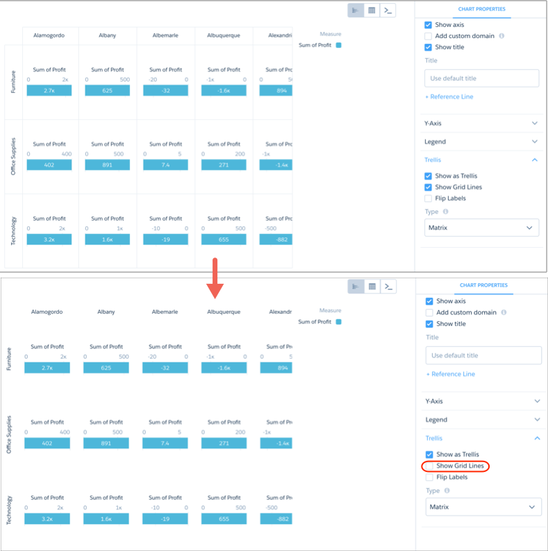
In any trellis view except for Wrap, you can remove the grid lines.
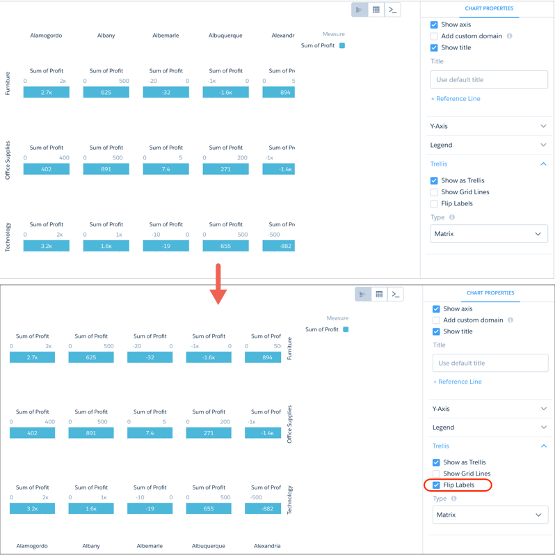
You can also move the labels to the other side of the chart.
Visualizing a large number of charts in a trellis can create a view that is difficult to read.
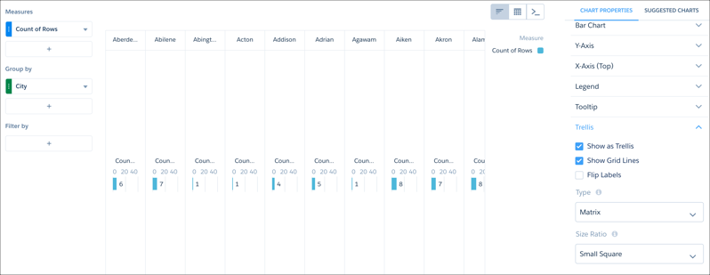
Adjust the matrix type and the size ratio to create a trellised chart that is easier to view and understand.