
You are here:
Fill the Area Between Lines
You can shade the area between lines in line and timeline charts to accentuate the spread between two measures.
To show the spread between minimum and maximum values of closed opportunities in a timeline chart, for example, click Shade Area. Then choose the measures from the Measure 1 and Measure 2 menus, and pick a color for the shading from Color for Shading.
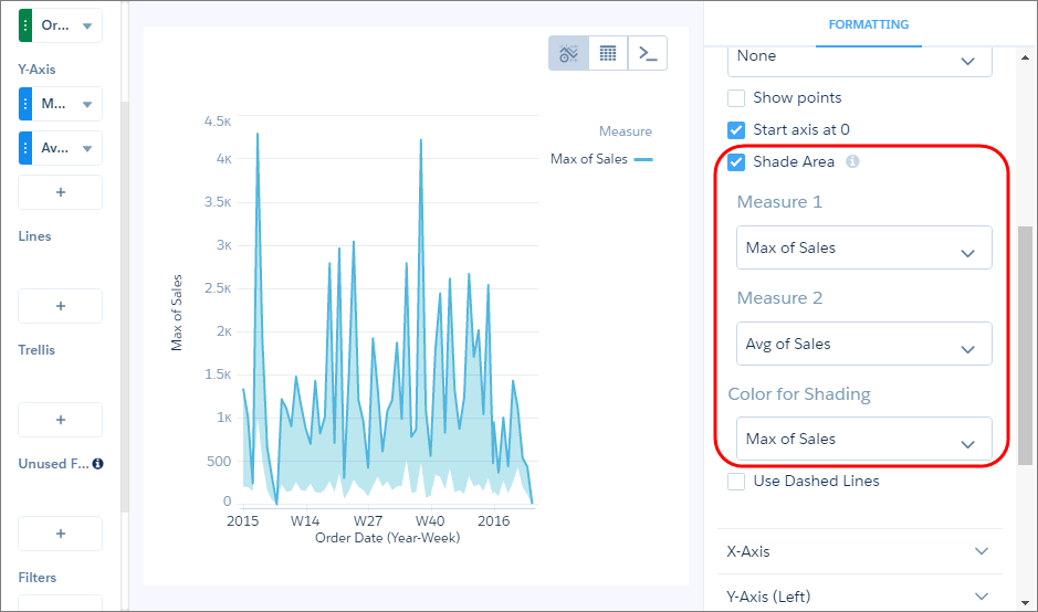
To focus on the shading, and not the lines, the chart hides the lines and legend for measures specified in Measure 1 and Measure 2, unless you select them in the Color of Shading field.

Note The
colors of the measures are based on the theme in the legend. The measure colors can change when
you select the shade color or if lines are removed from the chart.
Did this article solve your issue?
Let us know so we can improve!
