
You are here:
Best Practices for Building Your Own CRM Analytics Dashboard
Follow best practices to design and build useful, effective CRM Analytics dashboards, while minimizing rework and addressing potential gaps.
- Before you build the dashboard, take into account the following design best practices:
- Sketch your dashboard on paper or a whiteboard before you start building.
- Prioritize elements, top left to bottom right. With languages that are read left to right, people start by looking at the top left corner and working their way down. Consider the audience’s language and design for it. If your audience has limited time or attention, place important elements where they will be noticed.
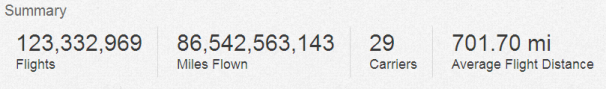
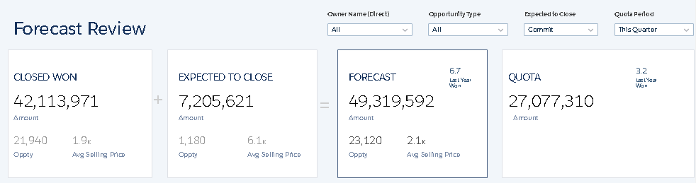
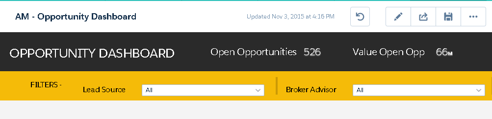
- Place high-level, easy-to-read, actionable widgets near the top left, and place
widgets with supporting information lower. For example, place numbers that display a
single measure, such as revenue for the current quarter, high and to the left.
Highlight facts that the audience wants to know at a glance.
- Group filters together at the top or left so that they are quickly noticeable. You can use a container widget to section them off in the dashboard.
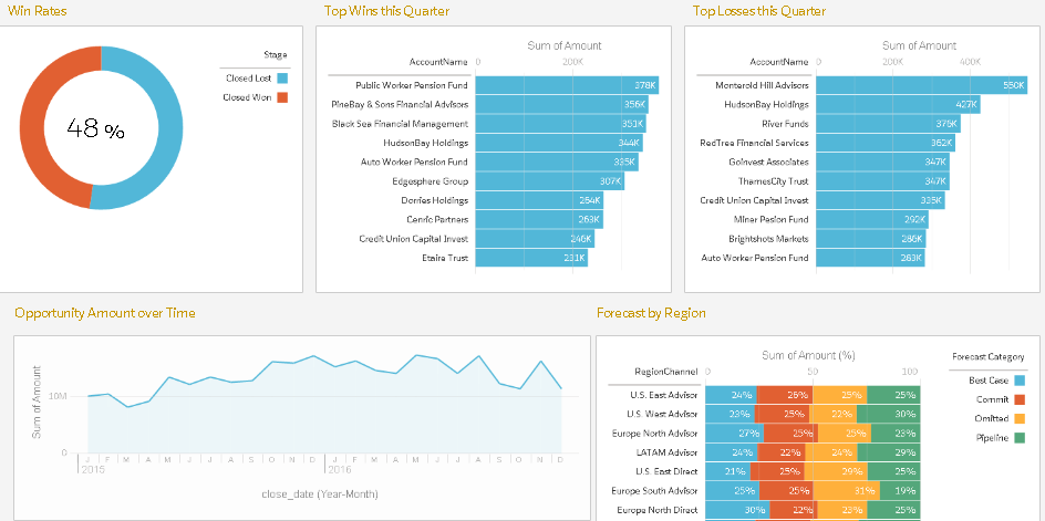
- Keep in mind that a chart in CRM Analytics is primarily a way to ask questions, not a way to illustrate a conclusion. A good dashboard invites the audience to drill down and seek ever more focused and useful information.
- Choose chart types based on the characteristics of the data, not for look or variety. For example, if most of your charts display value changes over time, it’s OK if they’re all line graphs.
- If a chart seems to need a lengthy caption or title, reconsider whether the chart is doing its job. Well-chosen data often speaks for itself.
- Use container widgets to frame and organize related elements in the dashboard.
- While you build the dashboard:
- Apply labels to sections and charts to annotate the dashboard.
- Use colors to define sections.
- Don’t clutter the dashboard—leave some empty space. If needed, break a dashboard into a series of dashboards, using link widgets to help the user navigate them.
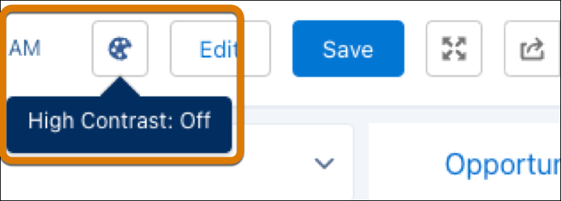
- Consider turning on high contrast colors to enable accessibility standards on your
dashboards.
- Apply labels to sections and charts to annotate the dashboard.
- After you build the dashboard:
- Have users review the dashboard before making it final. You can post a dashboard to Chatter to get feedback. Users can annotate the widgets in the dashboard to have conversations about the content.
See Also
Did this article solve your issue?
Let us know so we can improve!