
You are here:
Change the Layout and Style of an Input Widget
Fine-tune the input widget layout, and stylize its content for the dashboard. Input style options depend upon the selected input type.
- In the dashboard’s edit mode, select Input Style.
-
To change the style of a slider input type:
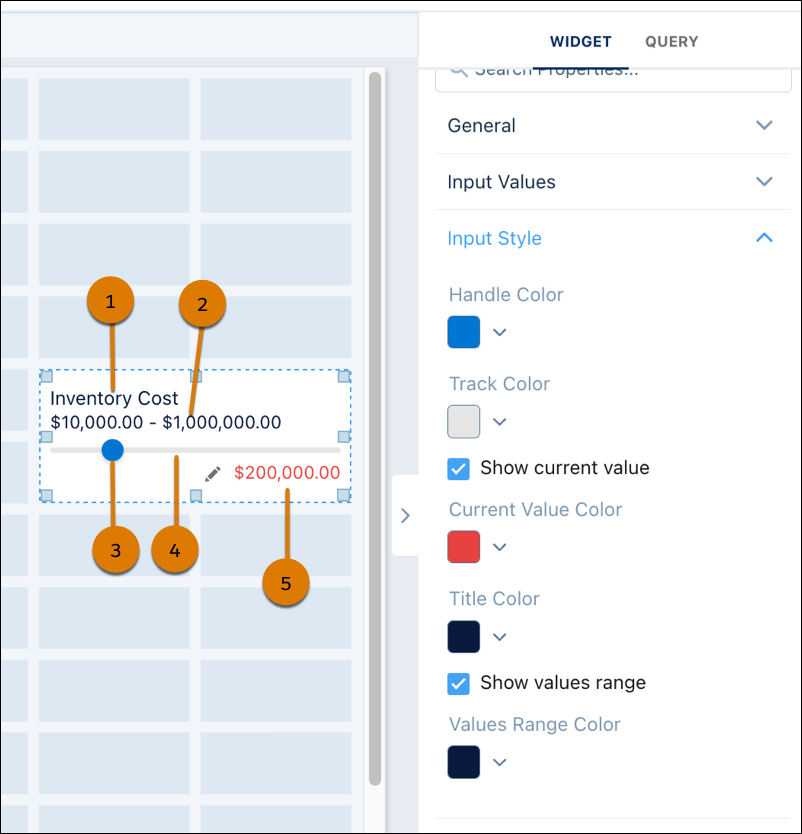 Input widget title (1), slider input range (2), slider handle (3), slider track (4), current slider value (5).
Slider Input Type Definition Handle Color Color of the position indicator on the slider track Track Color Color of the slider track Show current value Display the current slider value Current Value Color Color of the current slider value Title Color Color of the input widget title Show values range Display the slider range Values Range Color Color of the slider range -
Set an input style for a freeform input type.
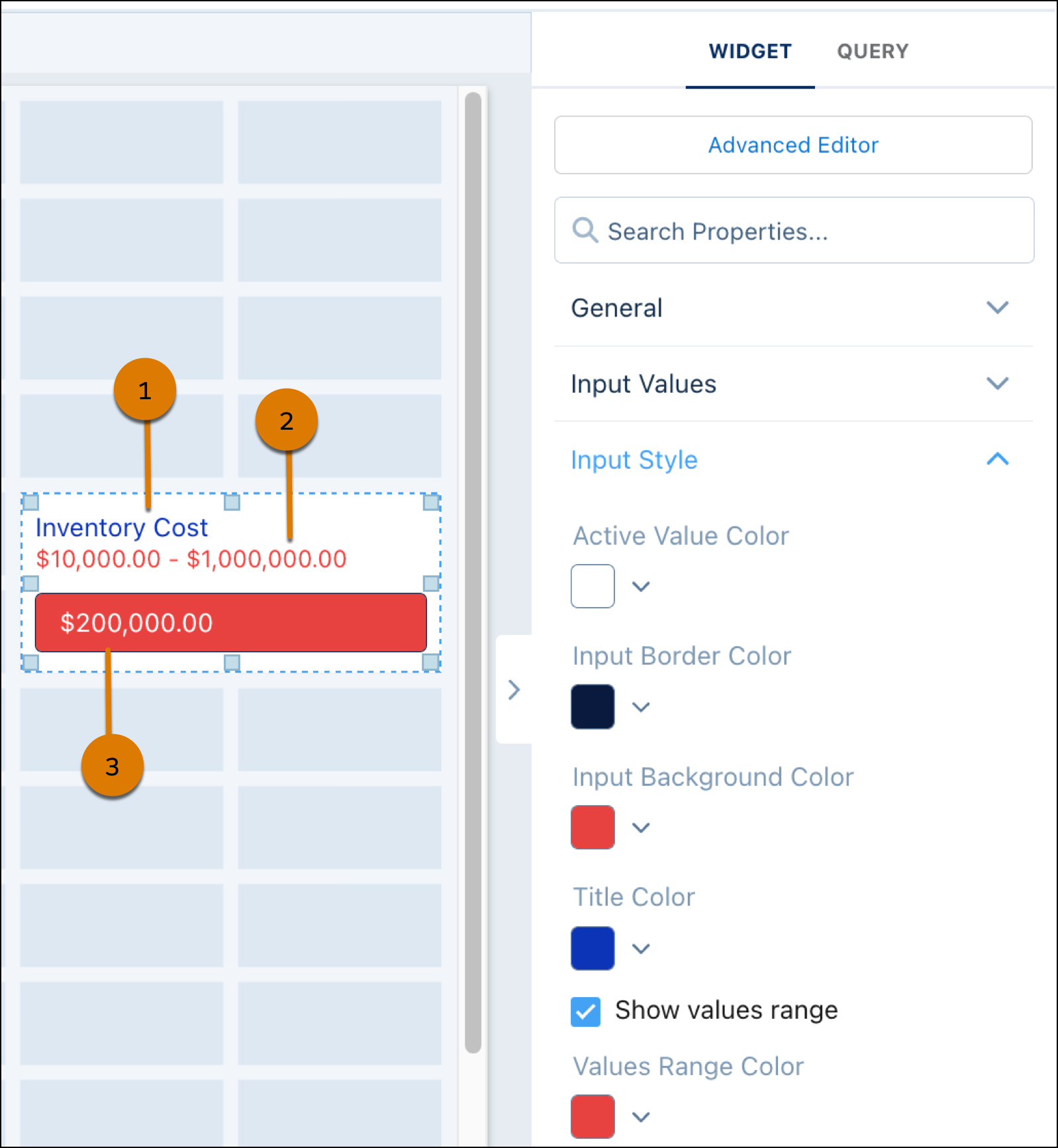 Input widget title (1), freeform input range (2), current freeform input value (3).
Slider Input Type Definition Active Value Color Color of the freeform input value Input Border Color Color of the border around freeform input Input Background Color Background color of the freeform input Title Color Color of the input widget title Values Range Color Color of the freeform range
Did this article solve your issue?
Let us know so we can improve!