
You are here:
Key Elements of a CRM Analytics Dashboard
A dashboard isn’t just for reading. It’s for carrying on a conversation based on one or more datasets that matter to your company. Don’t only look at the pictures—use the tools on the dashboard to dive deeper into the data that you care about. Go ahead, click around, and explore!
You read a Salesforce CRM Analytics dashboard interactively by clicking its displayed elements. Every element is a picture of a live, filtered query.
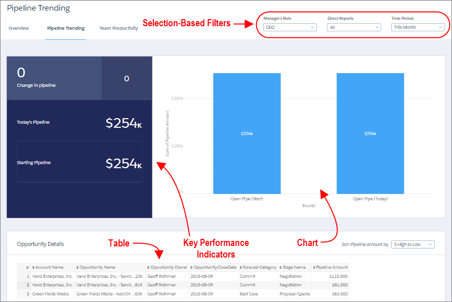
Selection-Based Filters
A selection-based filter lets you apply whatever filters you wish while viewing the dashboard. For example, set the minimum and maximum values in a range widget to make the dashboard show the amounts that fall within that range. These types of filters are often tied to each other so that you can progressively drill deeper. For example, use one filter to look at sales of a product. Then use the next to filter sales by region. Finally, use another to filter sales by account. The dashboard shows the results based on all three filters. Dashboard selections automatically reset each time you change a query grouping. There are different types of selection-based filter widgets: date, list, range, toggle, and charts.
Key Performance Indicators
Some information is best measured by a single number, also known a key performance indicator. Some number elements can be filtered based on selections in charts and filters. For example, in a bar chart that shows individual salespeople’s pipelines, click a bar to focus on a particular person’s pipeline. Notice that the number changes from showing the total value for all salespeople to show the value for the selected person.
Charts
A rich variety of charts shows you data from multiple angles. Many parts of a chart are interactive. For example, click a bar in a bar chart and watch what happens. Clicking a bar filters the query that the bar chart represents. Your revision changes other values in this chart, values in other charts, and number displays.
Tables
A table provides the record-level details. For example, a chart can show you a performance summary for each region, but the table can show you the opportunity-specific details. You can sort tables to show the top and bottom records. You can also create calculated columns in tables to compute values based on existing data.