
You are here:
Tips for Working with SAQL Queries in the Query Editor
Queries created or edited in the query editor have unique characteristics compared to other queries, like those queries created in the lens. Review the following tips for working with queries created in the query editor.
Sorting in a Stacked Bar or Stacked Column Chart
Sorting works differently in stacked bar and stacked column charts depending on whether the
underlying query is created in the lens or query editor. To see the difference, let’s start
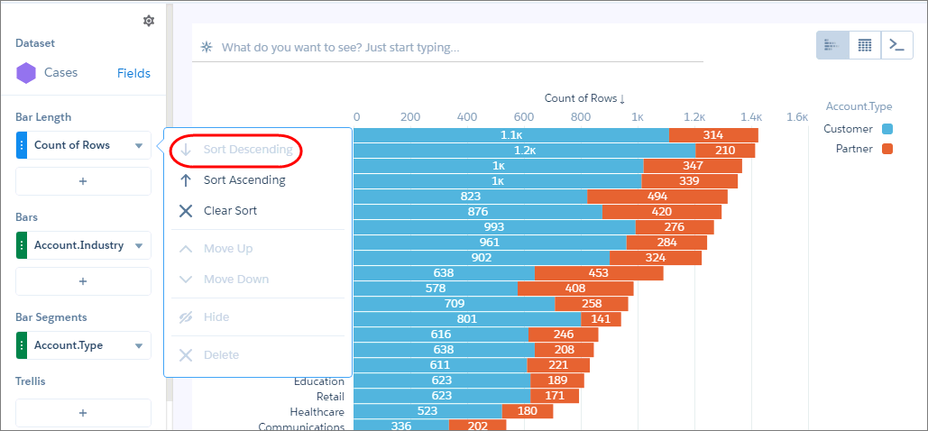
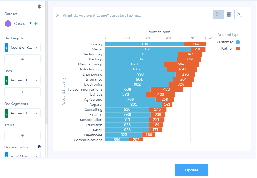
by creating a stacked bar chart in the lens. The chart shows the number of cases, grouped by
industry and account type. The chart is sorted in descending order. Notice how the total bar
size shortens. (For advanced users who modify the dashboard JSON, charts created in the lens
have query type aggregateflex.)
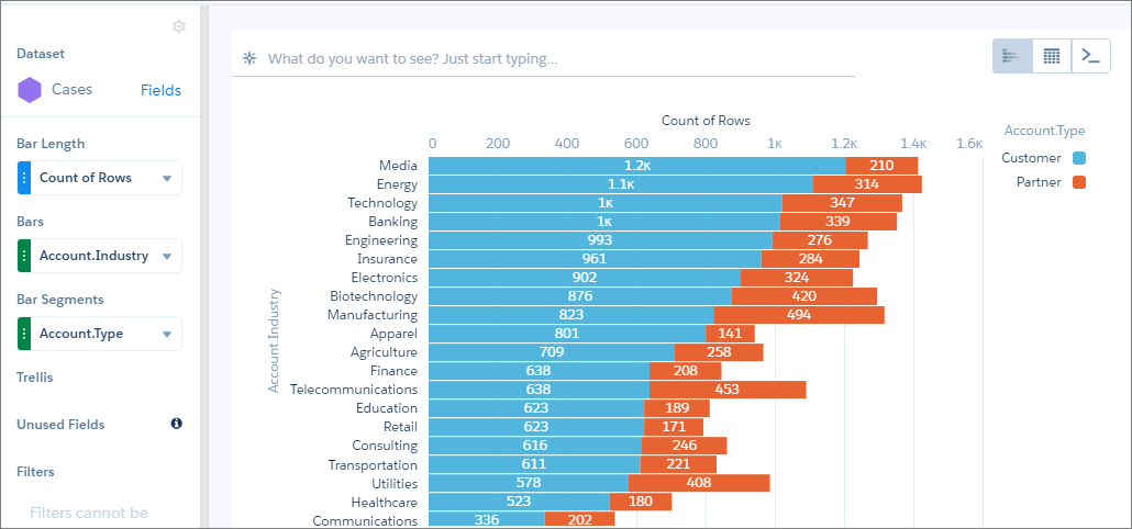
If you customize the query in the query editor, the results sort differently—even if you
don’t change the sort order. The same bars appear, but in a different order. (For advanced
users, the query type changes from aggregateflex to
saql in the dashboard JSON when you edit the query in
the query editor.)
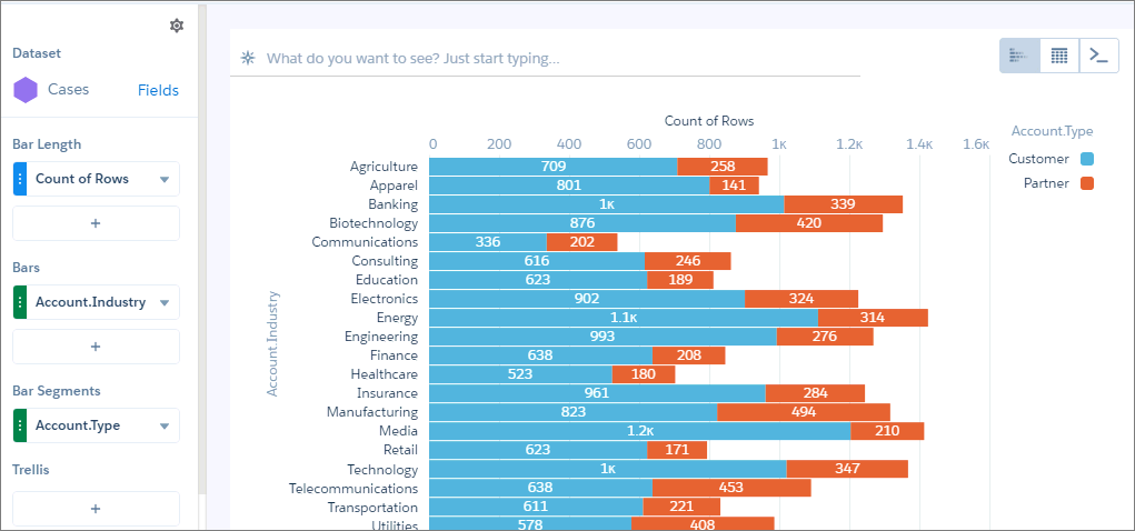
Although it looks like the results aren’t sorted, they are. The results are sorted in descending order based on the first account-type segment for each industry. Notice how the blue segments get shorter as you scan down the chart.
If you’re wondering how to sort the results based on total bar size, like we saw when we first created the chart in the lens, perform these tasks.
- In the lens, create the chart by adding the measure and groupings (one for Bars and
another for Bar Segments).
- Click
 and select
  to switch to a compare table.
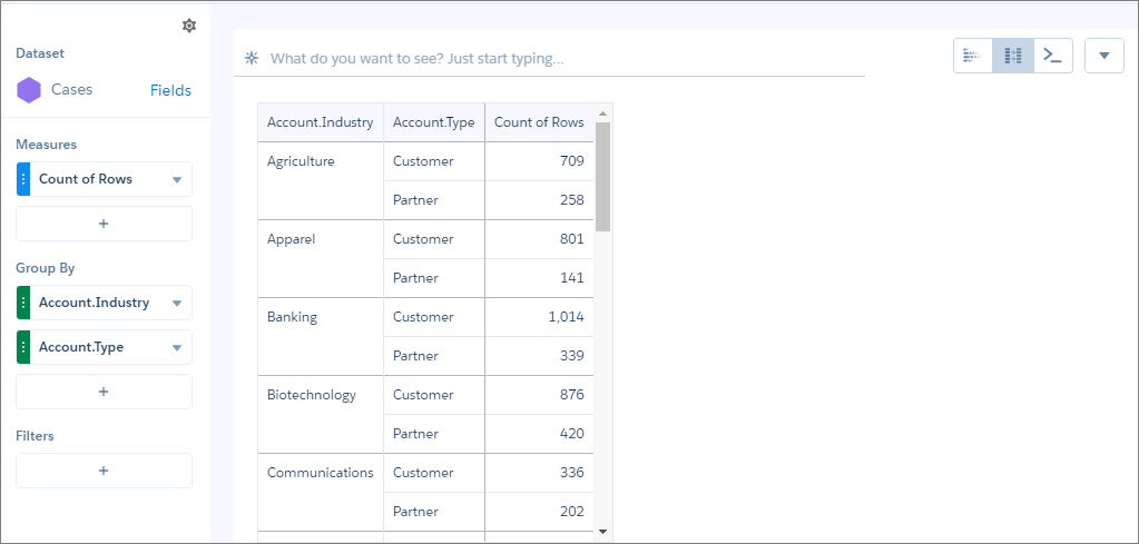
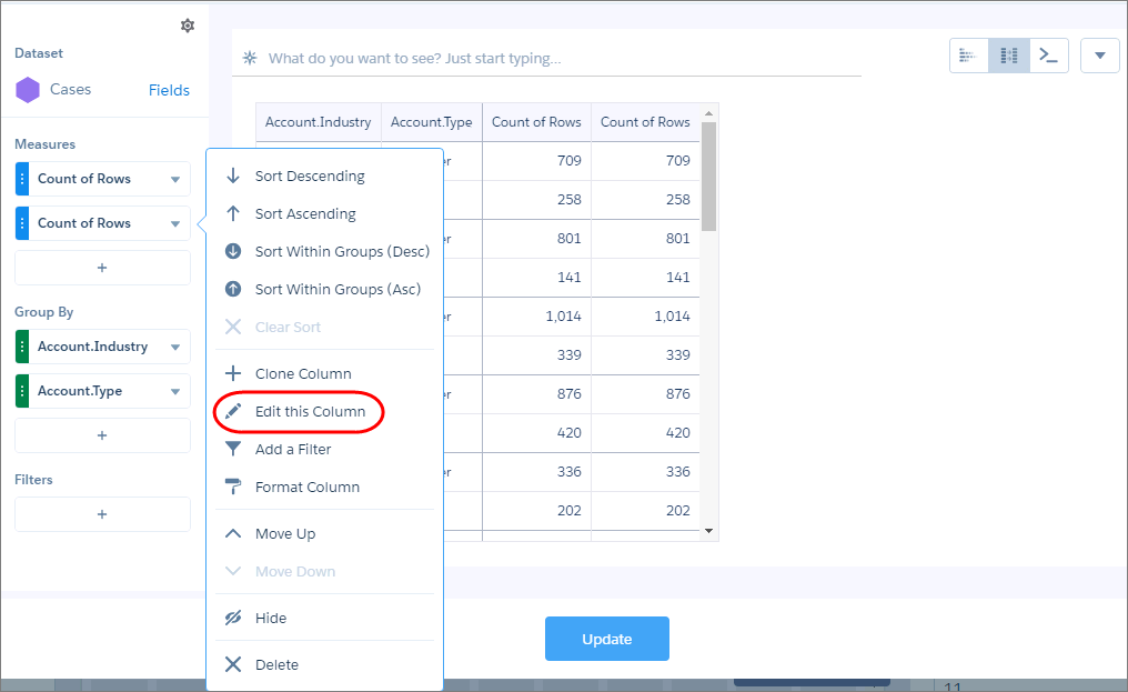
- Add another Count of Rows measure by clicking + under Measures, and then clicking . You’re going to total the values for all account types for each industry, and then sort based on that total using the windowing function.
- For the second Count of Rows measure, click the down arrow and select Edit
this Column.
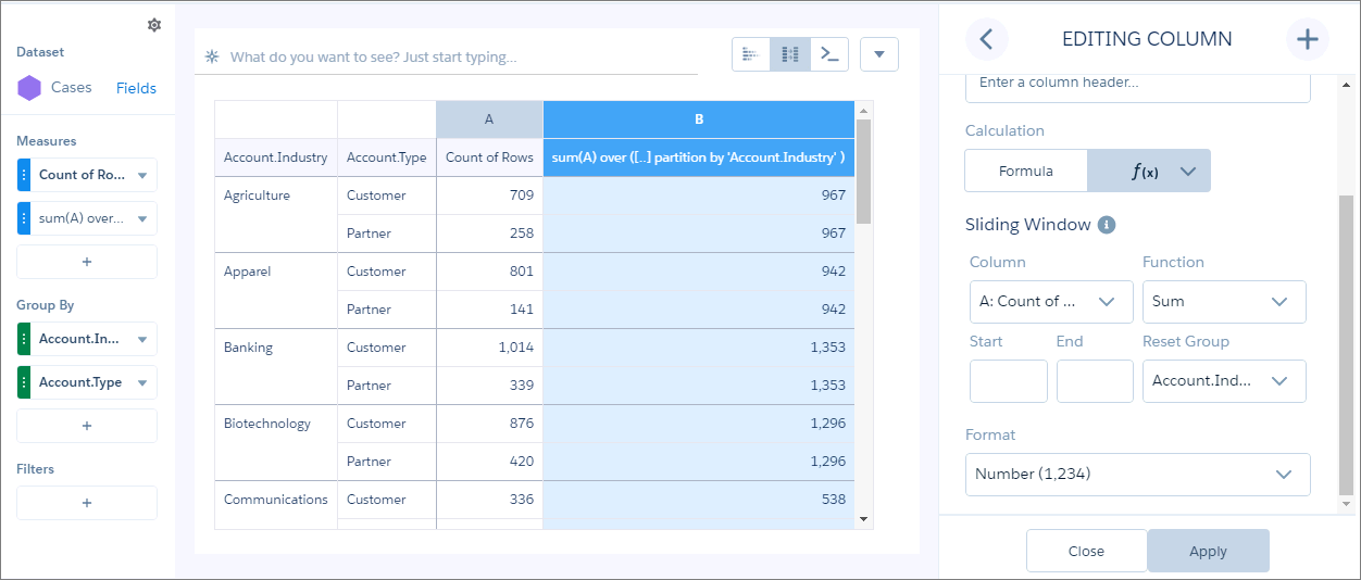
- Select Sliding Window under Calculation, select
Sum as the function, remove the start and end values for the
window, select the Account.Industry as the reset group, and then
click Apply. This calculation combines the counts for both account
types for each industry.
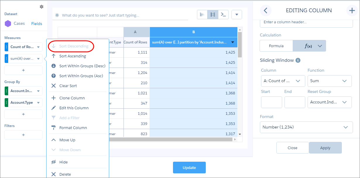
- To sort the results based on this new total, select the dropdown arrow for this measure
and select Sort Descending.
- To view the results as a stacked bar or column chart, select
 and select the chart.
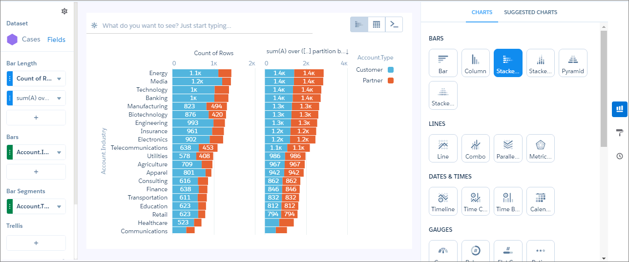
When you view the query for the chart in the query editor, you see the following SAQL query.
q = load "case95"; result = group q by ('Account.Industry', 'Account.Type'); result = foreach result generate q.'Account.Industry' as 'Account.Industry', q.'Account.Type' as 'Account.Type', count(q) as 'A'; result = group result by ('Account.Industry', 'Account.Type'); result = foreach result generate 'Account.Industry', 'Account.Type', sum(A) as 'A', sum(sum(A)) over ([..] partition by 'Account.Industry' ) as 'B'; result = order result by ('B' desc); result = limit result 2000; - To hide the second measure that we created for sorting purposes, click the dropdown
arrow for that measure, and then select Hide.
The hidden measure appears under Unused Fields in the left pane.
 Note If you hide a column in the query editor and then edit the SAQL query, the column will display again.
 - To apply the changes, click Update.