
You are here:
Widget Properties for Analytics Dashboard
Widget properties define how widgets appear in the Analytics dashboard. For example, you can apply labels, backgrounds, and borders. To make widgets look consistent, you can set up default widget properties in the layout and then assign them to each widget. Widget properties vary based on the widget type and the designer used to create them. The properties listed here apply only to widgets created in the dashboard designer.
General
Analytics groups widget properties into sections. After the first section (“General”), the remaining sections are listed in alphabetical order.
| Property | Description |
|---|---|
| Chart Type | Select the type of chart to visualize the data. |
| Show as pivot table | Indicates whether the table is pivoted. A pivot table requires the underlying query to have at least one grouping. Analytics pivots the table on the last defined grouping. Disabled, by default. |
| Show widget actions | Hide a widget’s action menu, which includes options to download, share, and explore the widget’s results. Hide the menu to hide these options or when the action dropdown arrow is too distracting in smaller widgets. |
| Show explore action | Allow dashboard viewers to click a link in the widget to open the underlying
query in a lens. This option appears when you select Show widget
actions.  Note This option only applies to widgets based on queries in
compact form. You can’t explore widgets that are built on SAQL form queries or
multiple datasets. |
| Show constant widget actions |
Widget actions are always visible without hovering. |
| Title | Title of the widget. |
| Subtitle | Subtitle of the chart. Appears below the title in a smaller font. |
| Title Alignment | Horizontal alignment of the title. |
| Title Color | Color of title. |
| Title Size | Font size of title. |
| Title Separator Color | Color of the line that separates the widget title from the global filters. |
| Filters Per Row | Number of global filters to show per row in the global filter panel. |
| Theme | Set a color scheme for the chart. |
| Update instantly | Instantly update the dashboard results based on a filter selection. Otherwise, you have to click Update to apply the filter. |
| Measure Field | The measure to show in the widget. You can use this field to specify the measure to show when multiple measures are defined in the underlying query. You can also use this option to not show the measure in the widget. |
| Shorten number | Display shortened numbers, rounded to the nearest tenths place. For example, when shortened, 1,111,556 appears as 1.1 M, 999.95 appears as 1.0 K, and 111,045 appears as 111.0 K. |
| Text | Widget label. |
| Link To | Link to a dashboard, lens, query, page, or URL. If the dashboard contains no pages, the option to link to a page doesn’t appear. |
| Page | Specify the page that you want the link widget to link to. |
| Destination | The URL of the page that the link widget links to. |
| Link Tooltip | Enter a tooltip that appears when the user hovers over the link. For example, if the link is to a website, enter the URL as the tooltip so the user knows where the link takes them. |
| Customize display and format | Customize the display values for a list or toggle widget. The widget can display
values from multiple fields. For example, a list widget can show sales rep and region,
with values like SalesRepA-West, SalesRepB-West, and SalesRepC-North—allowing you to
filter on both fields. You can also display measures as part of the value, and format
the display. Click Add field... dropdown, select a grouping or
measure defined in the query. You can insert more characters directly into the editor
box to format the display. For instance, you can add parentheses to enclose the measure
value as shown here.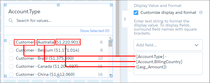 |
| Apply Selections and Filters |
CRM Analytics passes selections in chart, list, toggle, range, and date widgets as selections in the linked asset if they apply. For example, you select North America in a list widget based on the Region dataset field. CRM Analytics applies that same selection to faceted queries in the linked dashboard that have a grouping based on the Region field in the same dataset. CRM Analytics passes global filters as filters to a linked asset as long as the filters apply. CRM Analytics ignores a global filter if the linked asset doesn’t use the dataset that the global filter is defined on. If the global filter is locked and the incoming filter is defined on the same field, CRM Analytics ignores the incoming filter. If it’s unlocked, the incoming filter overrides the global filter defined in the dashboard. |
| Image | The file name of the image. The image must be available in the gallery of the CRM Analytics app that contains the dashboard. This property applies to image widgets created during or after Spring ’17. |
| Image ID | 15-character ID of the image. The image must be uploaded to the Documents tab of Salesforce and the Externally Available Image option must be enabled. This property applies to image widgets created before Spring ’17. |
| Image Scale | Indicate how to fit the image. |
| Image Alignment | Horizontal and vertical alignment of the image. |
| Show custom action | Show the widget properties that you set to show custom bulk actions on a table widget’s action menu. |
| Custom Action Label | Display label for the button in the table widget’s action menu. The dashboard viewer clicks the button to execute the action. |
| Visualforce Page Name | Name of the Visualforce page that defines the bulk action. |
| Visualforce Namespace Prefix | Optional. Namespace prefix of the Visualforce page that defines the bulk action. |
Background Image
| Property | Description |
|---|---|
| Image | The file name of the image. The image must be available in the gallery of the CRM Analytics app that contains the dashboard. This property applies to container widgets created during or after Spring ’17. |
| Image ID | 15-character ID of the image. The image must be uploaded to the Documents tab of Salesforce with the Externally Available Image option enabled. This property applies to container widgets created before Spring ’17. |
| Image Scale | Indicate how to fit the image. |
| Image Alignment | Horizontal and vertical alignment of the image. |
Band Colors
| Property | Description |
|---|---|
| Low Band | The color range for the low band. |
| Medium Band | The color range for the medium band. |
| High Band | The color range for the high band. |
BreakPoints
| Property | Description |
|---|---|
| Min | Minimum value of the low color band. |
| Medium | The value separating the low and medium colors. |
| High | The value separating the medium and high colors. |
| Max | Maximum value of the high color band. |
Center Axis, Left Axis, X-Axis, Y-Axis
| Property | Description |
|---|---|
| Start axis at zero | Start the axis at 0. |
| Show axis | Show the axis. |
| Show title | Show the title of the axis. |
| Title | Enter title of the axis. The default title is the name of the dimension for x-axis or names of the measures for y-axis. Multiple measures appear as a comma-separated list. |
| Reference Line | Show a reference line, which you can use to show a threshold, boundary, or reference point in the chart. For x-axis, it’s a vertical line. For y-axis, it’s a horizontal line. |
Chart Details
| Property | Description |
|---|---|
| Compute total | Computes the total based on all segments of the waterfall or stacked waterfall chart. |
| Show values in chart bars |
Show the measure value of each bar in the chart if there is enough space to do so. Available space will is determined by fit mode of axis, axis type (such as date-time), available space for the widget, and other factors. |
| Normalize values | Show stacked groups as a percentage of the total. |
| Axis Mode |
Specify how multiple measures appear in the chart. You can select one of the following values:
|
| Auto fit |
Fit entire chart inside the widget. Else, if needed, scroll to see the remainder of the chart. You can select one of the following values:
|
| Handling Missing Values |
Specify whether to connect data points regardless of missing data. You can select one of the following values:
|
| Fill area | Fill area under the timeline chart. |
| Show points | Show data points on the line. |
| # of stem segments |
The number of values that appear in the funnel’s stem. |
| Icon | Icon used in the ratings chart. |
| Number of icons | Number of icons that appear for each rating. |
| Show value as |
Specify how to show values. You can select one of the following choices:
|
| Show max value | Show the maximum measure value in each rating. |
| Show values on left | Show the measure value on the left of each rating. Default is on the right. |
| Show measure title | Show the title of the measure in the chart. |
| Show measure axes | Show the axes for measures in the chart. |
| Show total in title | Show the total in the measure title. |
| Show total in center | Show the total of the measure in the center of the donut chart. |
| Center Size | The percentage of the donut chart or polar gauge used to create the center circle. |
| Map Type | Select the type of map. |
| Colors | Depending on the chart type, specifies the colors of the low and high values, or colors for the start, total, positive, and negative values. |
Date
| Property | Description |
|---|---|
| Default Date Mode | Specify whether the date widget displays absolute or relative dates, by default. |
| Allow date mode switching | Indicates whether the dashboard viewer can switch between absolute and relative dates in the date widget. |
| Default Calendar Type | Specifies whether the date widget displays dates using the calendar or fiscal year, by default. |
| Allow calendar type switching | Indicates whether the dashboard viewer can switch between the fiscal and calendar year in the date widget. |
Filter Style
| Property | Description |
|---|---|
| Field Color | Color of the field name. |
| Value Color | Color of the field value. |
| Background Color | Color of the filter background. |
| Border Color | Color of the filter border. |
| Border Radius | Radius of filter border. |
Legend
| Property | Description |
|---|---|
| Show legend | Show the chart legend. |
| Show legend header | Show legend header. |
| Show legend inside chart area | Show legend inside the chart area to reduce space required for the legend. The legend might overlap with the chart. |
| Position | Location of legend inside the chart widget. |
Onboarding
| Property | Description |
|---|---|
| Resource Title | Specify a title for the frame that presents your resource. |
| Resource URL | Specify the URL for your video or webpage on a site that doesn’t prevent embedding.
For best results with a YouTube video, specify the Embed URL. To get the Embed URL in YouTube,
click Share and then Embed. The URL must have this format:
https://www.youtube.com/embed/xxxxxxxxxx Note The Onboarding property
loads content from any URL into a Analytics inline frame. If the URL allows execution
within an inline frame, then all content at the URL becomes accessible to dashboard viewers.
Salesforce is not responsible for third-party URLs. |
Table Options
| Property | Description |
|---|---|
| Column Size | You can set the table column size to:
|
| Column Width | The width of each column in the table. Configure the widths to minimize whitespace and ensure widget alignment in a dashboard. If you selected Fit to Data in Column Size, specify the minimum and maximum column widths to ensure that the columns aren’t too wide or narrow. |
| Show Totals | Shows the totals for all measures across the top of a compare or values table.
Note The Show Totals option appears in the widget properties only if the Show Totals option
is set in the query. |
| Pagination | Limits the amount of data
loaded for a values
table. As a user pages through the results, more data loads as needed. Table
pagination is on by
default. Disable
pagination by deselecting Disable paginated
loading, If you use a query in more than one widget, the dashboard fully loads and ignores the pagination setting. |
Text Style
| Property | Description |
|---|---|
| Text Color | Color | Color of the text. |
| Text Size | Size | Size of the text. |
| Number Color | Color of the number. |
| Number Size | Size of the number. |
| Title Color | Color of the title. |
| Title Size | Size of the title. |
| Alignment | Horizontal alignment of the text. |
Trellis
| Property | Description |
|---|---|
| Show as trellis | Create separate graphs based on groupings. |
| Type |
Select the type of trellis, which affects how the graphs appear. You can select one of the following values:
|
| Number of charts per line | Number of charts per line when the trellis wraps to multiple lines. |
Widget Style
| Property | Description |
|---|---|
| Use defaults | Use the default widget properties defined in the dashboard properties. |
| Background Color | Background color of the widget. |
| Border | Border around the widget. |
| Border color | Color of the widget border. |
| Border Width | Width of the widget border (in pixels). |
| Border Radius | Roundness of the corners of the widget border. |
See Also
- Add Chart Widgets to Visualize Data
- Add a Date Widget to Filter Dashboard Results Based on a Date
- Add a List Widget to Filter Dashboard Results Based on a Dimension
- Add a Range Widget to Filter Dashboard Results Based on a Measure
- Add a Toggle Widget to Filter Dashboard Results Based on a Dimension
- Add Number Widgets to Include Key Metrics
- Add a Global Filter Panel Widget to Filter Data from the Dashboard
- Add a Table Widget to Show Record Details and Create Calculated Columns
- Add a Container Widget to Create Sections in the Dashboard
- Add an Image Widget to Display Graphics in the Dashboard
- Add a Link Widget to Link to Other Assets
- Enrich Your Data with Dashboard Text