
You are here:
Add Chart Widgets to Visualize Data
Charts in a CRM Analytics dashboard allow you to visually summarize and trend your data. For example, a donut chart can show the distribution of opportunities across industry type.
CRM Analytics supports multiple chart types. Each type has unique widget properties and query requirements. For details about each chart type, see Visualizing Data With Charts.
When previewing a dashboard, some charts show values in segments. Values appear as shortened numbers, rounded to the nearest whole number. For example, 1,111,556 appears as 1 M, 999.95 appears as 1 K, and 111,045 appears as 111 K. You can hover over a segment to view the actual value.
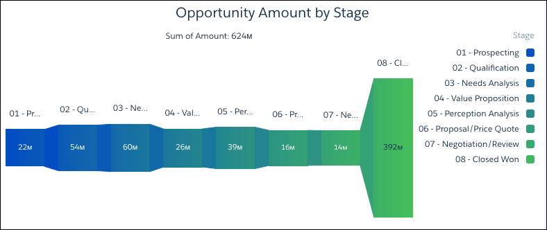
Check out the unit symbols for shortened numbers.
| Symbol | Unit | Example |
|---|---|---|
| K | Thousand (10^3) | 4K = 4,000 |
| M | Million (10^6) | 4M = 4,000,000 |
| B | Billion (10^9) | 4B = 4,000,000,000 |
| T | Trillion (10^12) | 4T = 4,000,000,000,000 |
| P | Quadrillion (10^15) | 4P = 4,000,000,000,000,000 |
| X | Quintillion (10^18) | 4X= 4,000,000,000,000,000,000 |
| Z | Sextillion (10^21) | 4Z = 4,000,000,000,000,000,000,000 |
| Y | Septillion (10^24) | 4Y = 4,000,000,000,000,000,000,000,000 |
| m | Thousandth (10^-3) | 4m = 0.004 |
| μ | Millionth (10^-6) | 4μ = 0.000004 |
| n | Billionth (10^-9) | 4n = 0.000000004 |
| p | Trillionth (10^-12) | 4p = 0.000000000004 |
| f | Quadrillionth (10^-15) | 4f = 0.000000000000004 |
| a | Quintillionth (10^-18) | 4a = 0.000000000000000004 |
| z | Sextillionth (10^-21) | 4z = 0.000000000000000000004 |
| y | Septillionth (10^-24) | 4y = 0.000000000000000000000004 |
- Drag the chart widget to the dashboard canvas.
-
One of the following screens appears.
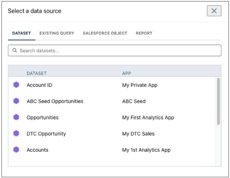
- The Choose Data screen appears, showing the most recently used datasets first.
Select the dataset in the Create Query tab or select an existing query in the Use
Existing Query tab.
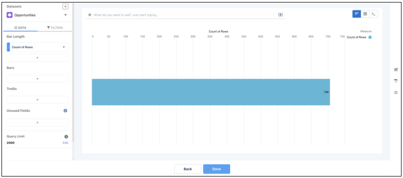
- The lens appears, showing a bar chart with the Count of Rows measure. CRM Analytics
selects the dataset that you used to create the previous query. To use a different
dataset or an existing query, click Back.
- The Choose Data screen appears, showing the most recently used datasets first.
Select the dataset in the Create Query tab or select an existing query in the Use
Existing Query tab.
-
In the lens, click Untitled Query and enter the query
label.
CRM Analytics creates the query ID from the label. After you create the query, you can’t change the query ID. CRM Analytics refers to queries by their ID so dashboards don’t break if you change the labels.
-
To add a measure, click + under the Bar Length field.
The Count of Rows measure shows, by default. To change a measure, click the measure and then choose a new one.
-
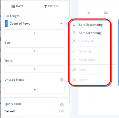
To sort, reorder, or delete a measure, click the down arrow to the right of the measure
and select the option.
- To group the measures by a date or dimension, click + under Bars, and then select the field.
-
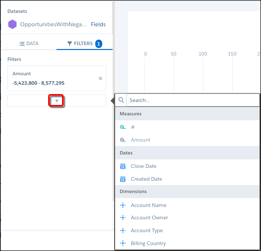
To add a filter, select Filters, click +
under Filters, and then select the field to filter by.
You can add multiple filters.
-
To change the chart type, click
 and the select the new one.
Although CRM Analytics saves the chart type with the query, you can override the chart type at the widget level by specifying a different chart in the widget properties. Setting the chart type at the widget level is useful when you use the same query for multiple widgets, but want to display the results differently in each widget.
and the select the new one.
Although CRM Analytics saves the chart type with the query, you can override the chart type at the widget level by specifying a different chart in the widget properties. Setting the chart type at the widget level is useful when you use the same query for multiple widgets, but want to display the results differently in each widget. - Click Done.
-
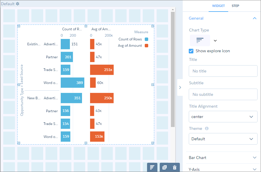
To change the widget and query properties, select the widget.
The Widget panel groups the widget properties into sections. So that you don’t accidentally overlook any properties, expand any collapsed sections.
-
To customize the appearance of the widget, set the widget properties.
For example, add a title in the Title field.
-
To show and set the query properties, click Query in the right
panel.
For example, to enable this widget to filter other faceted widgets, select Broadcast selections as facets.
While viewing the dashboard, a user can select a segment of a chart to filter the results of other faceted widgets. To allow the viewer to make single or multiple selections, configure this widget’s query properties. You can specify whether selections are optional or required. You can also set an initial selection that applies when the dashboard opens. While viewing the dashboard, viewers can undo the selection or change the selection to filter the results differently. For information about setting an initial selection, see Set Initial Selections in the Dashboard.
-
To preview your changes to the dashboard, click
 .
.
- Save the dashboard.
- Project the Same Query Results Differently in Charts and Tables
If charts and tables use the same query, each widget can show a different set of fields from the query results. You can also specify a different field order for each widget. For example, to change the measure that appears on each axis in a scatter plot, reorder the measures for that widget.