
You are here:
Project the Same Query Results Differently in Charts and Tables
If charts and tables use the same query, each widget can show a different set of fields from the query results. You can also specify a different field order for each widget. For example, to change the measure that appears on each axis in a scatter plot, reorder the measures for that widget.
If charts and tables use the same query, each widget can show a different set of fields from the query results. You can also specify a different field order for each widget. For example, to change the measure that appears on each axis in a scatter plot, reorder the measures for that widget.
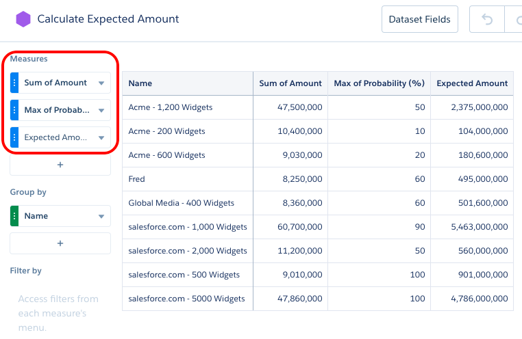
The following compare table query shows multiple measures grouped by a dimension. The Expected Amount measure is calculated based on the other two measures: Amount * Probability.
The following compare table query shows multiple measures grouped by a dimension. The Expected Amount measure is calculated based on the other two measures: Amount * Probability.
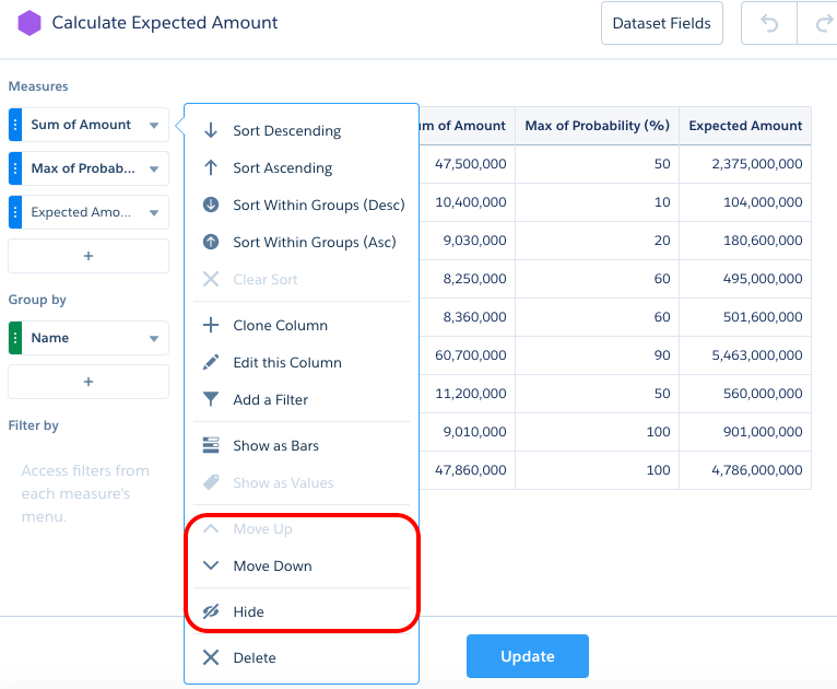
To show only the Expected Amount and Name fields for this widget, edit the widget and then select Hide for the other measures. (To show a hidden field, select Show. To reorder a field, select Move Up or Move Down.)
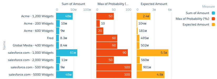
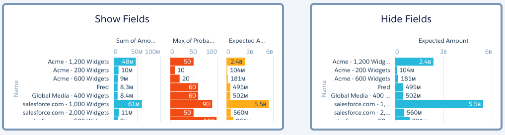
The following example shows two charts based on the same query. The second chart shows the effect of hiding the other two measures.
The Show and Hide options are only
available for aggregateflex (for compare tables) and
saql query types. To show or hide fields for tables
or charts based on other query types, configure the widget properties in the dashboard JSON.
Add a “columns” attribute and specify the API names of the fields that you want to appear in
the widget.
"chart_2": {
    "parameters": {
        "columns": [ "Name", "C" ],
        "visualizationType": "hbar",
        "step": "Amount_Prob_1",
        ...
    },
    "type": "chart",
    ...
}
Consider the following guidelines when configuring the “columns” JSON property.
- If fields are listed in "columns" and you add a measure or grouping to the query, the new field doesn’t appear in the widget until you add it to “columns.”
- If "columns" isn’t specified in the widget properties or is set to an empty array, the widget shows all fields available in the query results.
- CRM Analytics ignores fields specified in “columns” that don’t exist in the query. If none of the fields in “columns” exist in the query, the widget doesn’t show any fields.
- The order in which you specify fields in “columns” is the order in which they appear in the widget.
For charts and tables that use the same query, keep these behaviors in mind.
- If a chart widget’s underlying query returns multiple rows for the same grouping value, the chart only displays the first record for each unique grouping value and ignores the rest. As a workaround, customize the query in SAQL form.
- In a lens or dashboard, when you hide one of the groups of a chart with multiple groupings, the chart is no longer grouped by the hidden field.