
You are here:
Add a Table Widget to Show Record Details and Create Calculated Columns
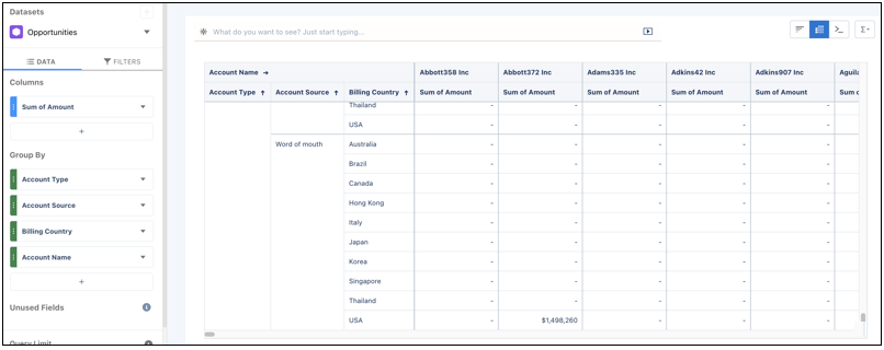
You can add different types of tables to a CRM Analytics dashboard. To view record-level details, add a values table. A values table can show details like how long a case has been open and who owns it. To create custom columns in a table based on calculations from existing fields, add a compare table. If the underlying query contains at least one grouping, you can create a pivot table.
The steps vary depending on the type of table you create. For a values table, choose which dataset fields to show as columns. For a compare table, select which dataset fields to show as columns and define the calculations for custom columns. For a pivot table, define at least one grouping. The values of the last grouping appear as columns.
- Drag the table widget to the dashboard canvas.
-
One of the following screens appears.
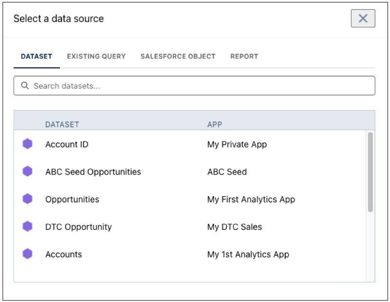
- The Select a data source screen appears, showing the most recently used datasets
first. Select the dataset in the Dataset tab or select an existing query.
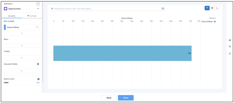
- The lens appears, showing a bar chart with the Count of Rows measure. CRM Analytics
selects the dataset that you used to create the previous query. To use a different
dataset or an existing query, click Back.
- The Select a data source screen appears, showing the most recently used datasets
first. Select the dataset in the Dataset tab or select an existing query.
-
Select
 and then choose the table type.
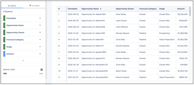
- Values table
- Use to show dataset fields as columns. You can add, remove, or reorder columns.
You can quick sort on a column by clicking its field header. You can also add
filters.
- Compare table
- Use to add calculated columns to the table. By default, the table shows the
previously selected measure as the first column. You can add measures and filters,
and group by dimensions. To quick sort on a column, click its field header. To add a
calculated column, click the down arrow next to a measure, and select
Clone Column and then edit the new column.
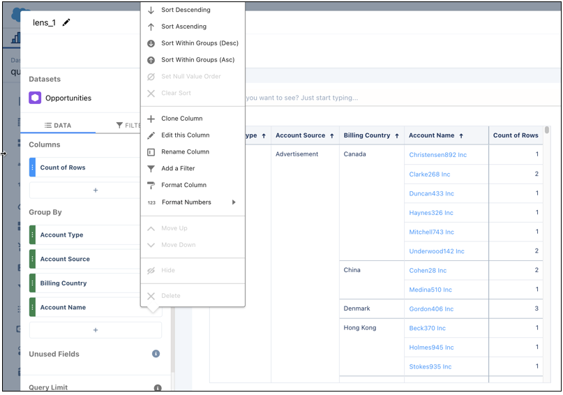
- For more information, see Creating Calculated Columns Using a Compare Table.
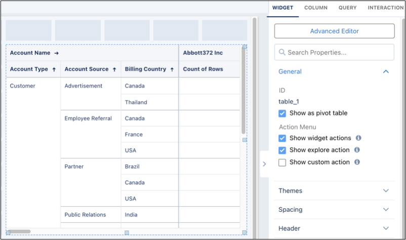
- Pivot table
- Use to show groupings on the x- and y-axes. The last grouping determines the
columns, and the other groupings determine the rows. The pivot table shows the first
specified measure in the table cells. To quick sort on a column, click its field
header.
-
To show totals in a values or compare table, click
 and then select Show Column Totals.
-
To increase the number of records that appear in a values table, update the Query Limit
value
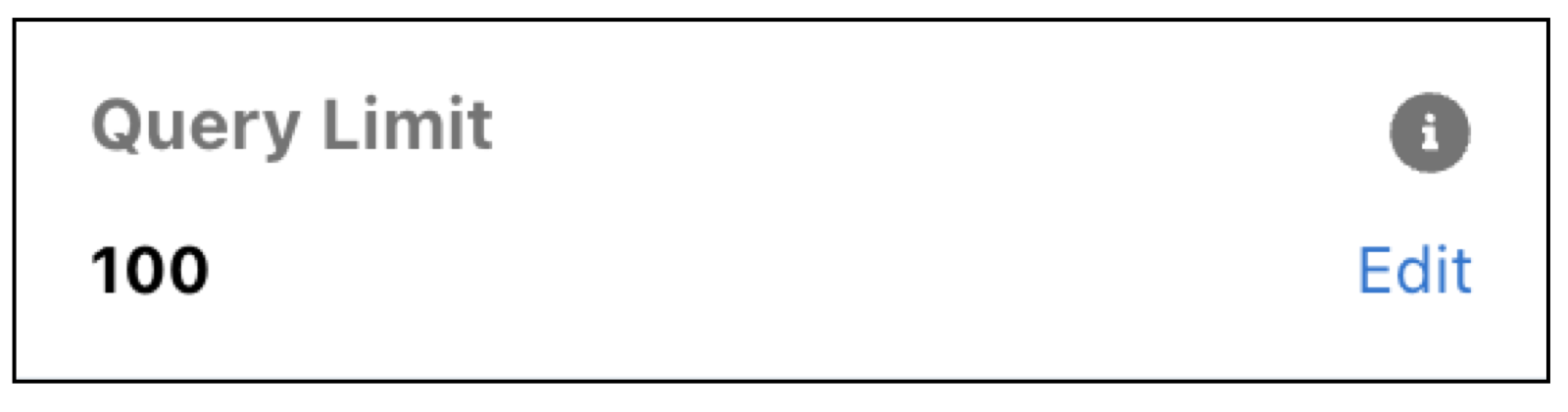 or click
  and change the
 limitparameter in the SAQL query. Note By default, the query for a values table widget returns up to 100 results. For more information about the
limitparameter, see CRM Analytics SAQL Developer Guide.When the limit value is increased for a table, pagination is automatically enabled and limits the amount of data loaded up front. As you page through table results, more data loads as needed. To disable table pagination, edit your dashboard and update the widget properties.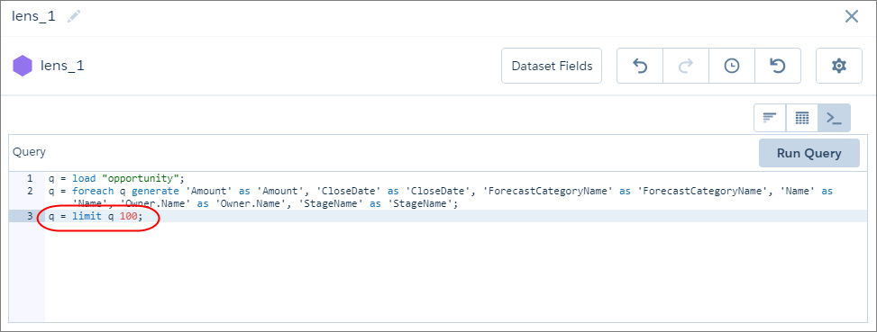 If the limit value is increased in the query, the limit value isn’t carried over to the Dashboard Inspector or Show Details, which both return up to 200 results.
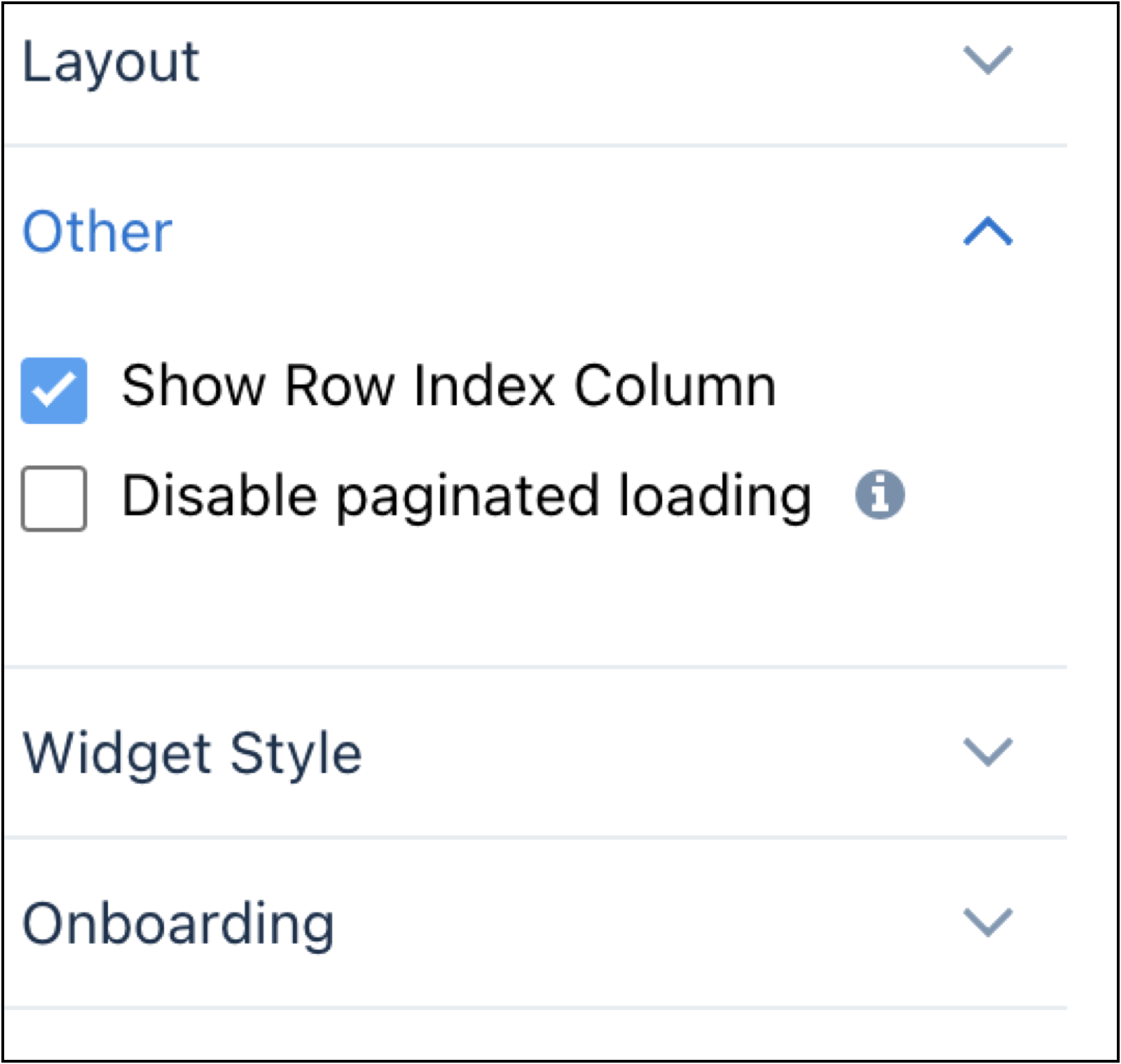
- Click Done.
-
To change the widget and query properties, select the widget.
The Widget panel groups the widget properties into sections. So that you don’t accidentally overlook any properties, expand any collapsed sections.
-
To customize the appearance of the widget, go to the Widget tab.
The widget properties vary based on the table type.
-
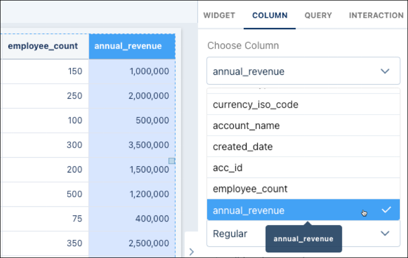
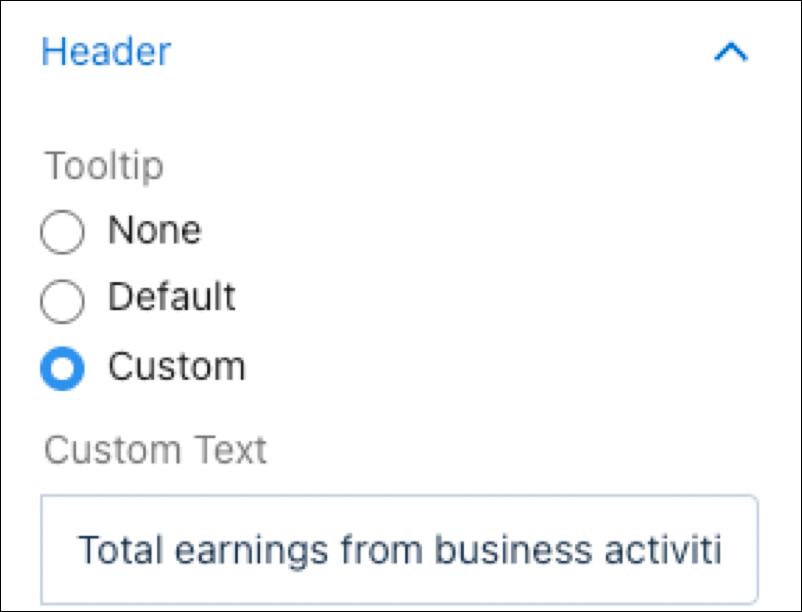
To add a tooltip to a table column, go to the Column tab and select a column.
-
Expand the Header section. Click Custom and type in a
tooltip.
-
Expand the Header section. Click Custom and type in a
tooltip.
- To show and set the query properties, click the Query tab.
- Click the Preview button to see your changes in the dashboard.
- Save the dashboard.
While viewing a dashboard, a table's groupings appear in the left columns (1) and the
measures appear in the right ones (2). Although the grouping columns are fixed, if needed,
you can scroll across the measures. If your table isn't wide enough to display any measures,
you won't see the scrollbar. 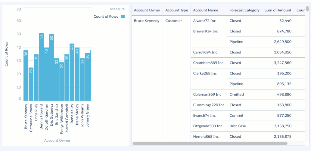
- Subtotal Considerations for Tables
The ability to expand and collapse rows, often seen in table widget types such as compare and pivot, depends on the presence and proper display of subtotals. This means that the ability to expand and collapse rows within these tables is closely linked to how subtotals are configured and rendered. And, if subtotals are turned off in a table widget, hiding the first row or column can make the entire table disappear. - Data Visibility Considerations in Pivot and Compare Tables
Enabling features such as totals, subtotals, row totals, or column totals in pivot or compare tables can alter data display. These added summary rows expand the result set, which can cause certain values to be excluded if the query limit is too low.
See Also
- Widget Properties for Analytics Dashboard
- Query Properties for Analytics Dashboard
- Manage Queries for Widgets
- Project the Same Query Results Differently in Charts and Tables
- CRM Analytics Quick Sort: Limitations and Guidance
- Subtotal Considerations for Tables
- Data Visibility Considerations in Pivot and Compare Tables