
You are here:
Compare Subgroups
Compare subgroups (categories or buckets) to learn how they relate to your model’s goal. For example, you can compare the sales performance between two different territories (such as “North America” and “Europe”). Einstein Discovery displays a waterfall chart to help you visualize the comparison between territories. Comparative insights help you determine whether the patterns you focus on are real and not accidents of the data.
To compare subgroups:
- Open a Model.
- In the Variables panel, select a variable you want to investigate.
-
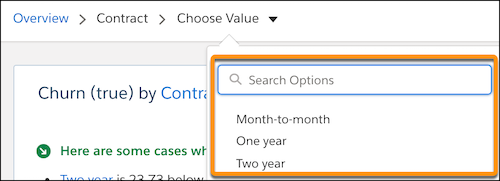
In the Filter Selector, choose the first value you want to compare.
-
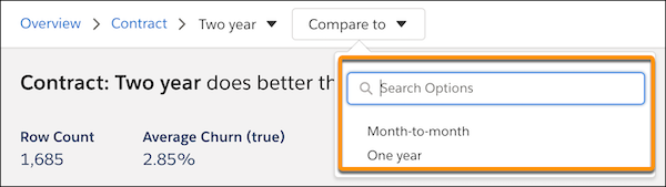
In the Filter Selector, choose the second value you want to compare.
Einstein shows a summary and waterfall chart of the comparison between the selected values.
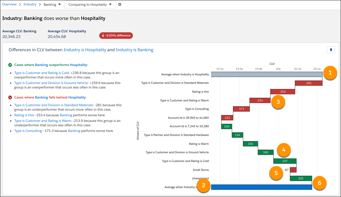
Chart Axis Axis Description Horizontal Outcome variable for this model. Vertical Drivers of the outcome variable. Chart Elements Number Element Description 1 First Explanatory Variable The gray bar represents the first (left-most) explanatory variable selected in the model toolbar. Hover over this bar to see additional information.
- Drivers of Outcome when First Explanatory Variable occurs
- Global Mean: Mean for the selected First Explanatory Variable
- Global Count: Number of observations for the selected First Explanatory Variable
- Outcome Variable: Average Outcome Variable for this bucket (Total / Global Count).
2 Second Explanatory Variable The blue bar represents the second explanatory variable selected in the model toolbar. Hover over this bar to see additional information.
- Drivers of Outcome when Second Explanatory Variable occurs
- Global Mean: Mean for the selected Second Explanatory Variable
- Global Count: Number of observations for the selected Second Explanatory Variable
- Outcome Variable: Average Outcome Variable for this bucket (Total / Global Count).
3 & 4 - (3) Cases where falls behind
- (4) Cases where outperforms
- Green bars reflect cases in which explanatory variables have a favorable effect on the outcome. A favorable effect moves you closer to your model’s goal, such as increasing opportunity wins when the goal is to maximize opportunity wins.
- Red bars reflect cases in which explanatory variables have an unfavorable effect on the outcome. An unfavorable effect moves you away from your model’s goal, such as increasing customer churns when the goal is to minimize customer churns.
Hover over a bar to see additional information. Some bars display the following information:
- Drivers of Outcome when Explanatory Variable and Other Condition occurs
- Left Base Impact: How much this term impacts the first selected group.
- Left Coefficient: Model coefficient for the interaction between this term and the first selected group.
- Left Frequency: How often this term occurs in the first selected group.
- Right Coefficient: Model coefficient for the interaction between this term and the second selected group.
- Left Interaction Impact: Impact of the interaction between this variable and the first selected group, on the first group.
- Right Interaction Impact: Impact of the interaction between this variable and the second selected group, on the second group.
- Base Coefficient: The model coefficient for just this term.
- Difference: The estimated difference in average between the first and second groups that can be attributed to the term and its interactions with the groups.
- Right Frequency: How often this term occurs in the second selected group.
- Right Base Impact: How much this term impacts the second selected group.
- Outcome: Net effect on Outcome.
5 Small Terms Represents the aggregate of terms that are too small to include in the other categories. Therefore, these terms are combined into a single set of statistics. Hover over this bar to see additional information.
- Combined Impact: Net impact on the Outcome of all the combined terms.
- Terms Combined: Number of terms combined.
- Outcome: Net effect on Outcome.
6 Unexplained Represents the unexplained variables on the Outcome. Hover over this bar to see the effect of unexplained variables on the outcome.