
You are here:
Gain and Lift Charts for Binary Classification Use Cases
The Gain and Lift charts help you evaluate your model’s ability to predict outcomes and understand the benefit of the model. Using a portion of the data that’s scored and ranked for analysis, the charts measure results obtained with the model compared to random guessing without a model. The greater the gain and the higher the lift, the more effective the model.
Navigate to the Gains and Lift Chart Tab
In Performance, click Model Evaluation, then Gain and Lift.
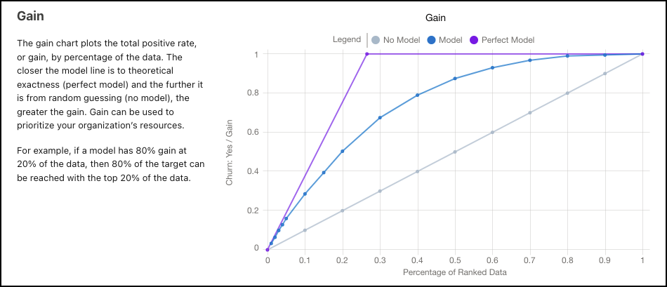
Gain
The Gain chart plots gain against the percentage of ranked data for the model. The closer the model line is to the perfect model, and the further it is from no model, the greater the gain. The greater the gain, the better the model.
The model prioritizes the high probability cases, resulting in more positive outcomes in the initial actions.
| Gain Chart | Description |
|---|---|
| Percentage of Ranked Data (x-axis) | Percentile of the cumulative data fraction. Hover over a data point to see details. 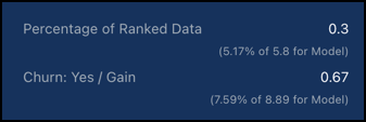 For example, a 0.3 percentage of ranked data equates to the top decile, or the 30% of records with the highest scores. |
| Gain (y-axis) | The total positive rate, or the cumulative number of desired outcomes. Represents the percentage of all desired outcomes captured by that percentile. Use gain to prioritize your organization’s resources. For example, a 0.8 gain at a 0.2 percentage of ranked data means that 80% of all of your targets (desired outcomes) are found in the top 20% of model scores. |
| No Model | Results without a model, or from random guessing. |
| Model | Results from the model. Is based on the data in the CRM Analytics dataset that Einstein Discovery used to validate the model’s performance. |
| Perfect Model | Results from a theoretically perfect model. |
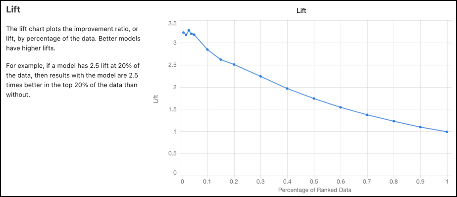
Lift
The lift chart plots the cumulative improvement ratio by the percentage of ranked data. The steeper the slope, the higher the lift. The higher the lift, the better the model.
The model prioritizes the high probability cases, resulting in more positive outcomes in the initial actions.
| Lift Chart | Description |
|---|---|
| Percentage of Ranked Data (x-axis) | Percentile of the cumulative data fraction. Hover over a data point to see details. 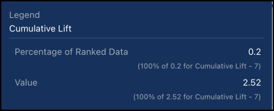 For example, a 0.2 percentage of ranked data equates to the top decile, or the 20% of records with the highest scores. |
| Lift (y-axis) | The total positive rate, or the cumulative number of desired outcomes. Use lift to measure efficiency. For example, if your model has 2.5 lift at 0.2 of the data, then results of the model are 2.5 times better in the top 20% of the data than without a model. |