You are here:
Clean and Prepare Data Intelligently with Column Profiles and Smart Suggestions
The column profile gives you key insights into the quality of your data and suggests additional transformations to help you clean and prepare it. This profile is especially useful when you are combining data from different sources, where inconsistencies are often introduced.
Let’s look at an example of how you can use the profile to review the quality of data in a
set of leads. Select the column you want to analyze to see its profile on the right of the
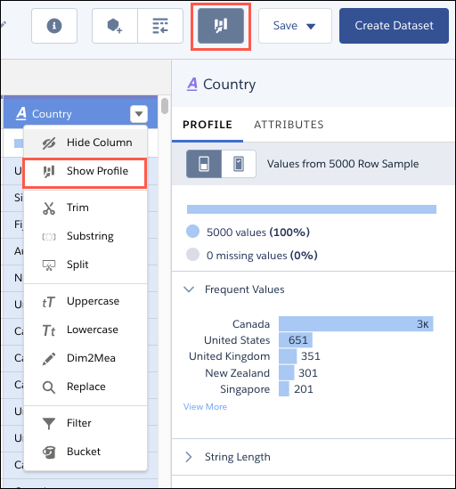
recipe editor. To open the column profile if it isn’t visible, click  or select Show Profile from the column’s
menu.
or select Show Profile from the column’s
menu.
Here are the sections that you see in the column profile.
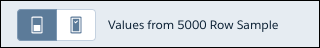
Sample Size
|
This section shows the number of rows used to generate the column profile data.
To use a larger sample, click  . . |
Valid Values
|
This section gives you an idea of how the column is populated. A high proportion of null values can indicate lower quality data of limited usefulness in lenses and dashboards. |
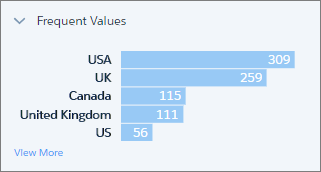
Frequent Values
|
This section shows the count for each of the top five values in the column. To see the count for all values in the sample, click View More. This information gives you a quick insight into the variation in your data. This example shows different values for the same country, which can impact grouping and filtering in a lens or dashboard. |
For dimension and date columns, click one or more bars to see suggested transformations for those values in the Suggestions bar. In this example, if you select the US value, CRM Analytics suggests replacing it or filtering it out.

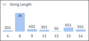
String Length (Dimension Columns Only)
|
|
This section gives you a breakdown of the number of characters in dimension values. A wider variation than expected can indicate inconsistencies with data from mixed sources. |
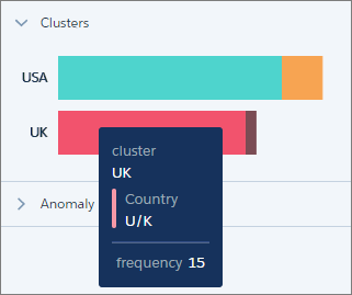
Clusters (Dimension Columns Only)
|
Clusters are groupings of similar values presented as a stacked bar. To see which value a segment represents, hover over it. In this example, CRM Analytics has found instances of “USA” and “US”, and “UK” and “U/K” in the Country column. These values can be genuinely different, but they could also indicate inconsistencies in data from different sources, or simply typos. |
To help you with your data cleansing, CRM Analytics suggests the Bucket By Cluster transformation whenever it identifies clusters. This transformation works just like regular bucketing, but gets you started by suggesting the buckets and values.
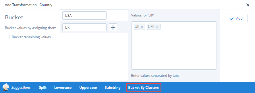
You can add the transformation as is, or add more buckets and values.
Anomalies (Dimension Columns Only)
|
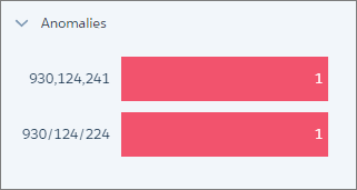
This section displays values that are not consistent with other values in the column. In this example, CRM Analytics has identified two values in a reference column that in which most values are in the format 123-456-789. |
Again, to help you clean your data, CRM Analytics suggests transformations when you click one or more bars. For example, you can replace the values or filter them out.
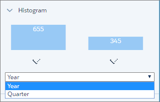
Histogram (Measure and Date Columns Only)
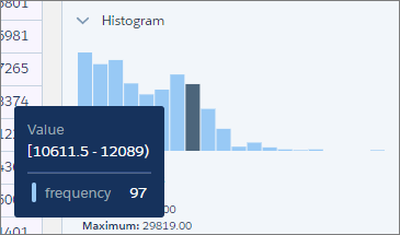
|
The histogram shows the distribution of values in a measure or date column. Each bar represents a predefined range, and the bar height shows the frequency of values falling within that range. Hover over a bar to see the range and frequency of the values it represents. Use the histogram to see if the data falls within expected ranges. Low-frequency outlying values could indicate data inconsistencies or data that could impact aggregate calculations. |
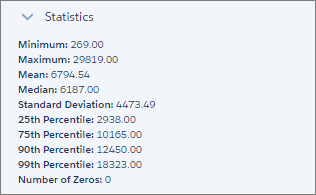
Measure columns also display statistical information that you can use in your data preparation.
With date columns, you can select the time frame for grouping values by year or by quarter.