You are here:
Profile Columns to Understand Data in a Data Prep Recipe
In CRM Analytics, run column profiling on sample data to estimate key stats about columns, such as the frequency of values and percent of columns with missing values. Column profiling is especially useful when you are combining data from different sources, where inconsistencies are often introduced. Column profiles are available only for columns shown in preview.
Column profiling works on the latest available data, except when you profile columns from a connected object. If you profile a column from a connected object, the profile can be based on outdated sample data. The sample doesn’t include changes to the connected object data within the last 24 hours. The sample data for a connected object updates when you run data sync and the sample data is more than 24 hours old. For example, if the data sync just ran, but your sample data isn’t more than 24 hours old, the sample data isn’t updated right away.
To run a column profile, select the column in the Preview or Columns tab, and then click
 . The Profile tab shows different results based on the data type of the column.
Use the results to understand the shape of the data and identify potential data quality
issues. The statistics provided for column profiles are based on sample rows, not all rows
in the recipe.
. The Profile tab shows different results based on the data type of the column.
Use the results to understand the shape of the data and identify potential data quality
issues. The statistics provided for column profiles are based on sample rows, not all rows
in the recipe.
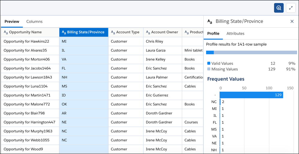
The Profile tab shows the following information.
- Valid values—Valid values are values that aren’t missing.
- Missing values—Missing values, which include nulls and empty strings (””), can lead to skewed calculations. For more information, see Handle Missing Values.
- Zero values—For measures, the column profile shows the count of zeroes.
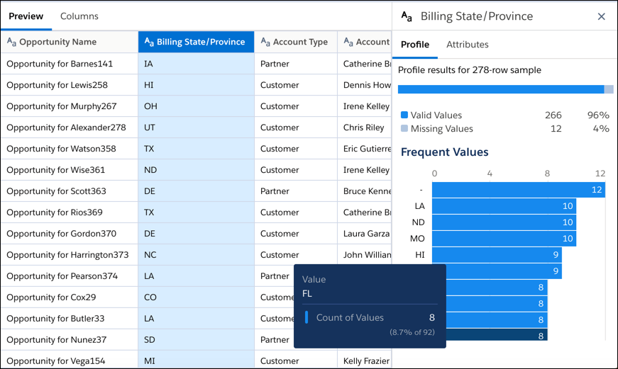
- Frequent values—The Frequent Values chart shows the top dimension values by count
(based on the sample), sorted in descending order. To see the percentage of the sample
total, hover over a bar. In the following example, Florida (FL) represents 8.7% of all
sample values in the Billing State/Province column.
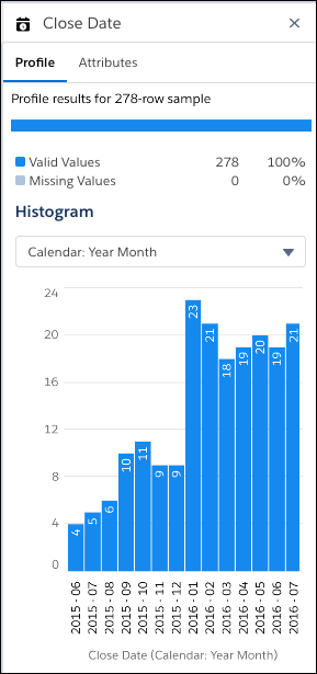
- Histogram—The histogram shows the shape of the sample data for measure and date
columns. Shape refers to the distribution of the data over equal-length ranges.
Use the histogram to understand the shape of the data and identify outliers. Outliers
are important because they can distort calculation results. For a measure column
profile, the histogram shows the count of rows, maximum value, minimum value, median
value, and average value for each range. To see the percentage of the sample total,
hover over a bar. For a date column profile, the histogram shows the count of rows for
the selected date grouping. You can group by different time frames, including
Year-Month, Year-Quarter, Year, Quarter, and Month.
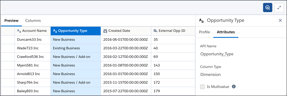
The Attributes tab shows the label, API name, and data type of the selected column. For measure columns, it also shows the scale. For dimension columns, it also indicates whether the column contains multiple values.