
You are here:
Group Your Data into Categories
Group data to organize it so that the data is displayed in useful categories.
-
While viewing data in a lens, tap
 Build.
-
Next to the chart element that you want to represent the group, tap
 . Note that the chart elements vary for different charts.
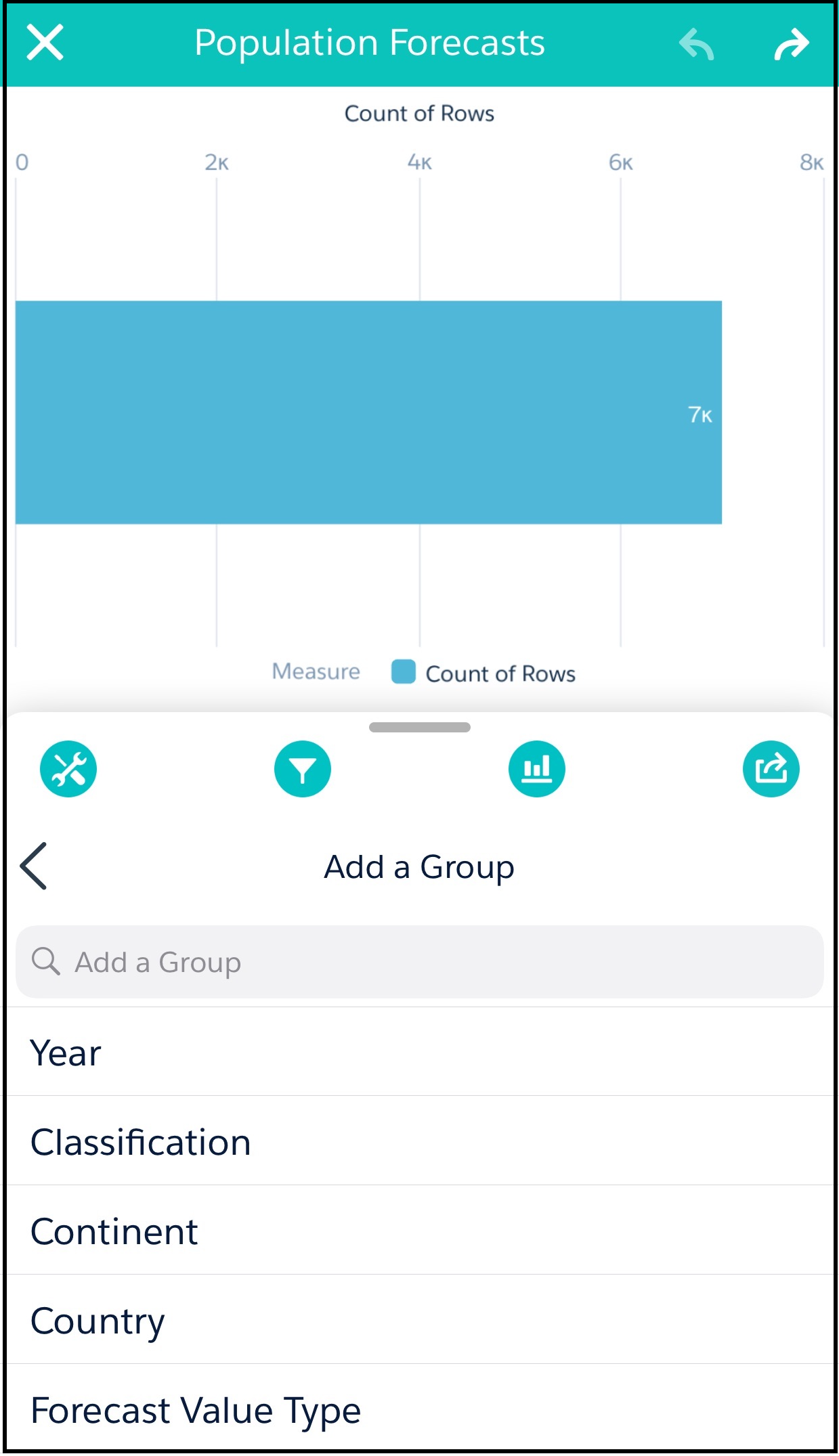
-
Under Add a Group, tap one of the dimensions to assign it to the chart element. For
example, in a bar chart, each bar could be a member of the group.
The dimensions in your dataset determine which categories you can group by.
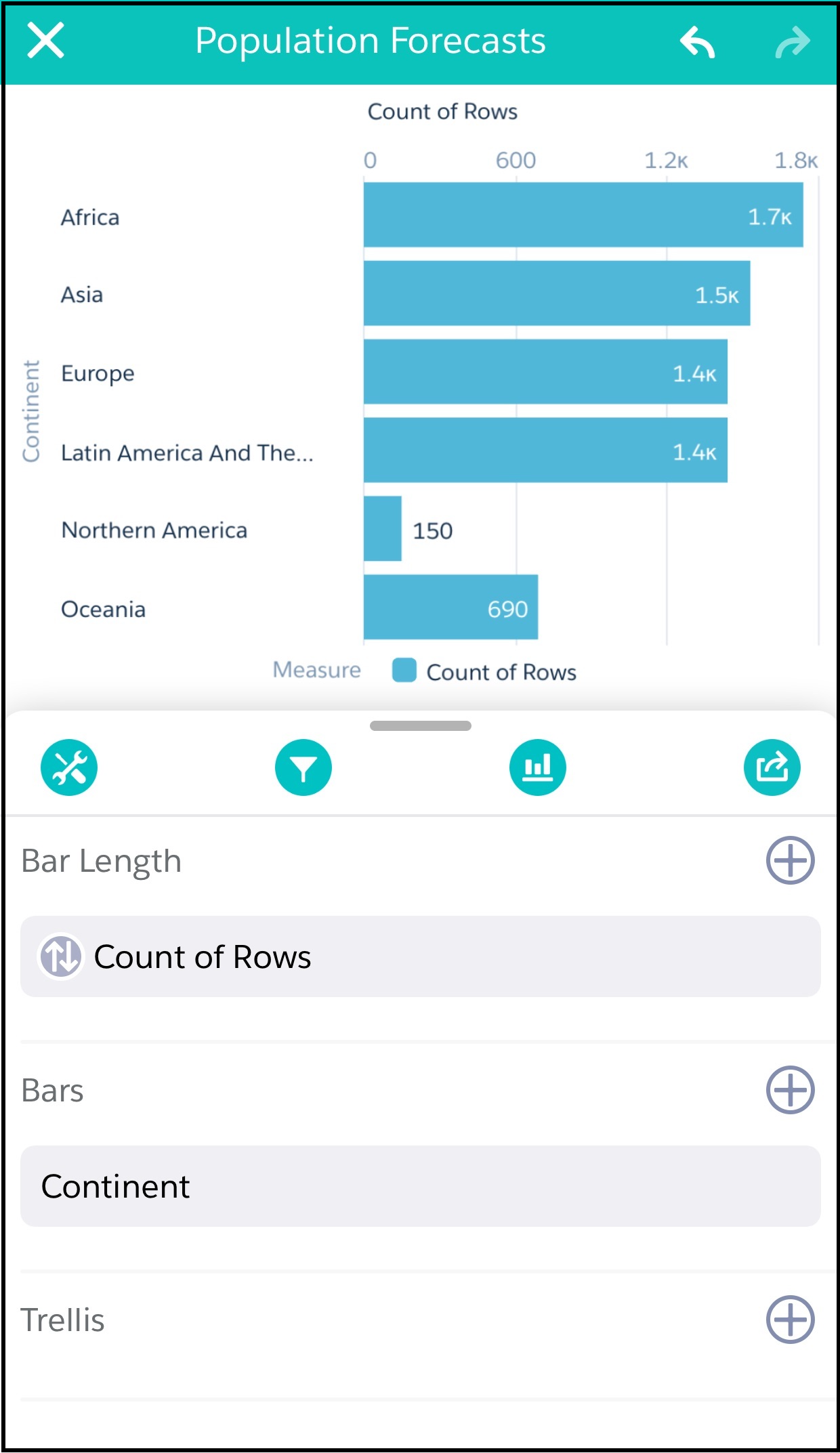 The visualization in your lens changes to show the data grouped by the dimension that you selected.
Did this article solve your issue?
Let us know so we can improve!