
You are here:
View Data in a Dashboard
A dashboard tells you a specific, focused story about data by using a curated set of lenses and widgets. For example, a dashboard can effectively summarize your company’s support cases.
A quick glance at this dashboard shows that 17 cases across all account regions are escalated:
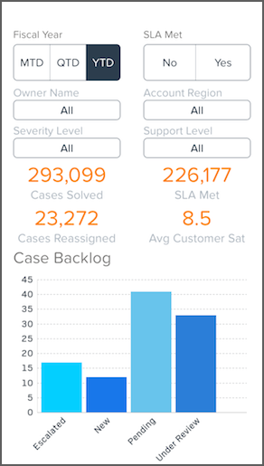
Dashboard are interactive. You can tap charts, buttons, and other elements to dynamically filter and drill into data.
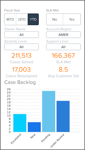
Let’s see how many escalated cases originate from North America. Directly under Account Region, tap All, and then select AMER. Note how all the data in the dashboard is instantly updated to represent the North American region and that 11 cases originating from North America are escalated:
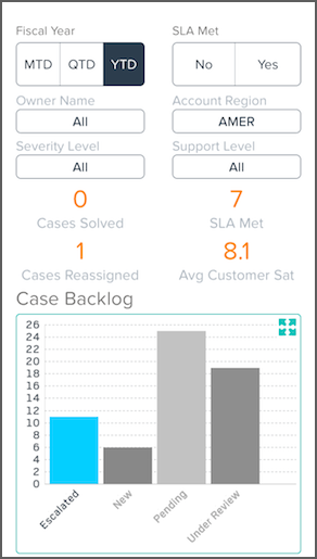
Next, let’s get more information about the escalated cases from North America. Tap the Escalated data bar. Note how the entire dashboard is updated again:
Now let’s get specific information about these North American escalated cases. Double-tap the chart to view it in full screen mode:
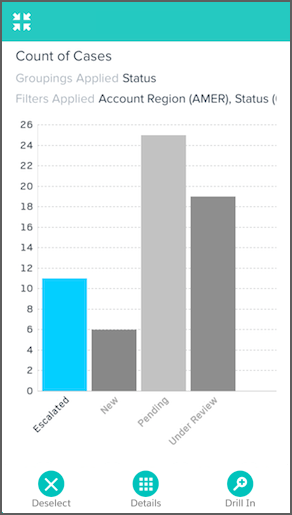
While in full screen mode, you can explore the chart in a lens.
- Tap
 Deselect to explore all of the data in the lens.
 - Tap
 Details to see a table of data about the escalated cases.
 - Tap
 Drill In to chart information about the escalated cases. Drilling in filters
by escalated cases, then lets you group by other dimensions.
Drill In to chart information about the escalated cases. Drilling in filters
by escalated cases, then lets you group by other dimensions.
Most of what you see in a dashboard is interactive or dynamic. Try tapping around and see what happens!
- Filter Your Data
Apply global filters in a dashboard to focus on the subset of data that’s most relevant for your business unit, project, or management team. - Return to the Initial View
Exploring your data can lead you down many paths. Not all of them are fruitful, and that’s OK. To go back to the dashboard’s original state, or just see those nifty animations again, you can use the reset option to quickly return to the initial view.
