
You are here:
Combination Chart Examples
Use a combination chart to show multiple values against a single axis range, show two chart types together, or compare two continuous summary values.
To create chart combinations similar to these examples in Lightning Experience, use the +Measure settings in the Chart Properties panel. In Salesforce Classic, use the Plot additional values settings on the Chart Data tab in the chart editor.
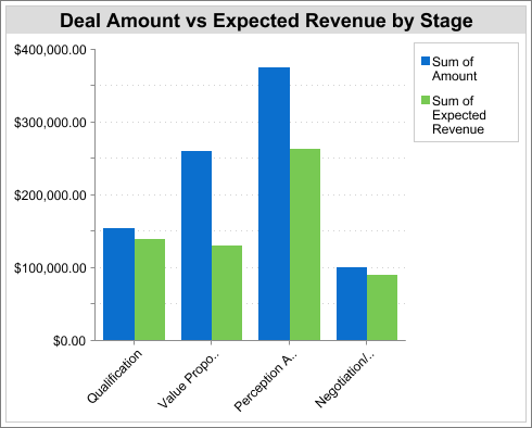
Column-on-Column
To show multiple values against a single axis range, add columns to a column chart.
To create the chart in this example, choose the Vertical Column chart type, set the opportunity sum of amount as the Y-Axis and stage as the X-Axis. Add the sum of expected revenue as a second column chart.
You can quickly compare the actual values against the expected values for each stage.
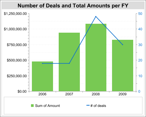
Line-on-Column
To show two chart types together, add a line to a column chart. Using a second axis allows you to add different types of values to the chart.
To create the chart in this example, choose the Vertical Column chart type, set the opportunity sum of amount as the Y-Axis, and set fiscal year as the X-Axis. Add the number of deals as a line chart plotted on a second axis.
You can now see both the total amount and number of deals for each year on a single chart.
Line-on-Line
To compare two continuous summary values, add a line to a line chart.
To create the chart in this example, first set up a custom summary formula that calculates a three-week moving average of opportunity amounts. Then choose the Line chart type. Set the opportunity sum of amount as the Y-Axis and date as the X-Axis. Add the calculated three-week moving average as a second line chart.
You can now compare sales against the moving average over time.
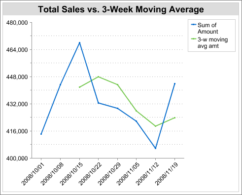
The custom summary formula used in this example is shown here:
(OppProductTrends__c.Amount__c:SUM+ PREVGROUPVAL(OppProductTrends__c.Amount__c:SUM, OppProductTrends__c.as_of_date__c) + PREVGROUPVAL(OppProductTrends__c.Amount__c:SUM, OppProductTrends__c.as_of_date__c,2))/3