
You are here:
Create a Visualization with Semantic Model Data
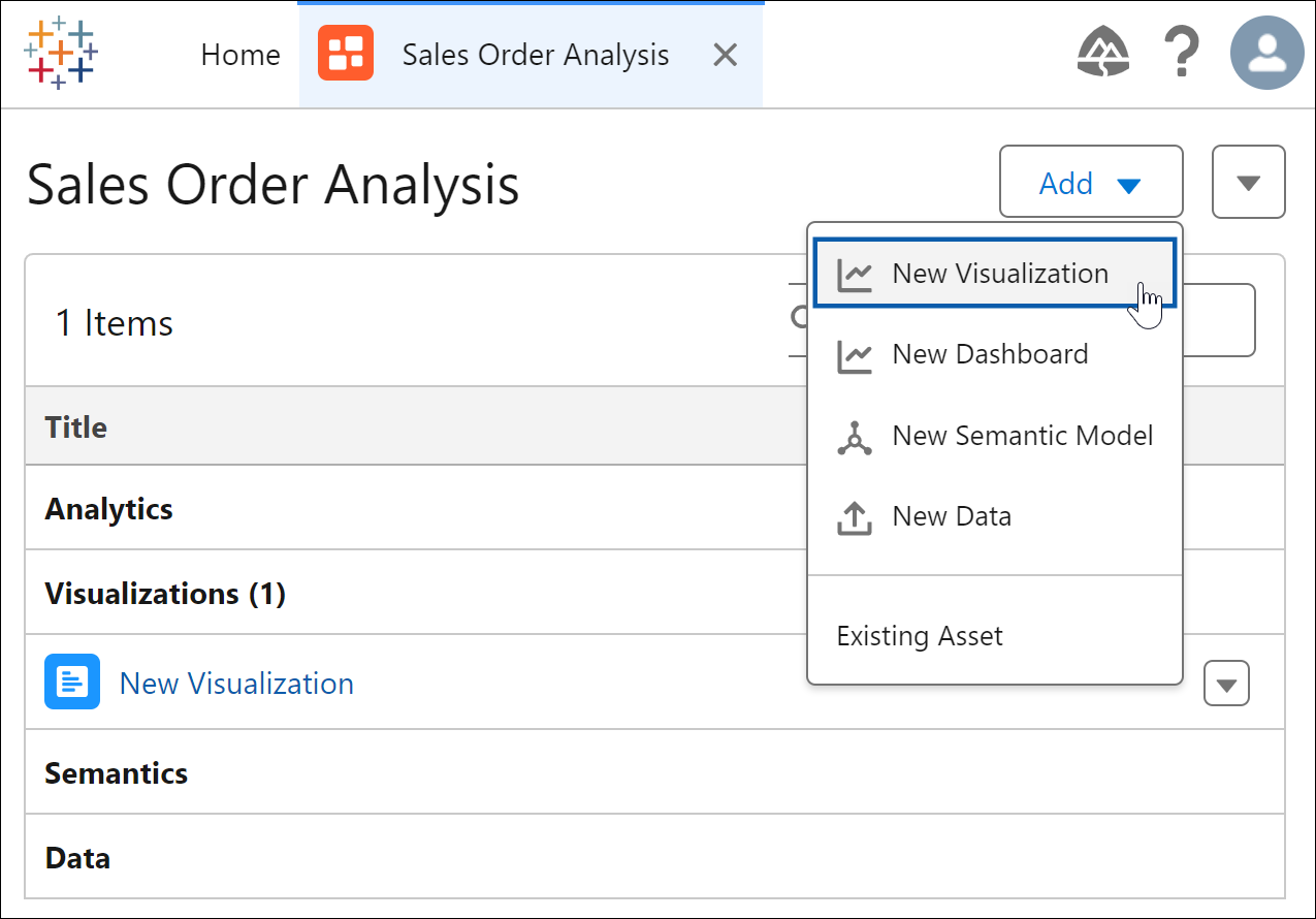
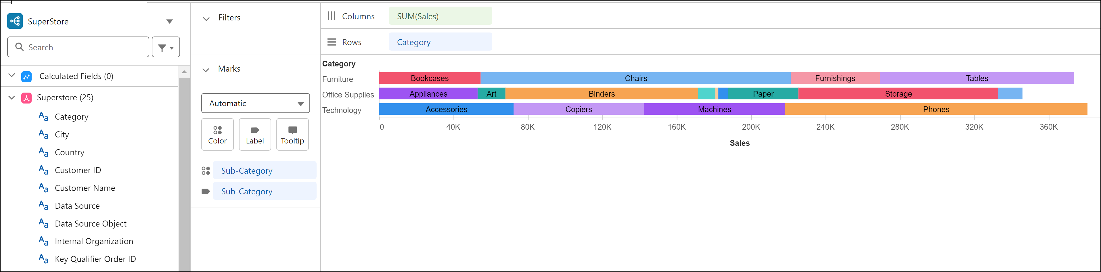
Build a Tableau Next visualization on your semantic model data to discover valuable insights about your business. For example, create a visualization that shows sales patterns by product category and sub-category.
Required Editions
| View supported editions. |
| User Permissions Needed | |
|---|---|
| To create Tableau Next visualizations: | Tableau Unmetered Platform Analyst or Tableau Next Platform Analyst permission set |
- In your workspace, from the Add dropdown, select New Visualization.
- For the data source, select the semantic model to use for the visualization.
- Drag and drop the fields you want in the visualization under Columns or Rows .
- In the Marks section, select the chart type for your visualization.
- To visually represent additional information, drag fields to Color and Label.
- Visualize Data Intensity and Patterns in Heat Maps
In Tableau Next, use heat maps to compare measure values across related categories and quickly locate where your data shows high or low concentrations. With color coding applied to a heat map, identify key data correlations, such as the impact of web traffic on sales. Or highlight outliers, like a low-engagement period on a top-selling product, so that you can address anomalies quickly. For example, compare product subcategories across each region in a heat map to see which subcategories drive the most profit in each region. - Create a Funnel Chart to Show Value Drop-Offs Across Stages
In Tableau Next, you can quickly surface patterns as your data moves through a process or workflow with funnel charts. Compare conversion from one stage to the next and spot bottlenecks in business operations to prioritize areas for improvement and efficiency gains. For example, analyze how opportunities move through your sales stages in a funnel chart to pinpoint the stages where opportunities need attention first. - Highlight Metric Value Changes in a Waterfall Chart
Visualize how a key value evolves over time or across categories by showing the cumulative effect of both positive and negative changes in a waterfall chart. This chart type, based on a bar chart, is ideal for highlighting the net effect each individual value has on the final value. For example, using your sales order data, create a waterfall chart to compare how each business region contributes to total profit. - Analyze Comparable Measures with Dual and Synchronized Axes
Use dual axes in Tableau Next to compare two measures on separate axes in the same chart across a shared dimension. Because each measure retains its own scale, you can highlight patterns and trends side by side while keeping the chart easy to interpret. To surface differences between measure values more clearly, synchronize the axes to align them to a common scale. For example, in a chart, compare sales and profit by product sub-category using dual axes. Then synchronize the axes to evaluate how closely profitability aligns with sales.
Did this article solve your issue?
Let us know so we can improve!