
You are here:
Sales Analytics Company Overview Dashboard
Intended to give sales leaders and operations staff high in the corporate hierarchy an overview of the sales business and operations.
Required Editions
| User Permissions Needed | |
|---|---|
| To use CRM Analytics apps: | Use CRM Analytics Templated Apps |
| To use Sales Analytics: | Access Sales Cloud Analytics Templates and Apps |
| To create and manage CRM Analytics apps: | Manage CRM Analytics Templated Apps |
| Edit CRM Analytics Dataflows | |
Default Behavior and Recommended Options
Shows quota progress and pipeline rolled up to the role one level below the manager selected in the View As filter. Defaults to showing results for the manager currently running the app. Select a different manager from the View As filter to view rollup of pipeline and quota for all team members subsidiary to that manager in the role hierarchy. You can remove any KPIs your organization doesn’t care about by removing them from the dashboard layout. To learn how to build and edit Analytics dashboards, see Build CRM Analytics Dashboards.
Wizard and Other Setup Options
- View As filter. If Salesforce is set up to use the Salesforce Forecasting feature in Sales Cloud, the filter shows forecast usernames. If your org doesn’t use forecasting, filter shows role developer names. In either case, quota and pipe roll up to the selected user. If your org doesn’t use Salesforce role hierarchy, this filter does not appear.
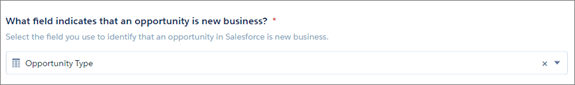
- Opportunity Type filter. Values shown determined by selection made in wizard page 5,
question 3. By default, the filter uses the standard Opportunity Type field.
- Time Period filter. All time periods based on Salesforce fiscal year setting.
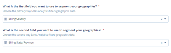
- Geography chart at bottom of dashboard uses values from fields selected in wizard page
4, questions 4 and 5.
- Product chart at bottom of dashboard uses values from fields selected in wizard page 6, questions 2 and 3, if you added Products object to your app. If you set up app without Products, the chart shows fields selected from wizard page 4, questions 1 and 2 about how you segment customers.
-
Top Deals details chart. Amount column changes to Schedule Amount, Close Date column changes to Schedule Date if you select Product Schedules on page that lets you add data to the app.
Supports Opportunity Splits if the feature is enabled in your org. See Opportunity Splits.
Datasets Used
- Opportunity
- Oppty Products (optional)
- User Manager
- Roles (optional)
- User Allocations
- ForecastingItems (optional)
KPI Calculations
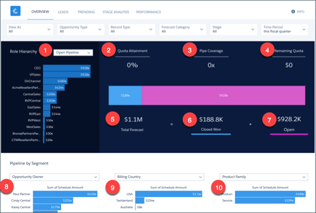
Role Hierarchy Filter Options (1)
- Open Pipeline. For selected role, total rollup opportunity amount for any open opportunity with a close date in selected time period.
- Closed Won. For selected role, total rollup opportunity amount for any closed won opportunity with a close date in selected time period.
- Avg Deal Size (Closed Won). For selected role, total rollup average opportunity amount for all closed won opportunities with close dates in selected time period.
- Avg Deal Size (Open). For selected role, total rollup average opportunity amount for all open opportunities with close dates in selected time period.
- Opportunity Count (Closed Won). For selected role, total rollup opportunity count for all closed won opportunities with close dates in selected time period.
- Opportunity Count (Open). For selected role, total rollup opportunity count for all open opportunities with close dates in selected time period.
Top of Main Chart
- Quota Attainment (2). Closed won/quota. Quota is the sum of the sales reps quotas that roll up to the role or user selected in the View As filter
- Pipe Coverage (3). Open pipe/remaining quota. Open Pipe amount based on value selected in Stage and Forecast filters.
- Remaining Quota (4). Quota - closed won
Bottom of Main Chart
- Total Forecast (5). Closed won + opportunity amount for categories selected in View As and Opportunity Type filters
- Closed Won (6). Total number of opportunities won in the selected time period.
- Open (7). Based on Forecast Category. Open pipeline based on close date from the period selected in the Time Period filter and categories selected in the Forecast Hierarchy filter.
Last two amounts shown in horizontal bar in middle of main chart.
Pipeline by Segment Charts
- Owners (8). Total opportunity amount grouped by opportunity or account owner. Based on values selected in filters at top of the dashboard.
- Geographies (9). Total opportunity amount grouped by geography based on close date from the selected time period.
- Products (10). Product total price grouped by product family or product name, depending on how you answered wizard page 6, questions 2 and 3 about products.