
You are here:
Custom Lightning Components
Build your own custom Lightning components to use in Experience Builder sites.
Required Editions
| Available in: both Salesforce Classic and Lightning Experience |
| Available in: Enterprise, Performance, Unlimited, and Developer Editions |
| User Permissions Needed | |
|---|---|
| To customize or publish an Experience Cloud site: |
|
To develop custom Aura components for your Experience Builder site, see Experience Cloud Developer Guide: Configure Drag-and-Drop Components for Experience Builder.
To develop custom Lightning web components for your Experience Builder site, see Lightning Web Components Developer Guide: Configure a Component for Experience Builder. You can’t incorporate Lightning web components with the 2 column, 2:1 ratio, split-sidebar fixed page layout that’s available in Experience Builder. Use a flexible layout to create a page or page variation in Experience Builder that’s arranged the same way.
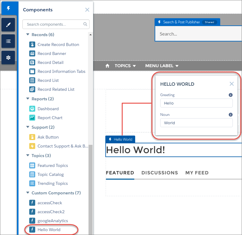
Custom Lightning components configured for Experience Builder sites behave just like standard template components. Drag the component to the page canvas. To edit its properties, select the component on the page canvas, and then enter changes in the floating component property editor.
Custom components appear in the Components panel along with your template’s components.
A custom component added to the page canvas, with properties open in the property editor: