
You are here:
Edit Pages and Components in Experience Builder
Each page contains a collection of components that are organized around a task or function, whether it’s opening a case or searching for an article. The pages in each Experience Builder template are ready for you to use with little configuration. Add new components to your site’s pages, edit the properties of existing components, or delete components that you don’t require.
Required Editions
| Available in: both Salesforce Classic and Lightning Experience |
| Available in: Enterprise, Performance, Unlimited, and Developer Editions |
| User Permissions Needed | |
|---|---|
| To customize or publish an Experience Cloud site: |
|
- From the Pages menu in the top navigation bar, select the page that you want to edit.
-
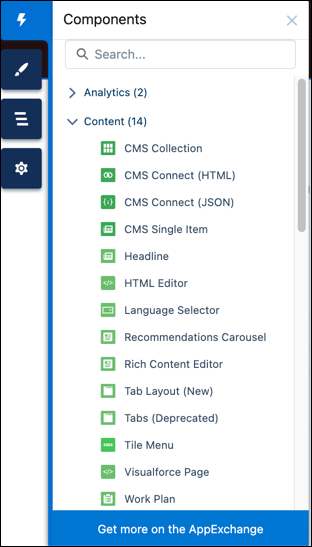
To open the Components panel, click the Components panel icon
 .
.
-
Drag the component from the Components panel onto an editable area of the page.
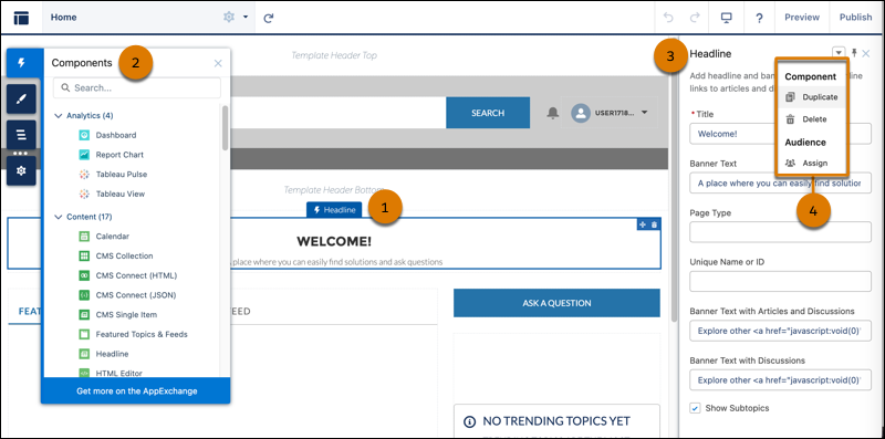
When you drag a component over a content or theme layout region, a label appears to help you identify the region. Components in a content layout region are specific to the page. Components in a theme layout region are shared everywhere that the theme layout region is used, and the label “Shared” is added to the component’s name on the canvas.
-
To edit the properties of a component, select it on the canvas or in the Page Structure
panel.
When you select a component, Experience Builder highlights the component with a blue border and shows the component’s property panel. Click the pushpin icon
 in the property panel to float the panel over the canvas or to dock it to the
right of the canvas. When the panel is docked, the entire canvas is visible.
in the property panel to float the panel over the canvas or to dock it to the
right of the canvas. When the panel is docked, the entire canvas is visible. - Update the component as needed.
- You can browse a selection of custom Lightning components on AppExchange and add them to your org directly from Experience Builder. Click Get more on the AppExchange in the Components panel. Components that are ready to add to Experience Builder pages are shown. When you add a component, it appears in the Components panel of all the template-based sites in your org.
- You can also create custom Lightning components and use them on Experience Builder pages. For more information on creating custom Lightning components and enabling them for Experience Builder, see the Experience Cloud Developer Guide.
- Assign Screen-Responsive Property Values in Custom Components in Enhanced LWR Sites
Specify different values for desktop, mobile, and tablet displays for string or integer property types in custom Lightning web components in enhanced LWR sites. With screen-responsive properties, the component uses the correct property value based on the end user’s screen size. - Show or Hide Components on Mobile, Tablet, or Desktop for Enhanced LWR Sites
Improve the readability of your site by hiding unnecessary components. In enhanced LWR sites, site builders can customize which components are shown or hidden for each device type—mobile, tablet, or desktop. Components are shown by default. - Hide Components on Mobile Devices with Experience Builder for Aura Sites
Reduce page load times and cluttered mobile screens by hiding non-business critical components on mobile devices. View your Aura site in Builder using the mobile mode and select which components you wish to hide. - Error Messages for Pages Without Data in Experience Builder
When you use Lightning components to build a template-based page in Experience Builder, sometimes the page doesn’t load correctly on your site. Find out why this error happens, and how you can fix it. Make sure that the component has underlying data.