
You are here:
Create a Flexible Layout
Build highly customized pages using flexible layouts. Create and resize columns within each section, then add and stack sections to build out the page. Bring it all to life with background images and color.
Required Editions
| Available in: both Salesforce Classic and Lightning Experience |
| Available in: Enterprise, Performance, Unlimited, and Developer Editions |
| User Permissions Needed | |
|---|---|
| To customize an Experience Cloud site: |
|
-
Create a custom page using a
flexible layout. When you select a flexible layout for your page, you can’t change the
layout type. The flexible layout lets you customize your page layout to suit your content
needs.
- To use a flexible layout with an existing page, create a page variation.
- To make the page span edge to edge, giving you full-screen-width sections, use the Set Max Page Width setting. First, create a theme layout from Settings | Theme | Configure. Then, in Edit Properties, deselect Set Max Page Width. Now you can create a page from this theme layout with sections that span the width of the screen.
-
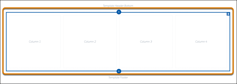
Build out your sections. A section consists of a row on your page and all its content.
Example section:
- To add a section above or below the current section, click
 .
. - To delete a section, click
 . Deleting a section also deletes its content. Pages must include at least one
section. To delete the last section, create another section and try again.
. Deleting a section also deletes its content. Pages must include at least one
section. To delete the last section, create another section and try again. - To reorder sections, drag the section to place it where you want it.
- To add a section above or below the current section, click
-
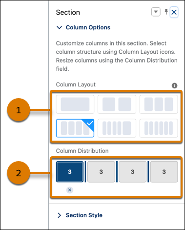
To customize a section, select it. Use Column Options to add, remove, and resize
columns in this section.
- To customize the column structure in this section, select a column layout preset (1).
- In the Column Distribution field (2), use the handles between columns to resize them. The columns snap to a 12-column grid. The number in each column represents the grid units that the column uses out of 12. To get two columns of equal width, give each column a value of 6. A section can have up to six columns.
- To delete a selected column, click the
 beneath it. Deleting a column also deletes its content.
-
Use Section Style to add some panache, like background images and color.
Color Sets the section’s background color. To set a color, click the color swatch and use the color selector or enter a specific hexadecimal code in the text box. Use the slider to adjust the color’s strength. Image Adds a background image to the section. Upload an image or select one from your org’s asset library. Then select the Image Layout and Image Position in the section. Image Overlay Color Adds an overlay color to the section. To set a color, click the color swatch and use the color selector or enter a specific hexadecimal code in the text box. Use the slider to adjust the color’s opacity. Section Height Use the slider to set the minimum section height in pixels. The section adjusts automatically when content is taller. The minimum doesn’t apply to phones or tablets in portrait mode. Content Width Use the slider to set the content width as a percentage of the full width of the section. This setting doesn’t apply to phones or tablets in portrait mode. 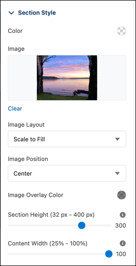
Did this article solve your issue?
Let us know so we can improve!