
You are here:
Theme Guidance: Hero Component
Hero images are large images that are designed to dominate the visual field of a page and grab attention.
Required Editions
| Available in: both Salesforce Classic and Lightning Experience |
| Available in: Enterprise, Performance, Unlimited, and Developer Editions |
| User Permissions Needed | |
|---|---|
| To customize or publish an Experience Cloud site: |
|
Hero layouts are all about visual impact. The hero is an image that dominates your page, providing a sense of theme, style, and purpose. But while hero layouts are excellent for setting mood and style, they eat up space. So they’re not good for a page that needs a lot of functionality.
A Search Versus a Call to Action Focus
Pre-built themes come in two different flavors that focus on different needs: hero search and hero call to action.
- Uses for hero search
- Sites that serve as an entry to a lot of diverse information with no easy way to provide a top-level organization.
- Sites where it’s challenging to predict customer needs or where your customers' information needs vary widely.
- Uses for hero call to action
- Sites with a focused purpose, like fund-raising or a supporting a specific event.
Selecting and Swapping Hero Components
The Webster, Jepson, and Citizen themes each come with a pre-configured hero theme component (Search or Call to Action). You can use these themes as they come or easily swap them through the component properties in Experience Builder.
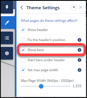
Like the theme but don’t want to use the hero style layout? Easy, uncheck Show hero on the Theme Settings tab of the Theme Panel.
Header and Hero Interaction
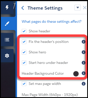
- When "Fix the header's position" and "Start hero under header" are both enabled in Theme Settings, choose a background color for best visibility. If you leave the background transparent, menu items can become invisible when a customer scrolls down the page. Menu items can be hidden because the hero image has scrolled out of view. A solid background color avoids this problem.