
You are here:
Theme Guidance: Search Component
Multiple search components and placement options give you flexibility to design the right experience for your customers.
Required Editions
| Available in: both Salesforce Classic and Lightning Experience |
| Available in: Enterprise, Performance, Unlimited, and Developer Editions |
| User Permissions Needed | |
|---|---|
| To customize or publish an Experience Cloud site: |
|
Pre-built themes offer the flexibility to have a search-first approach. This approach encourages customers to enter questions first to find answers rather than navigate through menus and pages.
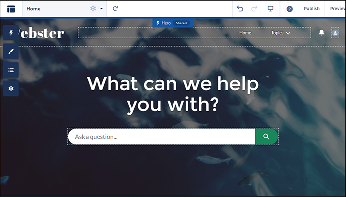
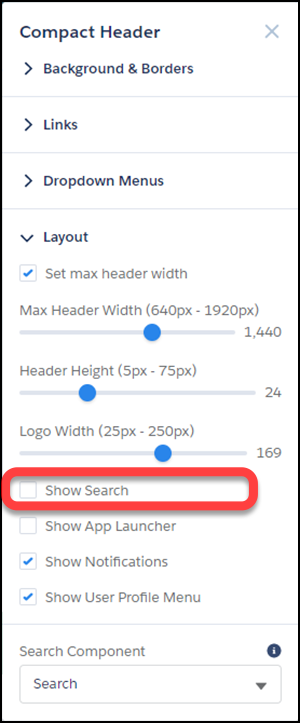
But you can also have search in your header. To avoid confusion and clutter, if you’re using the hero with search turned on, deselect search to hide it in your header. Themes with heroes have secondary layouts for the non-Home pages. That’s why search is on by default in the header of your other non-login pages.
Selecting a Search Component that Collapses and Expands

When the search component is collapsed, you can’t select it directly. Click the search icon to expand it, then select it to see its property editor. Alternatively, select Search in the page structure panel to bring up its property editor. Selecting Search in the page structure panel means you can’t see any changes you’re making. You can’t see your changes because the search component isn’t visible on the page.
Exporting a Custom Search Component
Imagine that you’re using a
Lightning Bolt Solution to export a site with a pre-built theme. The theme uses the global
search, peer-to-peer component, or a custom search component. Keep in mind that this
solution doesn’t include the custom search component. The search component isn’t exported
because the property value commThemeSearch isn’t
included in the Lightning Bolt Solution.