
You are here:
Add Salesforce CMS Content to Your LWR Site with Data Binding
Use data binding to populate your LWR site with Salesforce CMS content. Drop a component that supports data binding onto your site page and map it to content froma CMS workspace.
Required Editions
| Available in: Salesforce Classic and Lightning Experience |
| Available in: Enterprise, Performance, Unlimited, and Developer Editions |
| Applies to: LWR sites |
| User Permissions Needed | |
|---|---|
| To customize or publish an Experience Cloud site: |
|
Before you can add content from a CMS workspace to your site, add the site as a channel to the workspace. Then make sure that the content you want to add is published in the CMS workspace.
These steps demonstrate how to add news content from a CMS workspace to a Card component. You can follow these same steps for other CMS content types or if you're using the Banner, Tile, Grid, and Overlap components, which also support data binding. Some of the details can differ depending on the component and the type of CMS content that you're working with.
- In Experience Builder, click Components.
- Drag a Card component onto the page.
-
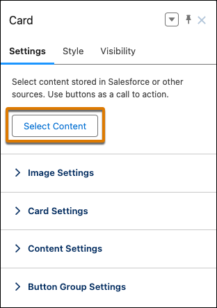
In the component property panel, click Select Content.
-
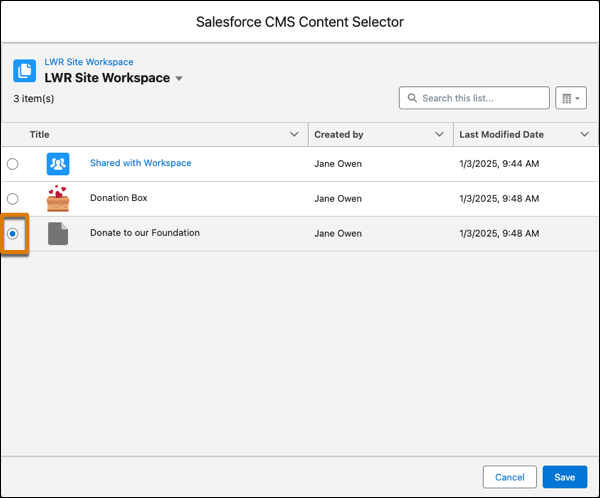
Select news content item that you want to add from the content selector, and then save
your changes.
 The news content item is now a data source for the card component. To populate the component with the news content, map elements of the content, such as the title, body, and banner image, to the components that are nested in the card.
 -
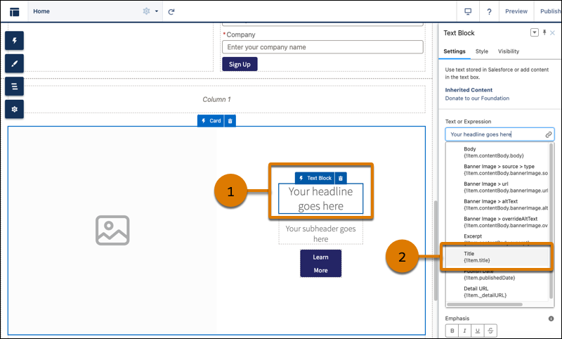
To add the news title:
- In the Card component, select the Text Block for the headline (1).
- In the component property panel, from the Text or Expression field, select Title (2).
-
To add the body:
- Select the Text Block component for the subheader.
- In the component property panel, from the Text or Expression field, select Body.
-
To add the banner image:
- Select the Card component.
-
In the component propery panel, go to Image Settings. From the Image URL or
Expression field, select Banner Image > url.
If the news content doesn’t have a banner image, select a background image from CMS or add a different image URL to the Image URL or Expression field.
- Continue to customize the card component and its nested components using the component property panel. You can customize the content layout, including component size, font size, image position, overlays, and more.
If the news content is later updated in the CMS workspace and republished, those updates appear on your site. Here are some considerations when using data binding components.
- If a component points to a site page that’s deleted, reconfigure the component to point to a different site page.
- If a component points to a list view or related list view whose API name is changed, reconfigure the component to point to a different list view or related listview.
- Although the Text Block, HTML Editor, Image, Video, and Button components don’t support direct data binding on the Home page, they’re data-bound when used on detail pages. And you can nest them in other data-bound components. On detail pages and as nested components, they inherit content from the data-bound component where they’re nested.
See data binding in a Banner component in the Did You Know Series (English Only).