You are here:
Contact Request Button & Flow
Add the Contact Request Button & Flow component to let members click a button to request that customer support get back to them. Members describe the problem and enter their contact details in a window. After the request is sent, a support person can review the issue and contact the customer for follow-up and resolution.

Contact Request works in public sites and sites that require authentication. Make sure that your site users have the Run Flows permission, including your Guest User profile that’s used in public sites. Without this permission, members don’t see the button to submit contact requests.
- On the page that you’re configuring, select the Contact Request Button & Flow component.
-
In the property editor, configure the component properties.
Property Details Button Label The text to display on the support request button. The default is Request Help. Contact Request Flow Select a contact request flow that you created in Setup or in Flow Builder. Only active flows that have the type Contact Request Flow are supported. Button Text Color Set the color of text to use for the button label.
The
 link icon shows that
the current selection comes from colors defined in the
theme.
link icon shows that
the current selection comes from colors defined in the
theme.Button Text Hover Color Set the color of text to use for the button label when a member mouses over the button.
In Experience Builder, you can test hover colors in Preview mode.
Button Background Color Set the color to use for the button background when the button is inactive. Button Background Hover Color Set the color to use for the button background when a member mouses over the button.
In Experience Builder, you can test hover colors in Preview mode.
Button Border Color Set the color to use for the border that surrounds the button. Button Border Radius Move the slider to control the amount of curve to use for the button shape. Max Button Width Move the slider to control the width of the button. Width percentage is set against the full width of the container that the button sits in. So 100% is the full width of the container, rather than the full width of the browser page. Button Alignment Select Center, Left, or Right to set the position of a button within its container.

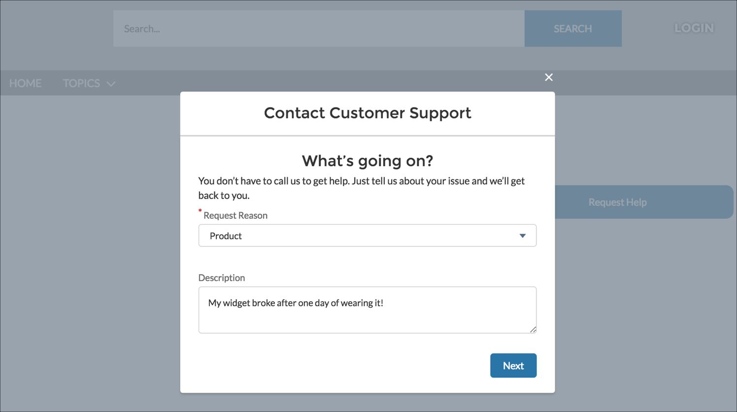
Sample Contact Request Button & Flow component.

When a user clicks the button a window appears.