
You are here:
Group
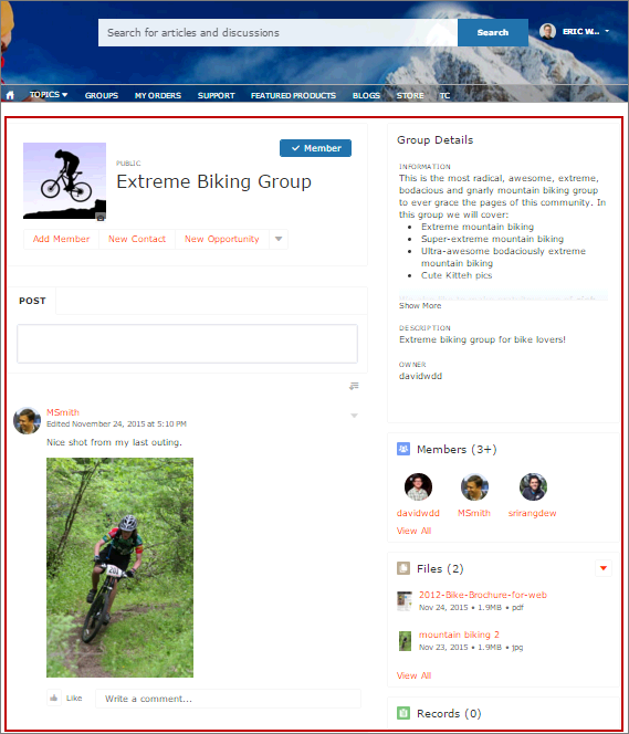
The Group component displays all the content in a group using a single composite component. It includes the group banner, which includes the member and owner actions, the group feed, description, and related lists (group members and files).

Note Beginning in Summer ’26, Chatter is turned off by default in
all new orgs. For any features in these orgs that require access to Chatter functionality or
the Chatter APIs, turn on Chatter by going to and selecting Enable. For details, see Chatter Is Turned Off by Default in New
Orgs Beginning in Summer ’26.
When you add groups to your site navigation menu, clicking the Groups item directs site members to a list of groups. Clicking a group in the group list loads the Group Detail page, which uses this component by default.
Note
- Add the Add Member action to the group publisher for users to access it from the banner.
- For optimal display, choose a wide column width when using this component on a custom page.
- Select the Group component on the page you’re configuring. By default, this component is on the Group Detail page. You must have at least one group in your site to view the Group Detail page and modify its components.
-
In the property editor, configure the properties
for the component.
Property Details Group ID The ID of the group. This value is automatically populated when the group is displayed. Feed Tab Label The label used for the group feed tab on mobile devices. The default text is Feed. The label you specify here doesn’t affect labels on desktop browsers. Details Tab Label The label used for the group details tab on mobile devices. The default text is Details. The label you specify here doesn’t affect labels on desktop browsers. Related Tab Label The label used for the related lists tab on mobile devices. The default text is Related. The label you specify here doesn’t affect labels on desktop browsers.

Example

Warning Avoid spamming new group members in a community, especially if you
are adding group members en masse. Deselect the following org-wide Chatter email
notifications: Allow Emails and Allow Posts via
Email. Access these settings by searching Email
Settings in the Quick Find search box in Salesforce Setup.
Sample Group component:
Note The Group component is optimized to be responsive across all devices. If you want
more control over the placement of group content, you can use separate components to
create a custom layout. Use the Group Banner, Group Detail, Group Related List, Feed
Publisher, and the Feed or Feed Compact components to create a custom group page.
However, creating a custom group page does not guarantee optimal display and
responsiveness across desktop and mobile devices.
Did this article solve your issue?
Let us know so we can improve!
