
You are here:
Record List (LWR)
The Record List component for LWR sites helps your site visitors easily view, search, and sort their accounts, cases, and other data. The component enhances security and user satisfaction by showing users only the data they’re permitted to view based on admin-defined access. With properties for component customization and styling—including support for custom CSS—the component helps you make sure that your visitors have a smooth and responsive experience across desktop, tablet, and mobile devices. The component offers a clean, professional data display that you can tailor to perfectly align with your brand and website design theme.
- The Record List component supports all Object Home page supported objects.
- You can use the Record List component on any page in your community. We recommend adding it to custom list views that you create. You can also create a navigation menu item to link to that page with its internal page URL.
- On a mobile device, if a user taps any field in the Record List component, including a field containing a URL, they’re directed to the full record detail page.
-
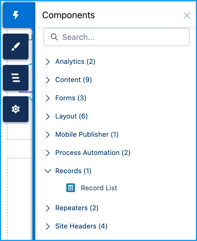
Select the Record List component on the Record List page.
-
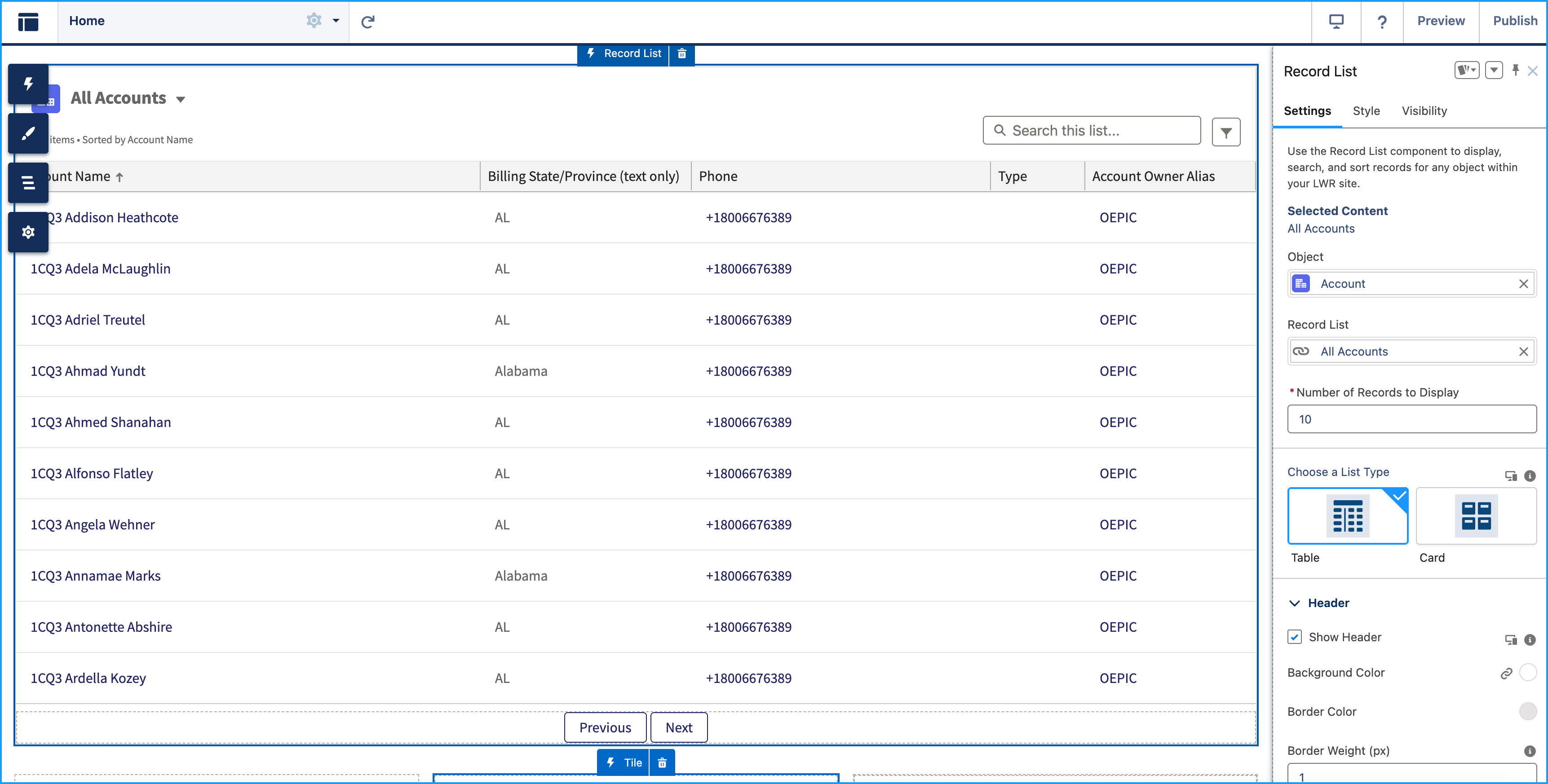
In the property editor, click Settings and configure the
following:
Property Details Object The Salesforce object whose records you want to display. The component supports all Object Home page objects, such as Opportunities, Accounts, or Contacts. Record List The Record List component displays a customizable list of records, such as open cases, accounts, opportunities, or product inventory, based on the object you select and the specific records you choose to show. Number of Records to Display Select how many records to display in a list view. The minimum is five, and the maximum is fifteen. Choose a List Type Choose how records appear in the list. Use Table view for detailed data or Card view for a compact, visual layout.
Pro Tip: For the best viewing experience, set Table view for desktop and Card view for mobile.
Header Customize the record list header to match the look and functionality you want. You can control whether the header is shown, set background color and borders, and choose from various text styling options.
Show Header: This option is enabled by default and can be customized.
- Set a background color that aligns with your brand or site theme.
- Define a border color to add emphasis or separation.
- Adjust the border weight in pixels to control how prominently the border appears.
Show Object Icon
Displays the object’s icon in the header. This option is enabled by default.
Show Title
Controls how the header title appears.
- Display the title to provide helpful context. Enabled by default.
- Choose a text style: heading or paragraph.
- Apply formatting such as bold, italic, or underline.
- Set the text color to match your site design.
Show List View Picker
Lets you switch between list views. Enabled by default.
-
Choose a heading or paragraph for the text style.
-
Apply bold, italic, or underline formatting to suit your design.
Show Status
Shows the status of the list view, including the total number of records, the column used for sorting, the sort order (ascending or descending), and whether any filters are applied. Enabled by default.
-
Choose either heading or paragraph style.
-
Apply bold, italic, or underline formatting.
Show Search
Adds a search field to the record list so users can filter results quickly and easily.
Records Customize the record display settings for Table and Card list types. These settings include hover colors, padding, background, border, spacing, and text styling.
Customize the appearance of records for a consistent and accessible display across layouts. Adjust background and border settings, control cell or card padding, and define spacing between items. Style text to match your site’s design.
Row or Card Hover Color
Set the background color shown when hovering over a row (Table) or a card (Card). Use the gradient panel to adjust saturation and brightness, and the vertical hue slider to pick a base color. Applies to Table and Card.
Cell or Card Padding
Adjust the internal spacing of each table cell or card. Use padding to control spacing around content and improve overall readability for Top, Right, Bottom, and Left, or use Make all values equal (enabled by default) to apply the same value to all sides. You can also select the unit of measurement in px, rem, or %. Applies to Table and Card.
Background Color
Sets the background color of the record rows (Table) or cards (Card). Use this setting to align with your brand or improve visual clarity. Applies to Table and Card.
Column Header Background Color
Sets the background color of the column headers in a table layout. Applies to Table only.
Column Header Text Color
Sets the text color of column headers in the table view. Applies to Table only.
Card Border Color
Defines the color of the outer border—either around the full table or each card. Applies to Table and Card.
Border Weight (px)
Specifies the thickness of the border in pixels. The default value is 1px. Applies to Table and Card.
Divider Border Color
Sets the color of horizontal dividers between table rows. Applies to Table only.
Divider Border Weight (px)
Specifies the thickness of dividers between rows. The default value is 1px. Applies to Table only.
Space Between Items (px)
Sets the spacing between individual cards in the list. Default value is 16px. Applies to Card only.
Text Style
Controls how record content appears. Select from available text styles such as Paragraph or Heading. Applies to Table and Card.
Text Color
Sets the color of the record text. Choose a color that complements your site’s design and ensures readability. Applies to Table and Card.
Pagination Pagination helps you navigate between different pages of records on the Record List page. There are two types of pagination:
Previous/Next
Displays a fixed number of records per page. You can click Previous or Next to move between pages.
Show More
Loads additional records below the current list, creating a smooth scrolling experience.
-
In the property editor, click Visibility and configure the
following:
Property Details Layout Configures the overall layout of the record list, including spacing and alignment settings.
-
Margin
Sets the outer spacing around the component. Configure spacing individually for Top, Right, Bottom, and Left, or use Make all values equal (enabled by default) to apply the same value to all sides. You can also select the unit of measurement in px, rem, or %.
-
Padding
Sets the inner spacing between the component’s content and its border. Configure spacing individually for Top, Right, Bottom, and Left, or use Make all values equal (enabled by default) to apply the same value to all sides. You can also select the unit of measurement in px, rem, or %.
Custom CSS Applies a custom CSS to modify the appearance of the record list.
Edit Head Markup
To customize the
headsection of your site’s HTML, click Edit Head Markup This section is useful for adding metadata, linking to custom stylesheets, or configuring site-level settings that influence how your site loads and appears. -
-
In the property editor, click Style and configure the
following:
Property Details Show Component on Desktop Controls whether the component is visible when the site is viewed on desktop devices. This setting is enabled by default.
Component visibility is also affected by visibility rules. These rules determine when the component appears and who can see it based on factors such as the user profile, audience, or device type. See Add Visibility Rule for Record List.
The List Type screen (Table and Card View), Show Header, Show List View Picker, and Layout screen are responsive on desktop. The default value for tablets and mobiles is the desktop value, but you can specify different values. - To move between Mobile, Tablet, and Desktop view, use the View Mode
- To search for existing cases, accounts, opportunities, or available product inventory, use Preview.
-
To narrow down the number of records shown based on predefined criteria set by your admin
and your own custom selections, click the Show Filter icon.
- Use the Quick Filters section to refine results for your session using fields like Account Name, Phone, Type, and Account Owner Alias.
- Click Apply to apply the selected filters.
Admin-Defined Filters at the top are locked and can’t be changed or removed. For example, a filter like Billing State equals AL shows only accounts in Alabama. Quick Filters are temporary, not saved, and don’t affect other users.
- To publish you site, click Publish.
- Add Visibility Rule to the Record List
Control when to show or hide a Record List component based on user context or custom logic to deliver a more tailored experience.