
You are here:
Tab Layout
Use the Tab Layout component to group other components in a set of customizable tabs for structure. Add as many tabs as you need and whatever components you want. You can rename and reorder the tabs, and choose whether to show or hide individual tabs to guest users in the site.
The Tab Layout component is a replacement for the Tabs component and offers better performance for your Aura site. The Tabs component still works, but because it’s deprecated, we recommend that you move your content from Tabs to Tab Layout for the most up-to-date experience.
- Add the Tab Layout component to a page, or select it on the page that you’re configuring.
-
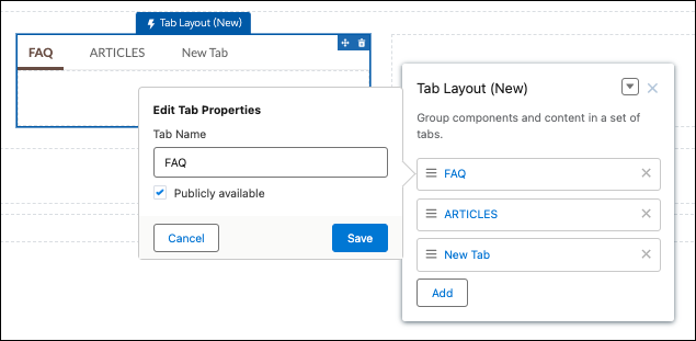
In the property panel, configure the component.
- To add another tab, click Add.
- To rename a tab or set its public availability, select the tab. To make that tab available to guest users in the site, select Publicly available. If no tabs are publicly available, the entire Tab Layout component is hidden from guest users.
- To reorder a tab, drag the tile into a new position.
- Add components to each tab. You can’t add a Tab Layout component to another Tab Layout component.
uiTabItem on the Tabs component, that custom CSS must now target
slds-tabs_default__item on Tab Layout.To present the new tab labels in other languages for a multilingual site, export your site content, translate the tab names, and import the translation back to your site.