
You are here:
Use the Sales Performance Dashboard (Managed Package)
Visualize progress toward sales goals over time. Start by learning which opportunities could use your attention to move them along the sales process. Then get insight into whether you’re going to be able to make your quota and evaluate your pipeline to learn about opportunities you can accelerate. Finally evaluate ways to turn more opportunities into wins.
To view the performance of individual advisors, select a team member from the Advisor Name global filter at the top. You can also view performance by stage, opportunity type and age, opportunity amount, and time period. Global filter selections persist across all the dashboard’s pages.
What Needs My Attention? Page
The dashboard opens to the What Needs My Attention? Page, which highlights high-value opportunities that require immediate action from the team. Shows opportunities that have stayed in a stage longer than the average for the stage, and ones where there's no recent activity. Click an element of one of the top two charts to get the specifics about opportunities in that category in the Opportunities Details table at the bottom.
Will I Make My Number? Page
Shows your team's progress toward quota, including your target and the number of business days left in the period. View quarter-over-quarter and year-over-year historic comparisons. Roll cursor over a chart element for details for that date, and scroll down to Opportunities Detail chart to see specifics for all open opportunities.
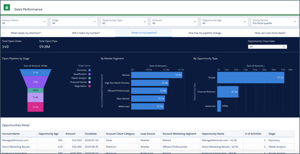
What's in My Pipeline? Page
Shown previously. To help you zero in on high-opportunity segments of the pipeline, shows open pipe by stage, market segment, and opportunity type. Also shows total open pipe and open deals. Click an element in a chart at the top to see details about opportunities in the following table.
How Has My Pipeline Changed? Page
Trends your pipeline, showing how it has changed between two dates (for example, quarter to date) for opportunities forecast to close within a specific time period. Change the Pipeline Start and End Date filter to view deals for a preset period (year, quarter, month, and so on), or select a custom period.
Metrics for Waterfall Chart
- Start. Value ($) of opportunities open at the start of selected period.
- New. Value ($) of opportunities created during selected period.
- Reopen. Value ($) of opportunities reopened during selected period.
- Expanded. Total increase in value ($) of open opportunities whose value has increased and are scheduled to close during selected period.
- Moved In. Value ($) of opportunities with close dates that shifted to close during selected period.
- Moved Out. Value ($) of opportunities with close dates originally within the selected period that shifted out of selected period.
- Reduce. Total decrease in value ($) of open opportunities whose value has decreased and are scheduled to close during selected period.
- Closed Won. Value ($) of opportunities that are closed and won during selected period.
- Closed Lost. Value ($) of opportunities that are closed and lost during selected period.
- Today. Value ($) of opportunities open today or at the end of selected period.
How Can I Win More Deals? Page
Visualizations help you understand how to win more deals. Top charts compare won and lost opportunities and show your team’s win rate over time. Use the following Understanding Win Rate chart to help understand what drives your win rate. Change the two selections in the chart to see what factors combine to increase or decrease win rate. Click a bubble in Win Rate Mix and view results for that combination in Deals Won/Lost. For example, the combination of a specific market segment (millennials, retirees, high net worth, and so on) and an opportunity type (such as simple or complex) can result in a higher win rate. Look for opportunities with that combination to increase your win rate.