You are here:
Add Expand and Collapse Settings on the Display Card
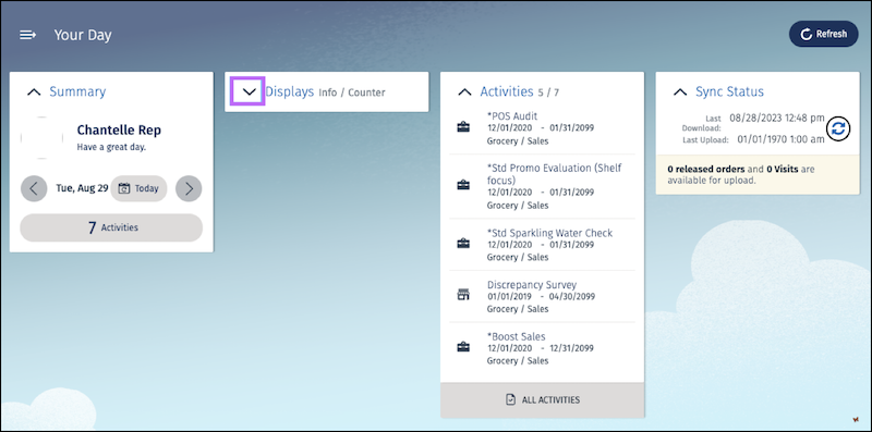
Add user interactions to the Display cockpit card. Make the Display card collapsible and store the collapsed state.
Required Editions
| User Permissions Needed | |
|---|---|
| To customize CG Cloud offline mobile app: | Customizer, Developer |
After collapsing the Display card, when you switch to a different screen in the app such as the
All Activities card and then return to the cockpit, the Display card
continues to be in the collapsed state. To define this behavior, use the isCollapsible binding. The isCollapsible binding controls the expand-collapse settings of a card. The isCollapsible function gets a card name and returns a boolean
value to indicate if the card can be collapsed.
To configure the expand or collapse setting, call the isCollapsible function in the ProcessContext::CardController.isCardCollapsible process contract.

CardController is a business object of type BoSalesCockpitHelper. BoSalesCockpitHelper is a helper class
containing properties and functions that you can use to orchestrate the card behavior.
BoSalesCockpitHelper.businessobject.xml is located at
$workspace/src/Utilities/BO/BoSalesCockpitHelper.-
Configure the
isCollapsiblefunction so that it can handle the new Display card:case "CardDisplay": collapsible = true; break; -
Define the
IsCollapsiblebinding in the UI contract and call theisCardCollapsiblefunction of the card controller:<!-- Display Card START--> <CardContainer name="DisplayCard"> <Bindings> <! -- Title and counter --> <Resource target="Title" type="Label" id="DisplayCardTitle" defaultLabel="Displays" /> <Resource target="Information" type="Label" id="DisplayCardInfo" defaultLabel="Info / Counter" /> <! -- Data loaded flag (by setting this card gets rendered) -> <Binding target="IsReadyToLoad" type="Text" binding="ProcessContext::CardDisplay_DataLoaded" bindingMode="ONE_WAY" /> <! -- Subcomponent (e.g. used for no data message) —-> <Binding target="DisplayedSubcomponentName" type="Text" binding="ProcessContext::CardDisplay_SubComponentName" bindingMode="ONE_WAY" /> <!-- Defines id card is collapsible --> <Binding type="Text" target="IsCollapsible" call="ProcessContext::CardController.isCardCollapsible" bindingMode="ONE_WAY"> <Parameters> <Input name="cardName" type="Literal" value="CardDisplay" /> </Parameters> </Binding> </Bindings> <VisibilityRoles allRoles="true" /> - Save your changes.
-
Build the contracts by running the command
sf modeler workspace
      build
or the alias commandsf mdl ws buildin your workspace. -
To test the changes, restart the simulator app.
The display card is now collapsible.
-
To store the collapsed state, add a variable in the card controller object
BoSalesCockpitHepler. Add theCollapseState_CardDisplayproperty inBoSalesCockpitHelper.<BusinessObject name="BoSalesCockpitHelper" schemaVersion="1.1"> <DataSource name="DsBoSalesCockpitHelper" /> <SimpleProperties> <SimpleProperty name="pKey" type="DomPKey" /> <SimpleProperty name="collapseState_CardUserWelcome" type="DomBool" /> <SimpleProperty name="collapseState_CardDisplay" type="DomBool" /> <SimpleProperty name="collapseState_CardActivities" type="DomBool" /> <SimpleProperty name="collapseState_CardSync" type="DomBool" /> <SimpleProperty name="number0fListItems" type="DomInteger" /> -
Add the
CollapseStatebinding to the card container definition.<!-- Defines id card is collapsible --> <Binding type="Text" target="IsCollapsible" call="ProcessContext::CardController.isCardCollapsible" bindingMode="ONE_WAY"> <Parameters> <Input name="cardName" type="Literal" value="CardDisplay" /> </Parameters> </Binding> <Binding target="CollapseState" type="Text" binding="ProcessContext::CardController.collapseState_CardDisplay" bindingMode="TWO_WAY" /> </Bindings> <VisibilityRoles allRoles="true" /> - Save your changes.
-
Build the contracts by running the command
sf modeler workspace
      build
or the alias commandsf mdl ws buildin your workspace. - To test the changes, restart the simulator app.