
You are here:
AdvancedSearch Component
Use the AdvancedSearch UI component to search and to set favorite search conditions.
Required Editions
| Available in: Lightning Experience in Professional, Unlimited, and Enterprise Editions that have Consumer Goods Cloud enabled |
Component name: advancedsearch
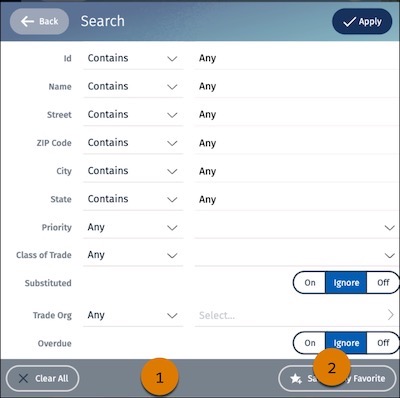
In the AdvancedSearch component, you can configure:
- Bar background color and transparency (1)
- Button border, background, label, and icon color, and button image (2)
The table lists the images and icons that are available for the AdvancedSearch UI component.
| Image | Description |
|---|---|
| Filter-active.svg | Icon that appears next to quick search when a filter is active. |
| Filter.svg | Icon that appears next to quick search when a filter is inactive. |
| Icon_Favorite.svg | Icon in the page header to indicate when a filter is saved as a favorite. |
| Icon_Favorite-outline.svg | Icon in the page header to indicate when a filter is not set as favorite. |
| StarPlus.svg | Icon to save a filter as a favorite. |
| StarMinus.svg | Icon to delete a filter as a favorite. |
| Icon_X.svg | Icon to reset a filter. |
Did this article solve your issue?
Let us know so we can improve!
