
You are here:
Button Types
Learn about the standard types of buttons in the Consumer Goods Cloud Offline mobile app.
Required Editions
| Available in: Lightning Experience in Professional, Unlimited, and Enterprise Editions that have Consumer Goods Cloud enabled |
The table lists the standard types of buttons.
| Button Type | Description | Button Image |
|---|---|---|
| Primary Button | A button that is usually part of the page header. |

|
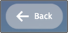
| Secondary Button | A button that’s smaller than the primary button, such as the Back button and the collapsed menu items button in the page header. |
|
| Navigation Button | A button used for navigation on the navigation bar. |

|
| Primary Small Button | A button that represents a primary action and is used in the ActionBar element of the Card Container component. Also used for menu buttons in lists, in the page header, and in previous and next buttons in a call calendar. |

|
| Secondary Small Button | A button that represents a secondary action, including secondary actions in an ActionBar. |

|
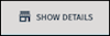
| Flat Button Primary Light | A button used in the LinkBar element of the Card Container for the primary button. |
|
| Flat Button Secondary Light | A button used in the LinkBar element within the Card Container for the secondary button. |

|
Did this article solve your issue?
Let us know so we can improve!
