Use the Emissions Forecast and What-If Analysis dashboard to gain insights into your
organization's emissions forecast, analyze fairness scenarios, and visualize potential outcomes.
Use the interactive What-If Analysis feature to experiment with various forecast metrics and see
how adjustments to these values impact the total emissions.
Required Editions
Available in: Enterprise, Professional, Unlimited, and
Developer Editions where Net Zero Cloud and CRM Analytics for Net Zero Cloud are
enabled
Note To set up the Net Zero Analytics app with the Emissions Forecast and What-If
Analysis dashboard, use the guided setup. During setup, you have the option to import
data from an external source to view key metrics and insights in the What-If Analysis dashboard.
Ensure to import at least the business metric data to install the app and access the
What-If Analysis features.
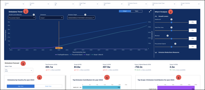
Filter the charts based on region, country, city, asset type, asset name, emission source,
stationary asset type, and scope 3 activity.
Shows how total emissions change over time, based on the forecast metrics (1).
Shows forecasted emissions metric values by a specified percentage in the What-If Analysis
pane (2). Adjust the slider to hypothetically modify the forecast. Increase or decrease these
values for specific emission metrics to dynamically update the Emission Trend chart and get a
visual representation of the impact of the adjustments on the total emissions forecast.
Growth Levers: Move the slider to adjust the growth metrics values by a specific
percentage.
Emission Reduction Measures: Move the slider to adjust the value of different emission
reduction measures by a specific percentage.
Shows the year-wise emission forecast KPI values and the percentage change compared to the
base year (3).
Shows the country-wise carbon footprint for the organization for the selected year. Use
either the Map View or Graph View to analyze the data, to visualize the geographical
distribution of emissions, and to identify countries with significant contributions (4).
Identifies top emission contributors for the selected year to highlight the sources with a
significant impact on emissions (5).
Shows the top Scope 3 emission contributors for the selected year. Scope 3 emissions are
indirect emissions from the activities of the organization, that is, emissions from sources not
owned or controlled by the organization (6).
Note To set up the What-If Analysis dashboard, ensure to configure the emissions target. For
more details, see Set Emissions Targets.
Watch this video to understand more about configuring and using the Emissions Forecast and
What-If Analysis dashboard.
We use three kinds of cookies on our websites: required, functional, and advertising. You can choose whether functional and advertising cookies apply. Click on the different cookie categories to find out more about each category and to change the default settings.
Privacy Statement
Required Cookies
Always Active
Required cookies are necessary for basic website functionality. Some examples include: session cookies needed to transmit the website, authentication cookies, and security cookies.
Functional Cookies
Functional cookies enhance functions, performance, and services on the website. Some examples include: cookies used to analyze site traffic, cookies used for market research, and cookies used to display advertising that is not directed to a particular individual.
Advertising Cookies
Advertising cookies track activity across websites in order to understand a viewer’s interests, and direct them specific marketing. Some examples include: cookies used for remarketing, or interest-based advertising.