
You are here:
Types of In-App Guidance
Select the appropriate type of in-app guidance depending on the support you want to give to users and the environment that you’re working in.
Required Editions
| Available in: Lightning Experience |
| Available with a limted number of active walkthroughs in: Essentials, Group, Professional, Enterprise, Performance, Unlimited, and Developer Editions |
| Available with Enablement, which is available in Developer Edition with a limited number of add-ons and with Sales Cloud, Service Cloud, or Salesforce Platform in: Enterprise, Performance, Unlimited and Einstein 1 Sales EditionEditions for an additional cost |
| In-app guidance in Experience Cloud sites with Partner Enablement requires an Enablement add-on license and supported PRM add-on license. |
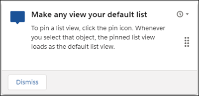
Floating Prompt
Promote feature discovery and adoption with a short message that users can quickly read and dismiss. Place the prompt at one of nine different locations on a page.
For example, show a prompt to let users know they can pin a favorite list view, which helps boost their productivity.
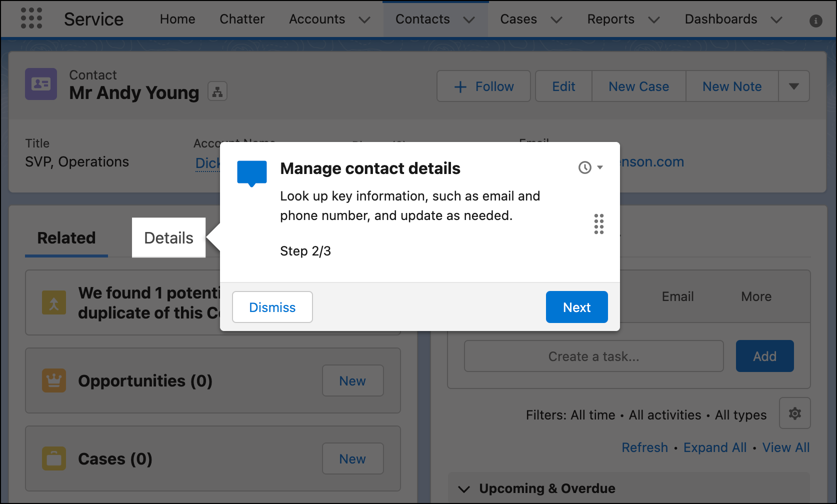
Targeted Prompt
Highlight a specific element on a page by pointing to the element with an arrow and graying out the rest of the page. Select the specific element that you want to target and position the prompt at one of 12 positions relative to the element. You can also target specific fields on a record page, dynamic form, or Create window.
Or, let Salesforce determine the best location for the prompt depending on the current page configuration.
For example, show a targeted prompt on the Details tab of the Contact record page.
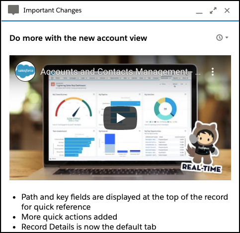
Docked Prompt
Drive feature adoption and help guide users through more complicated tasks. Embed images, videos, and step-by-step directions in a larger-sized prompt that stays available for users.
For example, show a docked prompt that includes a video to let users know about changes to the layout of the account page.
Comparison of Prompt Types
To help you select the right type of in-app guidance, compare supported features and environments.
| Consideration | Floating Prompt | Targeted Prompt | Docked Prompt |
|---|---|---|---|
| Lightning Experience supported |

|
|
|
| Experience Cloud sites supported |
|

|
|
| Rich text supported |
|
|
Supports more rich text options than floating and targeted prompts, including color, links, and list formatting. |
| Image |
|
|
|
| Embedded video |
|
|
|
| Optional Action button |
|
|
|
| Optional Dismiss button |
|
|
|
| Snooze icon |
|
|
|
| Behavior when a user leaves the page | Disappears | Disappears | Remains available. Users can maximize or minimize the prompt, or leave the prompt open as they navigate pages. |
| Size | Takes up a small area of the page, which users sometimes ignore. | Takes up a small area of the page, which users sometimes ignore. | Takes up a larger area of the page than floating or targeted prompts. |
| Special considerations |
|
Allows for more content than some users want or need. Too much information can overwhelm users. Review the writing tips in Tips for Writing Effective In-App Guidance. |
Because floating prompts and targeted prompts take up a small area of the page, you can set up a schedule for the prompt so that users see it again. See Considerations for Creating In-App Guidance.
Walkthrough
Provide guided, in-context training and onboarding on a single page or across multiple pages. Connect up to 10 prompts in a step-by-step, guided experience. Users can see their progress through the walkthrough at each prompt, such as Step 1 out of 4.
- In Lightning Experience, walkthroughs can have a mix of all prompt types. We recommend docked prompts only for the final step so that you can include more information and calls to action.
- In supported Experience Cloud sites, walkthroughs can have only floating prompts.
For example, show a walkthrough that introduces new sales team members to a specific feature.
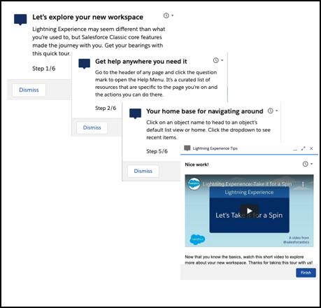
Prompts in a walkthrough behave differently compared to standalone prompts.
- Each prompt includes a progress button, labeled Next, except for the final prompt, where the button is labeled Finish.
- The final prompt provides an optional action link instead of an Action button.
A walkthrough can include prompts across multiple pages, even pages that only open when a user completes a required action. For example, create a walkthrough that shows users how to create a lead. Add prompts that highlight fields in the New Lead window. Then, add a final prompt that only appears on the lead record page after the user completes all the fields in the New Lead window and saves.