
You are here:
Reviewing Week-to-Week Forecast Changes
Review how forecasts have changed throughout the current period with the Weekly Changes chart. The chart includes key metrics and a visual representation of changes as the period has progressed. The information that’s available to you in the chart depends on enabled features and how long forecast data is retained.
Required Editions
| Available in: Lightning Experience |
| Available in: Enterprise and Unlimited Editions |
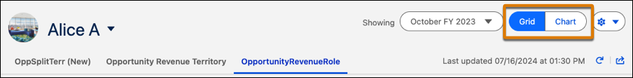
To review charts for a forecast, toggle to the Chart view on the forecasts page.
You have access to charts for your forecasts across all forecast types and any of your subordinates. Here’s a Weekly Changes chart example where quota and cumulative category rollups are enabled. Depending on your system setup, your chart can look different.
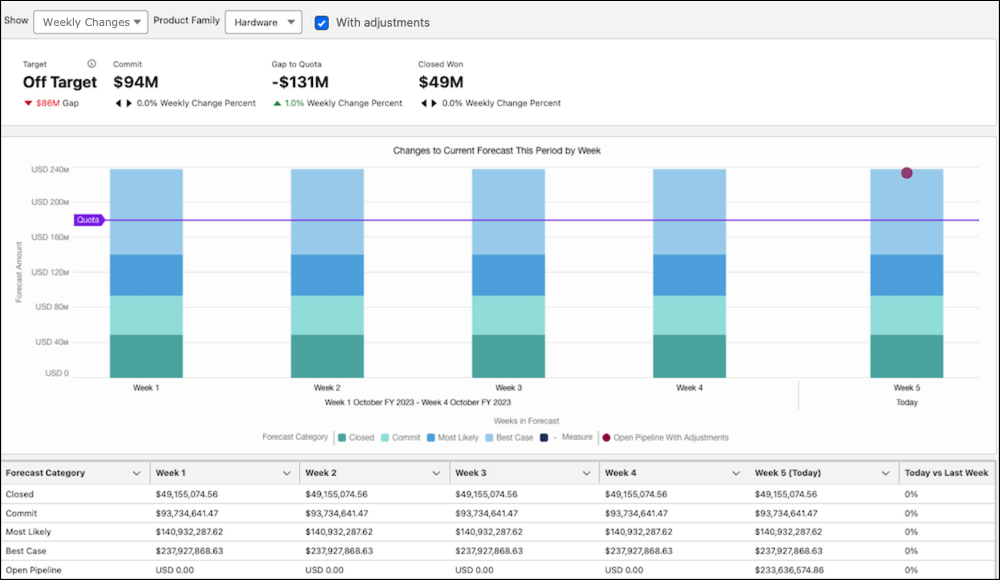
Metrics indicate key information as of today. Each metric also includes the percent change from the same time last week.
| Metric | Description |
|---|---|
| Target | Commit compared to quota. If the commit value is greater than quota, the user is on target to meet or exceed their quota for the period. |
| Commit | Total commit value. In cumulative category rollups, this value includes opportunities in the Commit and Closed forecast categories. |
| Gap to Quota | Quota minus Closed Won, which indicates how much is needed to meet quota. |
| Closed Won | Total value of opportunities that have been won and are now closed. |
| Pipe Coverage | Open pipeline divided by quota. |
If quota data isn’t available, the metrics that require quota aren’t shown. If Einstein Forecasting is enabled and its data requirements are met, additional AI-generated metrics about forecast predictions are shown.
Bar Chart Segments
Each time segment shows opportunities grouped by their forecast category. If you use single category rollups, open pipeline is represented as a bar segment. For cumulative category rollups, the open pipeline is shown as a dot on the chart. Hover over each segment for details about the changes compared to the previous week.
| Metric | Description |
|---|---|
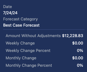
| Forecast Amount | The total forecast for the category including any adjustments made. The weekly and monthly changes including adjustments are included below the value. This value is shown when viewing the chart with adjustments. |
| Amount Without Adjustments | The total forecast for the category without adjustments. The weekly and monthly changes without adjustments are indicated below this value. This value is shown when viewing the chart without adjustments. |
| Weekly Change and Weekly Percent | The percentage difference compared to the same time last week. For example, if you’re viewing changes 2 days from the end of the week, the comparison is made to when there were 2 days from the end of last week. |
| Monthly Change | The percentage difference compared to the same time last month, based on time remaining in the month. For example, if there are currently 20 days remaining in the current month, the comparison is made to the day when there were 20 days remaining in the previous month. For example, July has 31 days, while June has 30. Therefore, July 11 is compared to June 10. |
If Einstein Forecasting is enabled and its data requirements are met, the chart includes AI-driven predicted values for future weeks through the end of the period.
Summary Table
To review the forecast changes side by side, see the table that shows when viewing the chart. The table includes the data for each category by time segment and includes the weekly or monthly change percentage of today’s forecast compared to the same time last week or month. To jump to the corresponding data in the table, click the bar segment in the chart.