
You are here:
Finding Trends Across Forecast Periods
Evaluate how this forecast period compares to the forecasts at the same point in past periods in the Monthly or Quarterly Trends chart. Understanding your team’s trends helps to gauge whether the team is tracking to hit their sales goals based on performance in previous periods. The information that’s available to you in the chart depends on enabled features and how long forecast data is retained.
Required Editions
| Available in: Lightning Experience |
| Available in: Enterprise and Unlimited Editions |
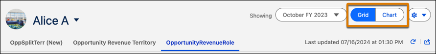
To review charts for a forecast, toggle to the Chart view on the forecasts page.
You have access to charts for your forecasts across all forecast types and any of your subordinates. Here’s a Trends chart example where quota and cumulative category rollups are enabled. Depending on your system setup, your chart can look different.
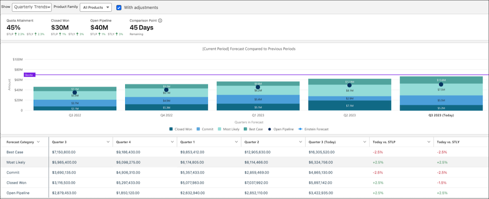
Each bar in the chart represents the same point in time in a previous period (month or quarter). In this example, the Today bar marks 45 days before the end of the current quarter. Other bars show the forecast when 45 days remained in each previous quarter.
Metrics are shown to provide key information as of today. Where applicable, metrics also show the comparison to the last period and the same time last year.
| Metric | Description |
|---|---|
| Quota Attainment | Closed Won divided by quota. |
| Closed Won | Total value of opportunities that have been won and are now closed. |
| Open Pipeline | Opportunities that haven’t closed. |
| Comparison Point | The number of days remaining in the current period. This number is the point in the period that is used to compare the current period to the previous periods. |
If quota data isn’t available, the metrics that require quota aren’t shown.
Bar Chart Segments
For quarterly forecast periods, the chart includes five bars (one for each historical period over the last year, and one for today). For monthly forecasts, the chart includes 13 bars (12 bars for each historical month, and 1 bar for today). If you’re new to Salesforce, or only recently enabled historical trending, your chart contains data only for the periods that it has data for.
Each forecast period segment shows opportunities grouped by the forecast category, including indicators for open pipeline and quota targets. Hover over each segment in a past period for details about how that period compares to today’s forecast.
Values are calculated as follows.
| Metric | Description |
|---|---|
| Forecast Amount | The total forecast for the category, including adjustments. This value is shown when viewing the chart with adjustments. |
| Amount Without Adjustments | The total forecast for the category without adjustments. This value is shown when viewing the chart without adjustments. |
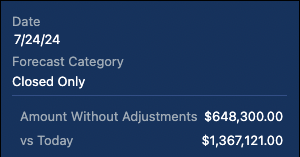
| vs Today | The difference in value between the forecast value for the period and the value today. |
Hover over each segment in the Today bar for details about how today’s forecast compares to the same time last period and last year.
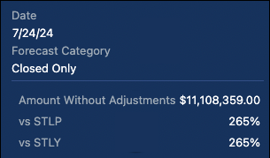
Values are calculated as follows.
| Metric | Description |
|---|---|
| Forecast Amount | The total forecast for the category, including adjustments. This value is shown when viewing the chart with adjustments. |
| Amount Without Adjustments | The total forecast for the category without adjustments. This value is shown when viewing the chart without adjustments. |
| vs STLP | The percentage difference from the same time last period, based on time remaining in the period. For example, if there are 20 days remaining in the current period, the comparison is made to the day when there were 20 days remaining in the previous period. If the current period has more days than the last period, the same time last period is the first day of the previous period. For example, 85 days are left in Q4, which has 90 days. But Q3 had 80 days. In this case, the same time last period is calculated using the first day of Q3. |
| vs STLY | The percentage difference from the same time last year, based on the number of days remaining in the period. For example, if 85 days are left in Q3 2023, the comparison is made to the day when 85 days were left in Q3 2022. |
Summary Table
To review the forecast trends side by side, see the table that shows when viewing the chart. The table shows the data for each category by time segment and includes the percentage change of today’s forecast compared to the same time last period and the same time last year. To jump to the corresponding data in the table, click the bar segment in the chart.